Visual Structure
This section defines the terms and concepts used in the scope of RadButtons that you have to get familiar with prior to continuing with the rest of the article. They can also be helpful in order to describe your issue better when contacting our support service. Below you can see snapshots and explanations of the main states and visual elements of the standard RadButton controls.
RadButton
Content—Represents the content of the button.
Button Part—Represents the part of the control that raises the
Clickevent on click.

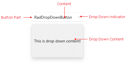
RadDropDownButton
Content—Represents the content of the button.
Drop Down Indicator—Represents the arrow indicator.
Button Part—Represents the part of the control that raises the
Clickevent on click.Drop Down Content—Represents the content of the drop down popup.

RadRadioButton
Content—Represents the content of the button.
Button Part—Represents the part of the control that raises the
Clickevent on click.

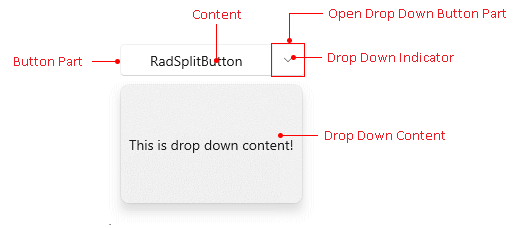
RadSplitButton
Content—Represents the content of the button.
Drop Down Indicator—Represents the arrow indicator.
Button Part—Represents the part of the control that raises the
Clickevent on click.Open Drop Down Button Part—Represents the button that opens the Drop Down Content.
Drop Down Content—Represents the content of the drop down popup.

RadToggleButton
Content—Represents the content of the button.
Button Part—Represents the part of the control that raises the
Clickevent on click.
