Creating custom cells
Custom data cell example
RadGridView provides a variety of visual cells (all inheriting from GridCellElement) with different functionality and purpose – header cells, indent cells, command cells, summary cells, group content cells, data cells, etc. All these cover the standard cases of the control usage. In case you need to implement more specific and custom scenario, you can create a custom cell. RadGridView provides powerful and flexible mechanism for creating cell types with custom content elements, functionality and properties.
You can use the following approach to create a custom data cell with a progress bar in it:
1. Create a class for the cell which derives from GridDataCellElement:
public class ProgressBarCellElement : GridDataCellElement
Public Class ProgressBarCellElement
    Inherits GridDataCellElement
public ProgressBarCellElement(GridViewColumn column, GridRowElement row) : base(column, row)
{
}
Public Sub New(ByVal column As GridViewColumn, ByVal row As GridRowElement)
    MyBase.New(column, row)
End Sub
2. Create the RadProgressBarElement and add it as a child of the custom cell.You can achieve this by overriding the CreateChildElements method:
private RadProgressBarElement radProgressBarElement;

protected override void CreateChildElements()
{
    base.CreateChildElements();

    radProgressBarElement = new RadProgressBarElement();
    this.Children.Add(radProgressBarElement);
}
Private radProgressBarElement As RadProgressBarElement
Protected Overrides Sub CreateChildElements()
    MyBase.CreateChildElements()
    radProgressBarElement = New RadProgressBarElement()
    Me.Children.Add(radProgressBarElement)
End Sub
3. Override the SetContentCore method to update the progress bar according to the cell value:
protected override void SetContentCore(object value)
{
    if (this.Value != null && this.Value != DBNull.Value)
    {
        this.radProgressBarElement.Value1 = Convert.ToInt16(this.Value);
    }
}
Protected Overrides Sub SetContentCore(ByVal value As Object)
    If Me.Value IsNot Nothing AndAlso Me.Value IsNot DBNull.Value Then
        Me.radProgressBarElement.Value1 = Convert.ToInt16(Me.Value)
    End If
End Sub
4. The custom cell will have no styles, because there are no defined styles for its type in the themes. You can apply the GridDataCellElement’s styles to it by defining its ThemeEffectiveType:
protected override Type ThemeEffectiveType
{
    get
    {
        return typeof(GridDataCellElement);
    }
}
Protected Overrides ReadOnly Property ThemeEffectiveType() As Type
    Get
        Return GetType(GridDataCellElement)
    End Get
End Property
5. Thanks to the UI virtualization mechanism only the currently visible cells are created and they are further reused when needed. A cell element is reused in other rows or columns if it is compatible for them. You can create a custom column and define that the custom cell IsCompatible for that column only. This will prevent the cell from being unintentionally reused by other columns.
public override bool IsCompatible(GridViewColumn data, object context)
{
    return data is ProgressBarColumn && context is GridDataRowElement;
}
Public Overrides Function IsCompatible(ByVal data As GridViewColumn, ByVal context As Object) As Boolean
    Return TypeOf data Is ProgressBarColumn AndAlso TypeOf context Is GridDataRowElement
End Function
public class ProgressBarColumn : GridViewDataColumn
{
    public ProgressBarColumn(string fieldName) : base(fieldName)
    {
    }

    public override Type GetCellType(GridViewRowInfo row)
    {
        if (row is GridViewDataRowInfo)
        {
            return typeof(ProgressBarCellElement);
        }
        return base.GetCellType(row);
    }
}
Public Class ProgressBarColumn
    Inherits GridViewDataColumn
    Public Sub New(ByVal fieldName As String)
        MyBase.New(fieldName)
    End Sub
    Public Overrides Function GetCellType(ByVal row As GridViewRowInfo) As Type
        If TypeOf row Is GridViewDataRowInfo Then
            Return GetType(ProgressBarCellElement)
        End If
        Return MyBase.GetCellType(row)
    End Function
End Class
6. Lastly, we need to add the custom column to our grid. The following code snippet demonstrates the usage of the custom column:
ProgressBarColumn customColumn = new ProgressBarColumn("Progress column");
this.radGridView1.Columns.Add(customColumn);
Dim customColumn As New ProgressBarColumn("Progress column")
Me.RadGridView1.Columns.Add(customColumn)
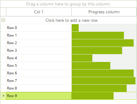
Figure 1: The custom column is now added to the grid.
Extending the custom data cell example
You can extend the custom cell further by adding a button in it and subscribing to its Click event. The button will be used to restart the progress bar by setting the cell value to 0. You can achieve this by using the following approach:
1. Initialize and add the elements to the cell:
private RadProgressBarElement radProgressBarElement;
private RadButtonElement radButtonElement;

protected override void CreateChildElements()
{
    base.CreateChildElements();

    radProgressBarElement = new RadProgressBarElement();
    this.Children.Add(radProgressBarElement);

    radButtonElement = new RadButtonElement();
    radButtonElement.Text = "Restart";
    radButtonElement.Margin = new System.Windows.Forms.Padding(0, 1, 3, 1);
    radButtonElement.Click += new EventHandler(radButtonElement_Click);
    this.Children.Add(radButtonElement);
}

protected override void DisposeManagedResources()
{
    radButtonElement.Click -= new EventHandler(radButtonElement_Click);
    base.DisposeManagedResources();
}
Private radProgressBarElement As RadProgressBarElement
Private radButtonElement As RadButtonElement
Protected Overrides Sub CreateChildElements()
    MyBase.CreateChildElements()
    radProgressBarElement = New RadProgressBarElement()
    Me.Children.Add(radProgressBarElement)
    radButtonElement = New RadButtonElement()
    radButtonElement.Text = "Restart"
    radButtonElement.Margin = New System.Windows.Forms.Padding(0, 1, 3, 1)
    AddHandler radButtonElement.Click, AddressOf radButtonElement_Click
    Me.Children.Add(radButtonElement)
End Sub
Protected Overrides Sub DisposeManagedResources()
    RemoveHandler radButtonElement.Click, AddressOf radButtonElement_Click
    MyBase.DisposeManagedResources()
End Sub
2. Override the ArrangeOverride method to arrange the children elements of the cell:
protected override SizeF ArrangeOverride(SizeF finalSize)
{
    if (this.Children.Count == 2)
    {
        float progressBarWidth = finalSize.Width - radButtonElement.DesiredSize.Width;

        RectangleF progressBarRect = new RectangleF(0, 0, progressBarWidth - 1, finalSize.Height);
        RectangleF buttonRect = new RectangleF(progressBarWidth + 1, 0, radButtonElement.DesiredSize.Width, finalSize.Height);

        this.Children[0].Arrange(progressBarRect);
        this.Children[1].Arrange(buttonRect);
    }

    return finalSize;
}
Protected Overrides Function ArrangeOverride(ByVal finalSize As SizeF) As SizeF
    If Me.Children.Count = 2 Then
        Dim progressBarWidth As Single = finalSize.Width - radButtonElement.DesiredSize.Width
        Dim progressBarRect As New RectangleF(0, 0, progressBarWidth - 1, finalSize.Height)
        Dim buttonRect As New RectangleF(progressBarWidth + 1, 0, radButtonElement.DesiredSize.Width, finalSize.Height)
        Me.Children(0).Arrange(progressBarRect)
        Me.Children(1).Arrange(buttonRect)
    End If
    Return finalSize
End Function
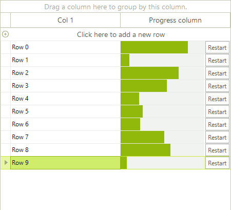
Figure 2: The new custom cell is shown in RadgridView.
Custom group cell example
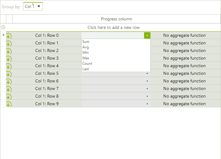
When the EnableGrouping property is set to true the GroupPanelElement is displayed at the top of the grid. Thus, when the user drags a column and drops it onto the panel GridGroupContentCellElements are created for the group rows. The following example demonstrates a sample approach how to customize the GridGroupContentCellElement in order to add a drop-down with aggregate functions next to the group header and calculate the function considering the user selection
Figure 3: The custom group cell contains a drop down list.
1. Create a class that inherits the GridGroupContentCellElement. In its CreateChildElements method we will use a RadDropDownListElement which contains the aggregate functions and a LightVisualElement to display the calculated result. In the SetContent method we should display the cell information considering for which row it is currently being used:
public class CustomGridGroupContentCellElement : GridGroupContentCellElement
{
    private RadDropDownListElement dropDown;
    private LightVisualElement textElement;
    private LightVisualElement aggregateElement;
    private StackLayoutElement stack;
    public CustomGridGroupContentCellElement(GridViewColumn column, GridRowElement row) : base(column, row)
    {
    }
    protected override Type ThemeEffectiveType
    {
        get
        {
            return typeof(GridGroupContentCellElement);
        }
    }
    protected override void CreateChildElements()
    {
        base.CreateChildElements();
        stack = new StackLayoutElement();
        stack.Orientation = Orientation.Horizontal;
        stack.StretchHorizontally = true;
        stack.Margin = new Padding(0, 2, 5, 0);
        textElement = new LightVisualElement();
        dropDown = new RadDropDownListElement();
        dropDown.DropDownStyle = Telerik.WinControls.RadDropDownStyle.DropDownList;
        aggregateElement = new LightVisualElement();
        dropDown.SelectedIndexChanged += SelectedIndexChanged;
        dropDown.Items.AddRange(new List<string>(new string[]
        {
            "Sum",
            "Avg",
            "Min",
            "Max",
            "Count",
            "Last"
        }));
        stack.Children.Add(textElement);
        stack.Children.Add(dropDown);
        stack.Children.Add(aggregateElement);
        this.Children.Add(stack);
    }
    public override void SetContent()
    {
        base.SetContent();
        GridViewGroupRowInfo row = this.RowInfo as GridViewGroupRowInfo;
        if (row != null)
        {
            this.textElement.Text = row.HeaderText;
            if (row.Tag != null)
            {
                dropDown.SelectedIndexChanged -= SelectedIndexChanged;
                dropDown.SelectedIndex = (int)row.Tag;
                dropDown.SelectedIndexChanged += SelectedIndexChanged;
            }
            else
            {
                dropDown.SelectedIndexChanged -= SelectedIndexChanged;
                dropDown.SelectedIndex = -1;
                dropDown.SelectedIndexChanged += SelectedIndexChanged;
            }
        }
        switch (dropDown.Text)
        {
            case "Sum":
                this.aggregateElement.Text = GetSum(row).ToString();
                break;
            case "Avg":
                this.aggregateElement.Text = (GetSum(row) / row.ChildRows.Count).ToString();
                break;
            case "Min":
                this.aggregateElement.Text = GetMin(row).ToString();
                break;
            case "Max":
                this.aggregateElement.Text = GetMax(row).ToString();
                break;
            case "Count":
                this.aggregateElement.Text = row.ChildRows.Count.ToString();
                break;
            case "Last":
                this.aggregateElement.Text = row.ChildRows.Last().Cells["ProductName"].Value.ToString();
                break;
            default:
                this.aggregateElement.Text = "No aggregate function";
                break;
        }
        this.Text = string.Empty;
    }
    private void SelectedIndexChanged(object sender, Telerik.WinControls.UI.Data.PositionChangedEventArgs e)
    {
        this.RowInfo.Tag = dropDown.SelectedIndex;
    }
    private decimal GetSum(GridViewGroupRowInfo row)
    {
        decimal sum = 0;
        foreach (GridViewRowInfo childRow in row.ChildRows)
        {
            sum = sum + (decimal)childRow.Cells["UnitPrice"].Value;
        }
        return sum;
    }
    private decimal GetMin(GridViewGroupRowInfo row)
    {
        decimal min = decimal.MaxValue;
        foreach (GridViewRowInfo childRow in row.ChildRows)
        {
            if ((decimal)childRow.Cells["UnitPrice"].Value < min)
            {
                min = (decimal)childRow.Cells["UnitPrice"].Value;
            }
        }
        return min;
    }
    private decimal GetMax(GridViewGroupRowInfo row)
    {
        decimal max = decimal.MinValue;
        foreach (GridViewRowInfo childRow in row.ChildRows)
        {
            if ((decimal)childRow.Cells["UnitPrice"].Value > max)
            {
                max = (decimal)childRow.Cells["UnitPrice"].Value;
            }
        }
        return max;
    }
}
Public Class CustomGridGroupContentCellElement
    Inherits GridGroupContentCellElement
    Private dropDown As RadDropDownListElement
    Private textElement As LightVisualElement
    Private aggregateElement As LightVisualElement
    Private stack As StackLayoutElement
    Public Sub New(column As GridViewColumn, row As GridRowElement)
        MyBase.New(column, row)
    End Sub
    Protected Overrides ReadOnly Property ThemeEffectiveType() As Type
        Get
            Return GetType(GridGroupContentCellElement)
        End Get
    End Property
    Protected Overrides Sub CreateChildElements()
        MyBase.CreateChildElements()
        stack = New StackLayoutElement()
        stack.Orientation = Orientation.Horizontal
        stack.StretchHorizontally = True
        stack.Margin = New Padding(0, 2, 5, 0)
        textElement = New LightVisualElement()
        dropDown = New RadDropDownListElement()
        dropDown.DropDownStyle = Telerik.WinControls.RadDropDownStyle.DropDownList
        aggregateElement = New LightVisualElement()
        AddHandler dropDown.SelectedIndexChanged, AddressOf SelectedIndexChanged
        dropDown.Items.AddRange(New List(Of String)(New String() {"Sum", "Avg", "Min", "Max", "Count", "Last"}))
        stack.Children.Add(textElement)
        stack.Children.Add(dropDown)
        stack.Children.Add(aggregateElement)
        Me.Children.Add(stack)
    End Sub
    Public Overrides Sub SetContent()
        MyBase.SetContent()
        Dim row As GridViewGroupRowInfo = TryCast(Me.RowInfo, GridViewGroupRowInfo)
        If row IsNot Nothing Then
            Me.textElement.Text = row.HeaderText
            If row.Tag IsNot Nothing Then
                RemoveHandler dropDown.SelectedIndexChanged, AddressOf SelectedIndexChanged
                dropDown.SelectedIndex = DirectCast(row.Tag, Integer)
                AddHandler dropDown.SelectedIndexChanged, AddressOf SelectedIndexChanged
            Else
                RemoveHandler dropDown.SelectedIndexChanged, AddressOf SelectedIndexChanged
                dropDown.SelectedIndex = -1
                AddHandler dropDown.SelectedIndexChanged, AddressOf SelectedIndexChanged
            End If
        End If
        Select Case dropDown.Text
            Case "Sum"
                Me.aggregateElement.Text = GetSum(row)
            Case "Avg"
                Me.aggregateElement.Text = GetSum(row) / row.ChildRows.Count
            Case "Min"
                Me.aggregateElement.Text = GetMin(row)
            Case "Max"
                Me.aggregateElement.Text = GetMax(row)
            Case "Count"
                Me.aggregateElement.Text = row.ChildRows.Count
            Case "Last"
                Me.aggregateElement.Text = row.ChildRows.Last().Cells("ProductName").Value.ToString()
            Case Else
                Me.aggregateElement.Text = "No aggregate function"
                Exit Select
        End Select
        Me.Text = String.Empty
    End Sub
    Private Sub SelectedIndexChanged(sender As Object, e As Data.PositionChangedEventArgs)
        Me.RowInfo.Tag = dropDown.SelectedIndex
    End Sub
    Private Function GetSum(row As GridViewGroupRowInfo) As Decimal
        Dim sum As Decimal = 0
        For Each childRow As GridViewRowInfo In row.ChildRows
            sum = sum + childRow.Cells("UnitPrice").Value
        Next
        Return sum
    End Function
    Private Function GetMin(row As GridViewGroupRowInfo) As Decimal
        Dim min As Decimal = Decimal.MaxValue
        For Each childRow As GridViewRowInfo In row.ChildRows
            If childRow.Cells("UnitPrice").Value < min Then
                min = childRow.Cells("UnitPrice").Value
            End If
        Next
        Return min
    End Function
    Private Function GetMax(row As GridViewGroupRowInfo) As Decimal
        Dim max As Decimal = Decimal.MinValue
        For Each childRow As GridViewRowInfo In row.ChildRows
            If childRow.Cells("UnitPrice").Value > max Then
                max = childRow.Cells("UnitPrice").Value
            End If
        Next
        Return max
    End Function
End Class
2. Subscribe to the CreateCell event where we should replace the default GridGroupContentCellElement with the custom one:
private void gridCustomGroupCell_CreateCell(object sender, GridViewCreateCellEventArgs e)
{
    if (e.CellType == typeof(GridGroupContentCellElement))
    {
        e.CellElement = new CustomGridGroupContentCellElement(e.Column, e.Row);
    }
}
Private Sub gridCustomGroupCell_CreateCell(sender As Object, e As GridViewCreateCellEventArgs) Handles gridCustomGroupCell.CreateCell
    If e.CellType = GetType(GridGroupContentCellElement) Then
        e.CellElement = New CustomGridGroupContentCellElement(e.Column, e.Row)
    End If
End Sub