Properties
| Property | Description | Result |
|---|---|---|
| Image, ImageKey and ImageIndex | Allows you manipulate the image displayed in the waiting indicators. |  |
| IsWaiting | Indicates whether the RadWaitingBar is currently waiting. | |
| ShowText | Indicates whether the text in RadWaitingBar is displayed. By default, the text of RadWaitingBar is not displayed. To show it, set the property to true. |  |
| StretchIndicatorsHorizontally | Indicates whether the waiting indicators are stretched horizontally, so that their width equals the available width of the parent element. |
 
|
| StretchIndicatorsVertically | Indicates whether the waiting indicators are stretched vertically, so that their height equals the available height of the parent element. |
 
|
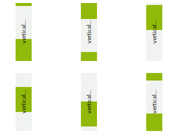
| Orientation | The property is set to Horizontal when the waiting indicator moves horizontally, i.e. the WaitingDirection property is set to Left or Right. The property is set to Vertical when the waiting indicator moves vertically, i.e. the WaitingDirection property is set to Top or Bottom. |
 
|
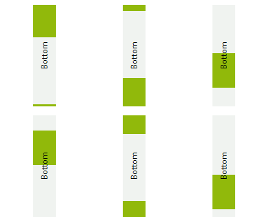
| WaitingDirection | The property indicates the direction of indicators’ movement. Right: the indicators move from left to right; Left: the indicators move from right to left; Top: the indicators move from bottom to top; Bottom: the indicators move from top to bottom; Note that setting WaitingDirection does not change the size of the control. This implies that when you set the property to Bottom or Top, you will need to resize the RadWaitingBar appropriately, i.e. the control height should be larger than its width. Changing the WaitingDirection property affects also the values of the StretchIndicatorsVertically and the StretchIndicatorsHorizontally, unless a local value is assigned to either of the two properties. For example, when the WaitingDirection is Top or Bottom, the StretchIndicatorsVertically is set to false and the StretchIndicatorsHorizontally is set to true automatically. When the WaitingDirection is Right or Left, the StretchIndicatorsVertically is set to true and the StretchIndicatorsHorizontally is set to false. |
   
|
| WaitingIndicatorSize | The property allows you to set the size of the of the waiting indicators |  |
| WaitingIndicatorWidth | The property is obsolete. Currently, it sets the WaitingIndicatorSize.Width | |
| WaitingSpeed | The property sets the speed of the animation. The higher the WaitingSpeed is, the faster the waiting indicators move. WaitingSpeed possible values range from 0 to 100, where 1 sets the slowest indicator and 100 results in the fastest indicator. If the WaitingSpeed is set to 0, the WaitingStopped event is raised and the waiting process terminates. Then, if the WaitingSpeed is set to a value greater than 0, the WaitingStarted event is raised and the waiting animation continues automatically. |  |
| WaitingStep | Sets the number of pixels the waiting indicators move during each step of the waiting animation process. If the WaitingStep is set to 0, the WaitingStopped event is raised and the waiting process terminates. Then, if the WaitingStep is set to a value greater than 0, the WaitingStarted event raises and the waiting animation continues automatically. |  |
| WaitingStyle | Sets the style of RadWaitingBar. Read more here: Waiting Styles | |
| AssociatedControl | Specifies the associated control. |
Methods
| Method | Description |
|---|---|
| StartWaiting() | Starts the animation. |
| StopWaiting() | Stops the animation. |
| ResetWaiting() | Moves the waiting indicators to their initial position. Resetting the animation after the waiting process has been started will not stop the animation. Respectively, resetting the animation after the waiting process has been stopped will not start the animation. |
Events
| Event | Description |
|---|---|
| WaitingStarted | Fires when the control starts waiting. |
| WaitingStopped | Fires when the control stops waiting. |