| Property |
Description |
| Direction |
Gets or sets the direction of rating element paint (Standard, Reversed). |
| Orientation |
Gets or sets the orientation of the rating control. |
| SelectionMode |
Gets or sets the selection mode of the rating control. |
| Items |
Gets the rating items collection. |
| Value |
Gets or sets the average value of rating element. |
| Minimum |
Gets or sets the minimum value of rating element. |
| Maximum |
Gets or sets the maximum value of rating element. |
| Caption |
Gets or sets the text of the Caption label. |
| Subcaption |
Gets or sets the text of the Sub Caption label. |
| Description |
Gets or sets the text of the description label. |
| RatingElement |
Gets the instance of RadRatingElement wrapped by this control. RadRatingElement is the main element in the hierarchy tree and encapsulates the actual functionality of RadRating. |
| ReadOnly |
Gets or sets whether the rating is ReadOnly. The Value of the element can still be set in ReadOnly mode, nothing else. |
| Property |
Description |
| CaptionElement |
Gets the caption element. |
| SubCaptionElement |
Gets the sub caption element. |
| DescriptionElement |
Gets the description element. |
| ElementsLayout |
Gets the elements layout. |
| ToolTipFormatString |
Gets or sets the tool tip format string. |
| SelectedValue |
Gets or sets the selected value. |
| HoverValue |
Gets or sets the hover value. |
| ToolTipPrecision |
Gets or sets the tool tip precision. |
| PercentageRounding |
Gets or sets the percentage rounding. |
| ToolTipOffset |
Gets or sets the tool tip offset. |
| ToolTipDuration |
Gets or sets the duration of the tool tip. |
| ShowItemToolTips |
Determines whether the tool tips are shown when hovering the items. |
| Event |
Description |
| ValueChanging |
Occurs when the value is being changed. Cancelable event. |
| ValueChanged |
Occurs before the value of the RatingElement is changed. |
You can find below how to set the aforementioned properties and how they affect RadRating:
-
ShowItemToolTips - by default RadRating shows tooltips when hovering the items. The user can disable this functionality by setting ShowItemToolTips property to False:
this.radRating1.ShowItemToolTips = false;
Me.RadRating1.ShowItemToolTips = False
| ShowItemToolTips=false |
ShowItemToolTips=true |
 |
 |
-
RightToLeft - RadRating supports RightToLeft functionality. It is disabled by default, so you should enable it:
this.radRating1.RightToLeft = System.Windows.Forms.RightToLeft.Yes;
Me.RadRating1.RightToLeft = System.Windows.Forms.RightToLeft.Yes
| RightToLeft=false |
RightToLeft=true |
 |
 |
-
Direction property can be used to control the hover direction.
this.radRating1.Direction = RatingDirection.Reversed;
Me.RadRating1.Direction = RatingDirection.Reversed
| Direction=Standard |
Direction=Reversed |
 |
 |
-
Orientation - the default RadRating orientation is Horizontal. It is allowed to change it to Vertical:
this.radRating1.Orientation = Orientation.Vertical;
this.radRating1.AutoSize = true;
Me.RadRating1.Orientation = Orientation.Vertical
Me.RadRating1.AutoSize = True
| Orientation=Horizontal |
Orientation=Vertical |
 |
 |
-
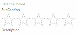
Caption, Subcaption and Description – specify texts for the captions of RadRating:
this.radRating1.Caption = "Rate the movie";
this.radRating1.Description = "Description";
this.radRating1.Subcaption = "SubCaption";
Me.RadRating1.Caption = "Rate the movie"
Me.RadRating1.Description = "Description"
Me.RadRating1.Subcaption = "SubCaption"

-
SelectionMode - determines how precisely the user will select the value:
RatingSelectionMode.Precise
this.radRating1.SelectionMode = Telerik.WinControls.UI.RatingSelectionMode.Precise;
Me.RadRating1.SelectionMode = Telerik.WinControls.UI.RatingSelectionMode.Precise
RatingSelectionMode.HalfItem
this.radRating1.SelectionMode = Telerik.WinControls.UI.RatingSelectionMode.HalfItem;
Me.RadRating1.SelectionMode = Telerik.WinControls.UI.RatingSelectionMode.HalfItem
RatingSelectionMode.FullItem
this.radRating1.SelectionMode = Telerik.WinControls.UI.RatingSelectionMode.FullItem;
Me.RadRating1.SelectionMode = Telerik.WinControls.UI.RatingSelectionMode.FullItem
| SelectionMode=FullItem |
SelectionMode=HalfItem |
SelectionMode=Precise |
 |
 |
 |
-
Minimum and Maximum – specifies the range of RadRating:
Specify minimum/maximum
this.radRating1.Minimum = 10;
this.radRating1.Maximum = 40;
Me.RadRating1.Minimum = 10
Me.RadRating1.Maximum = 40


-
Value - sets or gets the value of the RadRating:
this.radRating1.Value = 43.4;
Me.RadRating1.Value = 43.4