Element Types
RadTaskDialog supports different element types that can be added to a RadTaskDialogPage which represents the main container that hosts the elements.
Before proceeding further with this article, it is recommended to get familiar with the internal structure of RadTaskDialog and how the elements are being organized: Task Dialog's Structure
You can find listed below the most common elements that are usually inserted to a RadTaskDialog:
RadTaskDialogPage
RadTaskDialogPage contains the main UI elements and defines the layout logic. Once you have built the page's content, the RadTaskDialog.ShowDialog method expects a page as an input parameter.
RadTaskDialogPage offers the following events:
- Created - occurs when the page is added to the dialog and is about to become visible to the user.
-
Destroyed - occurs when the page is about to be unbound from the task dialog.
-
HelpRequest - occurs when the user presses
F1or clicks the “Help” standard button.
RadTaskDialogProgressBar
RadTaskDialogProgressBar displays progress information to the user.
The State property determines the mode - undetermined or determine which controls internally what element will be used - a RadProgressBarElement or a RadWaitingBarElement.
The State property is of type RadTaskDialogProgressBarState which offers the following options:
- Normal - shows a progress bar with bar which is green.
- Paused - shows a progress bar with bar which is yellow.
- Error - shows a progress bar with bar which is red.
- Marquee - shows a waiting bar in its default waiting bar style.
- MarqueePaused - shows a waiting bar which initially looks like an empty progress bar, but also can be paused at some point.
- None - neither progress bar, nor waiting bar is shown.
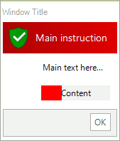
Adding a RadTaskDialogProgressBar
            RadTaskDialogPage page = new RadTaskDialogPage();
            page.Caption = "Window Title";
            page.Heading = "Main instruction";
            page.Text = "Main text here...";
            page.Icon = RadTaskDialogIcon.ShieldErrorRedBar;
            page.Icon.SvgImage = RadTaskDialogIcon.GetSvgImage(RadTaskDialogIconImage.FlatShieldSuccess, new Size(32, 32));

            RadTaskDialogProgressBar taskProgressBar = new RadTaskDialogProgressBar();
            taskProgressBar.Value = 30;
            taskProgressBar.State = RadTaskDialogProgressBarState.Error;
            page.ProgressBar = taskProgressBar;
            page.ProgressBar.Text = "Content";

            RadTaskDialog.ShowDialog(page);
        Dim page As RadTaskDialogPage = New RadTaskDialogPage()
        page.Caption = "Window Title"
        page.Heading = "Main instruction"
        page.Text = "Main text here..."
        page.Icon = RadTaskDialogIcon.ShieldErrorRedBar
        page.Icon.SvgImage = RadTaskDialogIcon.GetSvgImage(RadTaskDialogIconImage.FlatShieldSuccess, New Size(32, 32))
        Dim taskProgressBar As RadTaskDialogProgressBar = New RadTaskDialogProgressBar()
        taskProgressBar.Value = 30
        taskProgressBar.State = RadTaskDialogProgressBarState.[Error]
        page.ProgressBar = taskProgressBar
        page.ProgressBar.Text = "Content"
        RadTaskDialog.ShowDialog(page)
RadTaskDialogVerificationCheckBox
RadTaskDialogVerificationCheckBox represents a check box shown in the collapsible command area of a RadTaskDialog. Appropriate for simple choices such as "Do not show this dialog again".
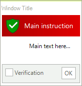
Adding a RadTaskDialogVerificationCheckBox
            RadTaskDialogPage page = new RadTaskDialogPage();
            page.Caption = "Window Title";
            page.Heading = "Main instruction";
            page.Text = "Main text here...";
            page.Icon = RadTaskDialogIcon.ShieldErrorRedBar;
            page.Icon.SvgImage = RadTaskDialogIcon.GetSvgImage(RadTaskDialogIconImage.FlatShieldSuccess, new Size(32, 32));

            RadTaskDialogVerificationCheckBox verificationCheck = new RadTaskDialogVerificationCheckBox();
            verificationCheck.Text = "Verification";
            verificationCheck.CheckStateChanged += new EventHandler(delegate(object sender, EventArgs e) { RadMessageBox.Show(verificationCheck.CheckState.ToString()); });
            page.Verification = verificationCheck;
            RadTaskDialog.ShowDialog(page);
           Dim page As RadTaskDialogPage = New RadTaskDialogPage()
        page.Caption = "Window Title"
        page.Heading = "Main instruction"
        page.Text = "Main text here..."
        page.Icon = RadTaskDialogIcon.ShieldErrorRedBar
        page.Icon.SvgImage = RadTaskDialogIcon.GetSvgImage(RadTaskDialogIconImage.FlatShieldSuccess, New Size(32, 32))
        Dim verificationCheck As RadTaskDialogVerificationCheckBox = New RadTaskDialogVerificationCheckBox()
        verificationCheck.Text = "Verification"
        AddHandler verificationCheck.CheckStateChanged, New EventHandler(Function(sender As Object, e As EventArgs)
                                                                             RadMessageBox.Show(verificationCheck.CheckState.ToString())
                                                                         End Function)
        page.Verification = verificationCheck
        RadTaskDialog.ShowDialog(page)
RadTaskDialogCommandLinkButton
RadTaskDialogCommandLinkButton represents a flat button positioned in the content area of the page.
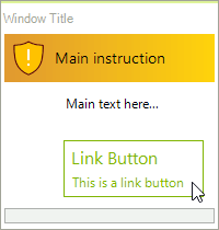
Adding a RadTaskDialogCommandLinkButton
               RadTaskDialogPage page = new RadTaskDialogPage();
            page.Caption = "Window Title";
            page.Heading = "Main instruction";
            page.Text = "Main text here...";
            page.Icon = RadTaskDialogIcon.ShieldWarningYellowBar;
            page.Icon.SvgImage = RadTaskDialogIcon.GetSvgImage(RadTaskDialogIconImage.FlatShieldWarning, new Size(32, 32));

            RadTaskDialogCommandLinkButton linkButton = new RadTaskDialogCommandLinkButton();
            linkButton.Text = "Link Button";
            linkButton.DescriptionText = "This is a link button";
            page.ContentArea.Buttons.Add(linkButton);
            RadTaskDialog.ShowDialog(page);
        Dim page As RadTaskDialogPage = New RadTaskDialogPage()
        page.Caption = "Window Title"
        page.Heading = "Main instruction"
        page.Text = "Main text here..."
        page.Icon = RadTaskDialogIcon.ShieldWarningYellowBar
        page.Icon.SvgImage = RadTaskDialogIcon.GetSvgImage(RadTaskDialogIconImage.FlatShieldWarning, New Size(32, 32))
        Dim linkButton As RadTaskDialogCommandLinkButton = New RadTaskDialogCommandLinkButton()
        linkButton.Text = "Link Button"
        linkButton.DescriptionText = "This is a link button"
        page.ContentArea.Buttons.Add(linkButton)
        RadTaskDialog.ShowDialog(page)
RadTaskDialogRadioButton
Adding multiple RadTaskDialogRadioButtons allows users to choose from different options.
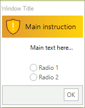
Adding a RadTaskDialogRadioButton
            RadTaskDialogPage page = new RadTaskDialogPage();
            page.Caption = "Window Title";
            page.Heading = "Main instruction";
            page.Text = "Main text here...";
            page.Icon = RadTaskDialogIcon.ShieldWarningYellowBar;
            page.Icon.SvgImage = RadTaskDialogIcon.GetSvgImage(RadTaskDialogIconImage.FlatShieldWarning, new Size(32, 32));

            page.RadioButtons = new RadItemOwnerGenericCollection<RadTaskDialogRadioButton>()
            {
                new RadRadioButtonElement() { Text = "Radio 1" },
                new RadRadioButtonElement() { Text = "Radio 2" }
            };

            RadTaskDialog.ShowDialog(page);
         Dim page As RadTaskDialogPage = New RadTaskDialogPage()
        page.Caption = "Window Title"
        page.Heading = "Main instruction"
        page.Text = "Main text here..."
        page.Icon = RadTaskDialogIcon.ShieldWarningYellowBar
        page.Icon.SvgImage = RadTaskDialogIcon.GetSvgImage(RadTaskDialogIconImage.FlatShieldWarning, New Size(32, 32))
        page.RadioButtons = New RadItemOwnerGenericCollection(Of RadTaskDialogRadioButton)() From {
            New RadRadioButtonElement() With {
                .Text = "Radio 1"
            },
            New RadRadioButtonElement() With {
                .Text = "Radio 2"
            }
        }
        RadTaskDialog.ShowDialog(page)
RadTaskDialogButton
RadTaskDialogButton is shown in the command area of the page.
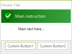
Adding a RadTaskDialogButton
            RadTaskDialogPage page = new RadTaskDialogPage();
            page.Caption = "Window Title";
            page.Heading = "Main instruction";
            page.Text = "Main text here...";
            page.Icon = RadTaskDialogIcon.ShieldSuccessGreenBar ;
            page.Icon.SvgImage = RadTaskDialogIcon.GetSvgImage(RadTaskDialogIconImage.GradientShieldSuccess , new Size(32, 32));

            RadTaskDialogButton button1 = new RadTaskDialogButton();
            button1.Text = "Custom Button1";
            button1.Click += new EventHandler(delegate(object sender, EventArgs e) { RadMessageBox.Show("Clicked Button1!"); });
            page.DefaultButton = button1;
            page.CommandAreaButtons.Add(button1);
            RadTaskDialogButton button2 = new RadTaskDialogButton();
            button2.Text = "Custom Button2";
            button2.Click += new EventHandler(delegate(object sender, EventArgs e) { RadMessageBox.Show("Clicked Button2!"); });
            page.CommandAreaButtons.Add(button2);

            RadTaskDialog.ShowDialog(page);
           Dim page As RadTaskDialogPage = New RadTaskDialogPage()
        page.Caption = "Window Title"
        page.Heading = "Main instruction"
        page.Text = "Main text here..."
        page.Icon = RadTaskDialogIcon.ShieldSuccessGreenBar
        page.Icon.SvgImage = RadTaskDialogIcon.GetSvgImage(RadTaskDialogIconImage.GradientShieldSuccess, New Size(32, 32))
        Dim button1 As RadTaskDialogButton = New RadTaskDialogButton()
        button1.Text = "Custom Button1"
        AddHandler button1.Click, New EventHandler(Function(sender As Object, e As EventArgs)
                                                       RadMessageBox.Show("Clicked Button1!")
                                                   End Function)
        page.DefaultButton = button1
        page.CommandAreaButtons.Add(button1)
        Dim button2 As RadTaskDialogButton = New RadTaskDialogButton()
        button2.Text = "Custom Button2"
        AddHandler button2.Click, New EventHandler(Function(sender As Object, e As EventArgs)
                                                       RadMessageBox.Show("Clicked Button2!")
                                                   End Function)
        page.CommandAreaButtons.Add(button2)
        RadTaskDialog.ShowDialog(page)