Design Time
To start using RadPanorama just drag it from the toolbox and drop it at the form.
Smart Tag
Select RadPanorama and click the small arrow on the top right position in order to open the Smart Tag. The Smart Tag for RadPanorama lets you quickly access common tasks involved with building RadPanorama elements and customizing appearance through themes.
Figure 1: Smart Tag
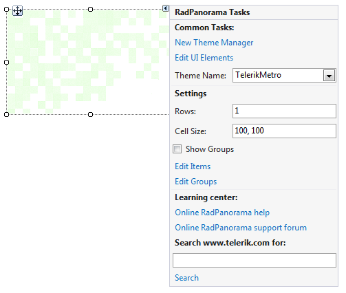
New Theme Manager: adds a new RadThemeManager component to the form.
Edit UI Elements: allows setting properties at multiple levels of the class hierarchy.
Theme Name – allows you to set the theme for the control.
Rows – define the number of rows that the control will have.
Cell Size – define the size of each cell.
Show Groups – shows the groups in the control (if any).
Edit Items – opens the RadItem Collection Editor, which allows you to add RadTileElements and RadLiveTileElements.
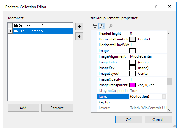
Edit Groups – opens the RadItem Collection Editor, which allows you to add groups to the control.
Learning Center: Navigate to the Telerik help, code library projects or support forum.
Search: Search the Telerik site for a given string.
Adding Tiles
In order to add or remove tiles either click on the “Edit items” link in the Smart Tag or edit the Items collection in the Properties window in Visual Studio. This will open the RadItem Collection Editor. You can add two types of elements to the Items collection: RadTileElement and RadLiveTileElement.

Adding Groups
To add or remove groups click on the “Edit Groups” link in the Smart Tag or edit the Groups collection in the Properties window in Visual Studio. To add tiles to a group, edit the Items collection of the group itself. Switching between grouped or ungrouped view, is achieved by checking or unchecking the ShowGroups check box in the Smart Tag or setting the ShowGroups property in the Properties window in Visual Studio.
Customizing Tiles
Each RadTileElement's properties can be customized via the Properties window of Visual Studio, or via the Smart Tag. The available properties for customization in the Smart Tag are:
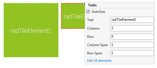
Text – sets the text of the tile.
Column – defines in which column the item resides in.
Row – defines in which row the item resides in.
Column Span – defines the item's length by specifying how many columns it should take.
Row Span – defines the item's height by specifying how many rows it should take.
Edit UI elements – allows you to edit the element’s properties.
Customizing Live Tiles
Each RadLiveTileElement's properties can be customized via the Properties window of Visual Studio, or via the Smart Tag. The available properties for customization in the Smart Tag are:
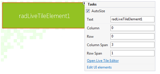
Text – sets the text of the tile.
Column – defines in which column the item resides in.
Row – defines in which row the item resides in.
Column Span – defines the item length by specifying how many columns it should take.
Row Span – defines the item height by specifying how many rows it should take.
Open Live Tile Editor – opens the Live Tile Editor, where you can customize the tile.
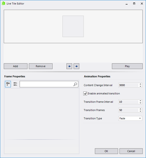
- Edit UI elements – allows you to edit the element’s properties.