Design Time
To start using RadOfficeNavigationBar, just drag it from the toolbox and drop it onto the form.
Smart Tag
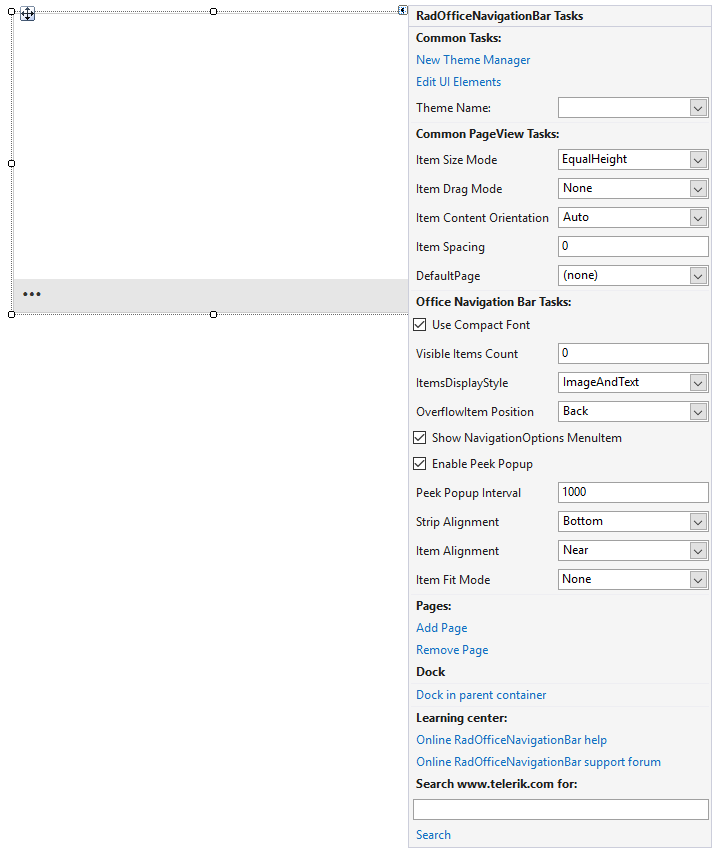
Select RadOfficeNavigationBar and click the small arrow on the top right position in order to open the Smart Tag.

Common Tasks
New Theme Manager: Adds a new RadThemeManager component to the form.
Edit UI elements: Opens a dialog that displays the Element Hierarchy Editor. This editor lets you browse all the elements in the control.
Theme Name: Select a theme name from the drop-down list of themes available for that control. Selecting a theme allows you to change all aspects of the control visual style at one time.
Common PageView Tasks
Item Size Mode: Determines whether the items should have equal size. The supported modes are EqualHeight, EqualWidth, EqualSize and Individual.
Item Drag Mode: Determines the drag mode of the items. The supported modes are Preview and Immediate.
Item Content Orientation: Determines the orientation of the item content (image, text, and buttons' panel). The supported orientations are Auto, Horizontal, Horizontal180, Vertical90 and Vertical270.
Item Spacing: Determines the spacing between the items in pixels.
Default Page: Specifies the default page in RadOfficeNavigationBar.
Adding Pages
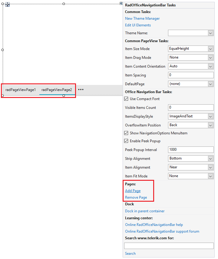
To add/remove a page, we can click on the Add Page/Remove Page buttons.
Add Page: Clicking on this link will add a new page to RadOfficeNavigationBar.Pages collection.
Remove Page: Clicking on this will remove the currently selected page in RadOfficeNavigationBar.

Customize a Page
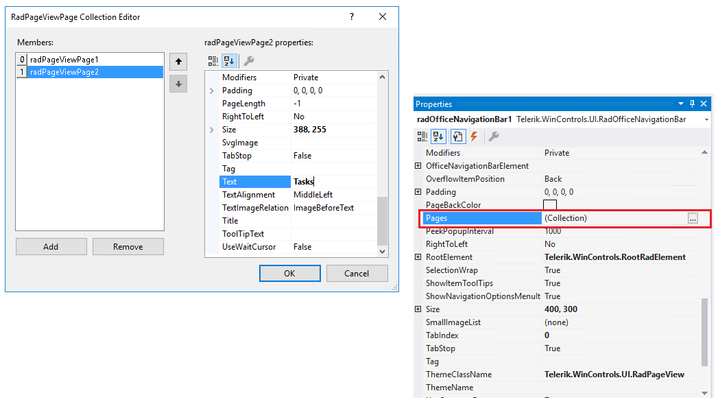
From the Properties window in Visual Studio, we can navigate to the Pages collection property. Then clicking on the button on its right side, we can further customize the elements inside the collection.

Customize RadOfficeNavigationBar
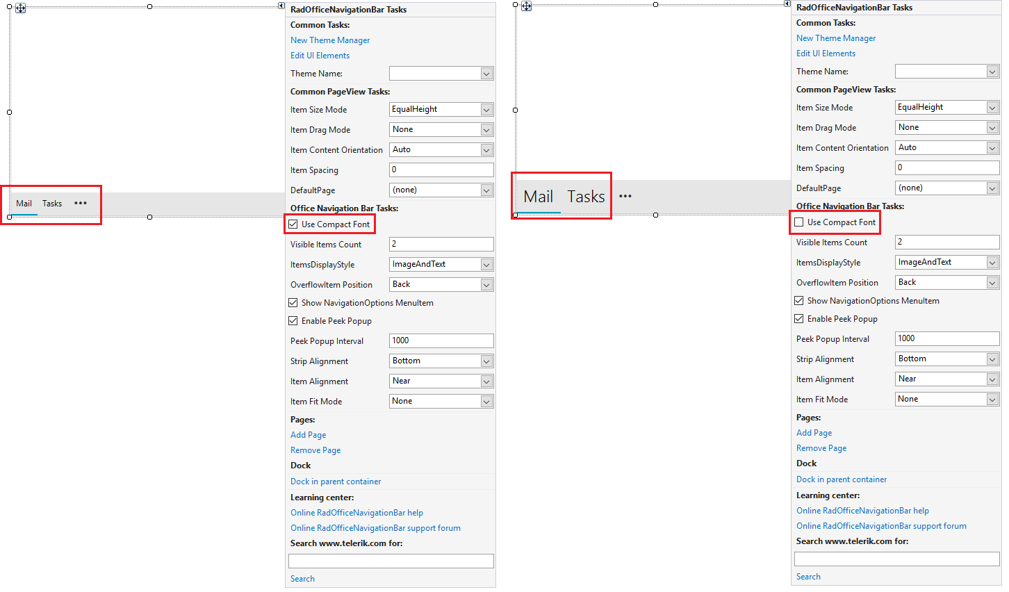
Using the settings inside the Office Navigation Bar Tasks section in the smart tag, we can further customize the control.
- Use Compact Font: Specifies whether to use compact or large font for the items in RadOfficeNavigationBar.

Visible Items Count: Specifies items that are visible on the strip.
ItemsDisplayStyle: Determines whether to display text or image or both for the items inside the strip.
OverflowItem Position: Specifies the position of the overflow button.
Show NavigationOptions MenuItem: Indicating whether to show the navigation options menu item when the context menu is opened.
Enable Peek Popup: Disable or Enable the Peek Popup window.
Peek Popup Interval: Set the interval in which the Peek window will show after a page item is hovered.
Strip Alignment: Specifies the position of the strip.
Item Alignment: Determines the position of the strip items.
Item Fit Mode: Determines the fit mode which will be applied when measuring child items.