Design Time
RadDataLayout control hosts a RadLayoutControl allowing the user to build complex layouts at design-time as well as at run-time. Information on how RadLayoutControl can be customized in the designer is available here: RadLayoutControl Design Time
Smart Tag
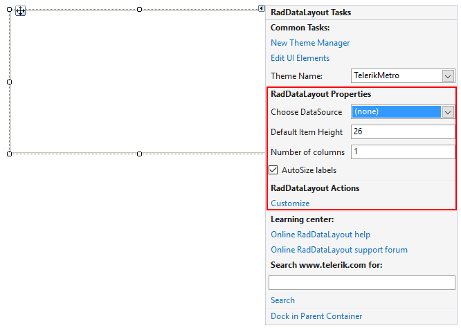
The smart tag allows you to open the layout editor, change the theme and open the on-line resources. You can dock the control in its parent container as well. The following section describes the layout editor.
Figure 1: Smart Tag.

Design Time Data Binding
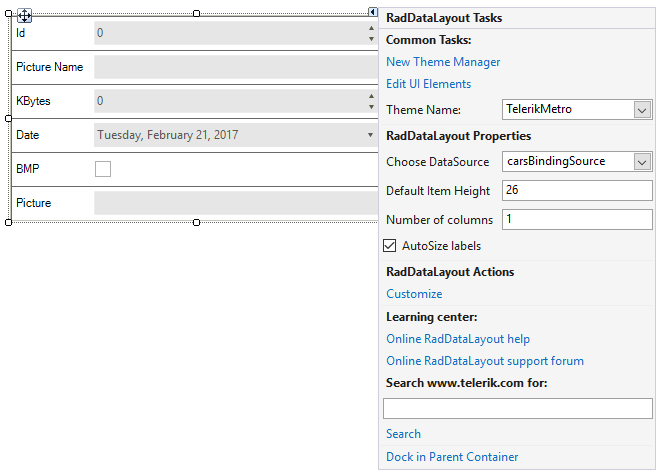
For the purpose of this example we will bind our data layout control to the Cars table of the Northwind database. After specifying the data source, the control will build the editors according to the properties of the data bound object.
Figure 2: Data Binding.

Layout Editor
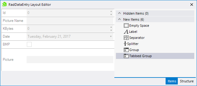
This editor allows us to rearrange the generated editors. Additional elements can be dragged from the Items tab in the layout panel. You can hide existing items with the default context menu as well. The Structure tab shows the current layout structure and allows easier item selection. You can start drag and drop operation from this tab to the layout panel.
Figure 3: The design time Layout Editor.

Selection Glyph
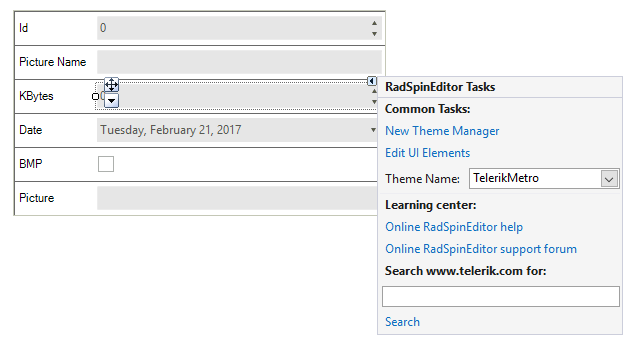
The selection glyph is an arrow that is shown when a control in the layout panel is selected. It allows you to select the underlying host item and change its properties at design time.
Figure 4: Selection Glyph.
