TableCell
TableCell class represents a single cell in a Table. Cells are added to a TableRow instance in the rows collection of a table. The main purpose of the cell is to contain, organize and layout tabular data.
Inserting a TableCell
In order to add a cell to a Table, you should add it in the TableCellCollection of a TableRow.
The code snippet in Example 1 shows how to create a table with a single row and add a cell in the first row.
[C#] Example 1: Create TableCell
Table table = new Table();
TableRow firstRow = table.Rows.AddTableRow();
TableCell firstCell = firstRow.Cells.AddTableCell();
Adding Cell Content
Using TableCell's Blocks property you can easily add one or several IBlockElement instances to the cell.
Example 2 shows how to create a cell with a single Block in it.
[C#] Example 2: Add content to TableCell
Block block = firstCell.Blocks.AddBlock();
block.InsertText("Text in the cell.");
Modifying a TableCell
You can easily change the cell's presentation by using the following properties:
RowSpan: Defines the number or rows that the TableCell instance should occupy.
ColumnSpan: Defines the number of columns that the TableCell instance should occupy.
Padding: Specifies the distances between the cells borders inner contour and the cell content. If the value is null, the cell will use the padding from the table's DefaultCellProperties.
Borders: Specifies the borders of the cells. If the value is null the cell uses the value from table's DefaultCellProperties.
Background: Specifies the background of the cell. If null, the cell uses the background from table's DefaultCellProperties.
PreferredWidth: Specifies the preferred width of the cell. The final width of the cell may be bigger of the set value in case when another cell from the same column requires bigger PreferredWidth.
VerticalAlignment: Specifies the vertical alignment of the content inside the cell.
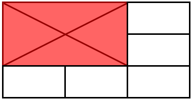
Example 3 demonstrates how to set locally the cell properties to a specific cell. This helps achieve different appearance for this cell by changing its borders and background. Additionally, the cell will span onto two rows and two columns.
[C#] Example 1: Change TableCell appearance
firstCell.RowSpan = 2;
firstCell.ColumnSpan = 2;
firstCell.Borders = new TableCellBorders(new Border(1, new RgbColor(150, 0, 0)));
firstCell.Background = new RgbColor(255, 100, 100);
The result from Example 3 is illustrated on Figure 1.
Figure 1: TableCell
