Card Building Blocks
The Card component supports a variety of template-based components used as building blocks. All building blocks can be rendered as root level elements of the Card and therefore can be used as desired with no restriction in their place of declaration or requirement for the Card structure. The elements can also be nested inside each other.
CardHeader- renders header area, useful for title, subtitle, etc. Has a separator after itself.CardBody- renders the body of the card with added paddings.CardFooter- renders footer area separated from the content through a separator.CardImage- renders card image to fill the size of the card. Read more in the Card Image article.CardActions- renders dedicated area for actions. Read more in the Actions article.CardSeparator- renders a horizontal line. Read more in the Card Separator article.CardTitle- renders div title with default theme styling.CardSubTitle- renders div title with default theme styling as sub title.
CardHeader
Use the CardHeader tag to render header area of the Card.
Render CardHeader area. The result from the snippet below.
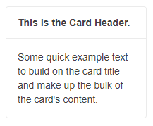
@* Card Header *@

<TelerikCard Width="200px">

    <CardHeader>
        <strong>This is the Card Header.</strong>
    </CardHeader>

    <CardBody>
        <p>Some quick example text to build on the card title and make up the bulk of the card content.</p>
    </CardBody>
</TelerikCard>
CardBody
Use the CardBody tag to render the body of the Card.
Render CardBody area. The result from the snippet below.
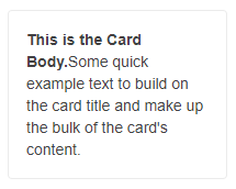
@* Card Body *@

<TelerikCard Width="200px">

    <CardBody>
        <p><strong>This is the Card Body.</strong> Some quick example text to build on the card title and make up the bulk of the card's content.</p>
    </CardBody>

</TelerikCard>
CardFooter
Use the CardFooter tag to render the footer area of the Card.
Render CardFooter area. The result from the snippet below.
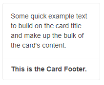
@* Card Footer *@

<TelerikCard Width="200px">
    <CardBody>
        <p> Some quick example text to build on the card title and make up the bulk of the card content.</p>
    </CardBody>

    <CardFooter>
        <strong>This is the Card Footer.</strong>
    </CardFooter>

</TelerikCard>
CardImage
Use the CardImage tag to render the image section of the Card. The image will fill the size of the card unless you set any other Width and Height values.
Use CardImage in the Card component. The result from the snippet below.
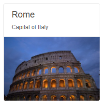
@*Card Image*@

<TelerikCard Width="200px">
    <CardHeader>
        <CardTitle>Rome</CardTitle>
        <CardSubTitle>Capital of Italy</CardSubTitle>
    </CardHeader>

    <CardImage Src="https://docs.telerik.com/blazor-ui/components/card/images/rome.jpg"></CardImage>

</TelerikCard>
CardActions
Use the CardActions tag to render the actions area of the Card. You could place any action buttons inside and style them with the predefined orientation and layout of the buttons.
Use CardActions in the Card component. The result from the snippet below.
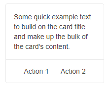
@* Card Actions *@

<TelerikCard Width="200px">
    <CardBody>
        <p> Some quick example text to build on the card title and make up the bulk of the card content.</p>
    </CardBody>
    <CardSeparator></CardSeparator>

    <CardActions Layout="CardActionsLayout.Center">
        <TelerikButton Class="k-flat">Action 1</TelerikButton>
        <TelerikButton Class="k-flat">Action 2</TelerikButton>
    </CardActions>

</TelerikCard>
CardSeparator
Use the CardActions tag to render the actions area of the Card. An example of CardSeparator used between Card elements or nested inside an element.
Use CardSeparator in the Card component. The result from the snippet below.
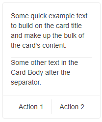
@* Card Separator *@

<TelerikCard Width="200px">
    <CardBody>
        <p> Some quick example text to build on the card title and make up the bulk of the card content.</p>

        <CardSeparator></CardSeparator>

        <p>Some other text in the Card Body after the separator.</p>
    </CardBody>

    <CardSeparator></CardSeparator>

    <CardActions Layout="CardActionsLayout.Center">
        <TelerikButton Class="k-flat">Action 1</TelerikButton>

        <CardSeparator Orientation="CardOrientation.Vertical"></CardSeparator>

        <TelerikButton Class="k-flat">Action 2</TelerikButton>
    </CardActions>
</TelerikCard>
CardTitle
Use the CardTitle tag to render a title (heading). Although the header area is suitable for placing title, it is not required and you can use the CardTitle as desired. The below sample demonstrates implementation of a title in three different sections.
Use CardTitle in the Card component. The result from the snippet below.
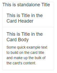
@* Card Title *@

<TelerikCard Width="200px">

    <CardTitle>This is standalone Title </CardTitle>

    <CardHeader>
        <CardTitle>This is Title in the Card Header</CardTitle>
    </CardHeader>
    <CardBody>
        <CardTitle>This is Title in the Card Body</CardTitle>
        <p> Some quick example text to build on the card title and make up the bulk of the card content.</p>
    </CardBody>
</TelerikCard>
CardSubTitle
Use the CardSubTitle tag to render sub title. Although the header area is suitable for placing title and sub title, it is not required and you can use the CardSubTitle as desired. It can also be used along with the CardTitle or as a standalone element. The below sample demonstrates both approaches.
Use CardSubTitle in the Card component. The result from the snippet below.
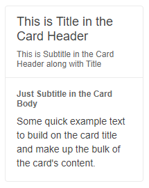
@* Card Subtitle *@

<TelerikCard Width="200px">
    <CardHeader>
        <CardTitle>This is Title in the Card Header</CardTitle>

        <CardSubTitle>This is Subtitle in the Card Header along with Title</CardSubTitle>

    </CardHeader>
    <CardBody>

        <CardSubTitle><strong>Just Subtitle in the Card Body</strong></CardSubTitle>

        <p> Some quick example text to build on the card title and make up the bulk of the card content.</p>
    </CardBody>
</TelerikCard>