Card Actions
Every Blazor Card can have a dedicated area for action buttons related to the content. The content of these action items, as well as their overall layout and orientation, is completely customizable through the available configuration options.
Telerik Button components with the k-flat class are designed to fit in the card design as actions, so you can use them as your first choice of action components. You can find examples with them below.
In this article:
Features
The Card provides the following features:
Class-string- the CSS class that will be rendered on the main wrapping container of the action buttons.Orientation-CardOrientation- defines the orientation of the Action buttons.Layout-CardActionsLayout- defines the layout of the Action buttons.
Orientation
You can define the orientation of the buttons through the Orientation parameter of the CardActions. It takes a member of the Telerik.Blazor.CardOrientation enum:
-
Horizontal- the default Vertical
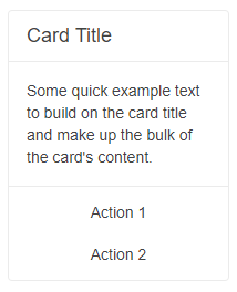
Change the orientation of the action buttons. The result from the snippet below.
@* Change the orientation of the action buttons *@

<TelerikCard Width="200px">
    <CardHeader>
        <CardTitle>Card Title</CardTitle>
    </CardHeader>
    <CardBody>
        <p>Some quick example text to build on the card title and make up the bulk of the card content.</p>
    </CardBody>
    <CardSeparator></CardSeparator>

    <CardActions Orientation="@CardOrientation.Vertical">
        <TelerikButton Class="k-flat">Action 1</TelerikButton>
        <TelerikButton Class="k-flat">Action 2</TelerikButton>
    </CardActions>

</TelerikCard>
Layout
You can set the layout of the action buttons through the Layout parameter of the CardActions. We support 4 types of layout - to the start, center, end part of the actions container, or stretched buttons that will fill the whole container with equal size.
The Layout parameter takes a member of the Telerik.Blazor.CardActionsLayout enum:
-
Center- the default EndStartStretch
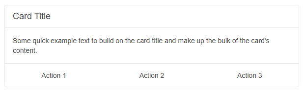
Set stretched layout for the action buttons. The result from the snippet below.
@* Change the layout of the action buttons *@

<TelerikCard Width="600px">
    <CardHeader>
        <CardTitle>Card Title</CardTitle>
    </CardHeader>
    <CardBody>
        <p>Some quick example text to build on the card title and make up the bulk of the card content.</p>
    </CardBody>
    <CardSeparator></CardSeparator>

    <CardActions Layout="@CardActionsLayout.Stretch">
        <TelerikButton Class="k-flat">Action 1</TelerikButton>
        <TelerikButton Class="k-flat">Action 2</TelerikButton>
        <TelerikButton Class="k-flat">Action 3</TelerikButton>
    </CardActions>

</TelerikCard>
Icon buttons in the CardActions area will expand horizontally and vertically, if the
LayoutisStretchor if theOrientationisVertical. If this is not desired, check this knowledge base article: CardAction Icon Buttons Are Too Big.