Card Separator
The CardSeparator element of the Card for Blazor distinguishes separate sections or content in the Card. You can use it as a standalone building block, or inside any of the other Card elements. When used as nested component, the CardSeparator will be rendered in accordance to any margin applied to the content.
The CardHeader comes with a built-in separator at the bottom of the section and the CardFooter comes with a built-in separator at the top of the section. Therefore, you don't need to explicitly insert a CardSeparator after the CardHeader and before the CardFooter elements.
In this article:
Standalone Card Separator
Use the CardSeparator to distinguish CardBody and CardActions sections.
In the example below no separator is used after the CardHeader, the horizontal line is still present due to the built-in CardHeader feature.
Use the Card Separator as a standalone building block. The result from the snippet below.
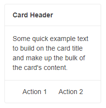
@*CardSeparator as a standalone building block*@

<TelerikCard Width="200px">
    <CardHeader>
        <strong>Card Header</strong>
    </CardHeader>
    <CardBody>
        <p> Some quick example text to build on the card title and make up the bulk of the card content.</p>
    </CardBody>

   <CardSeparator></CardSeparator>

    <CardActions Layout="CardActionsLayout.Center">
        <TelerikButton Class="k-flat">Action 1</TelerikButton>
        <TelerikButton Class="k-flat">Action 2</TelerikButton>
    </CardActions>
</TelerikCard>
Nested Card Separator
Use the CardSeparator to distinguish two separate sections in the CardBody. The result from the snippet below.
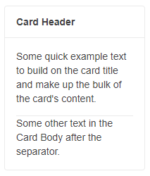
@*CardSeparator as a nested building block*@

<TelerikCard Width="200px">
    <CardHeader>
        <strong>Card Header</strong>
    </CardHeader>
    <CardBody>
        <p> Some quick example text to build on the card title and make up the bulk of the card content.</p>

        <CardSeparator></CardSeparator>

        <p>Some other text in the Card Body after the separator.</p>
    </CardBody>
</TelerikCard>
Card Separator Orientation
You can change the CardSeparator orientation through its Orientation parameter.
Use CardSeparator with vertical orientation to separate the two action buttons. The result from the snippet below.
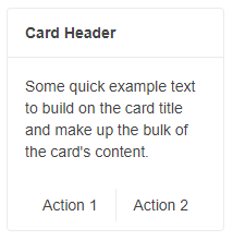
@*CardSeparator with vertical orientation*@

<TelerikCard Width="200px">
    <CardHeader>
        <strong>Card Header</strong>
    </CardHeader>
    <CardBody>
        <p> Some quick example text to build on the card title and make up the bulk of the card content.</p>
    </CardBody>
    <CardActions Layout="CardActionsLayout.Center">
        <TelerikButton Class="k-flat">Action 1</TelerikButton>

        <CardSeparator Orientation="CardOrientation.Vertical"></CardSeparator>

        <TelerikButton Class="k-flat">Action 2</TelerikButton>
    </CardActions>
</TelerikCard>
Features
The CardSeparator provides the following features:
Class-string- the CSS class that will be rendered on the main wrapping element of theCardSeparator.Orientation-CardOrientation- defines the orientation of theCardSeparator. Takes a member of theTelerik.Blazor.CardOrientationenum (HorizontalorVertical).