Using a Telerik UI for ASP.NET Core Project Template in VS for Windows
This tutorial shows how to create an ASP.NET Core web app that uses Telerik UI for ASP.NET Core components.
You will create a project from a template and configure it for Telerik UI by using the Visual Studio extensions. This method allows you to download the components and then create a pre-configured application that has all necessary scripts, styles, and editor templates so that you can immediately start adding the Telerik UI components.
If you need to add Telerik UI controls to an existing project, see the First Steps with VS for Windows tutorial.
You'll learn how to:
- Download and install the Telerik UI extensions.
- Create an ASP.NET Core MVC (Model-View-Controller) project.
- Bind data to Telerik UI components like the Grid.
- Enhance the project with additional components like the DatePicker.
- Use the Telerik UI Themes.
- Add your license file.
Prerequisites
-
For newer .NET Core versions, a recent matching Visual Studio might be required.
Windows 10 or higher
Telerik account—if you don't have an account yet, you can create one for free.
Installing the Telerik UI Extensions
Close any running Visual Studio instances.
-
Go to the Progress Telerik UI for ASP.NET Core Extension page and click Download.
Locate and double-click the
TelerikUI.ASP.NET.Core.VSPackage.vsixfile to install the extensions.
Once you install the Telerik UI Extensions, you can open Visual Studio and start using the automated Create New Telerik Project wizard.
Creating the Project
In Visual Studio, select Create a new project.
-
Filter by project type and select Telerik from the drop-down.
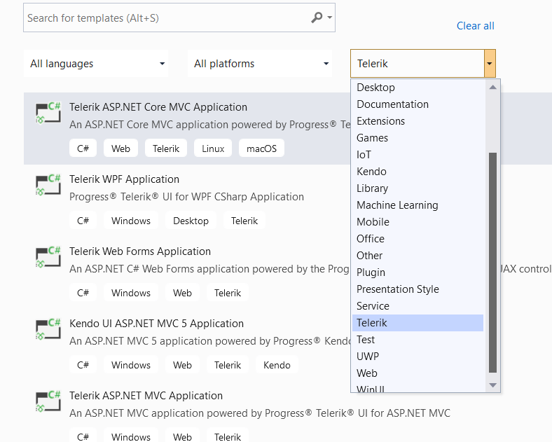
Select Telerik ASP.NET Core MVC Application, and then select Next.
-
Name the project
TelerikAspNetCoreAppand select Create.Using this name guarantees that the
namespacefrom the code snippets in this tutorial will match your project.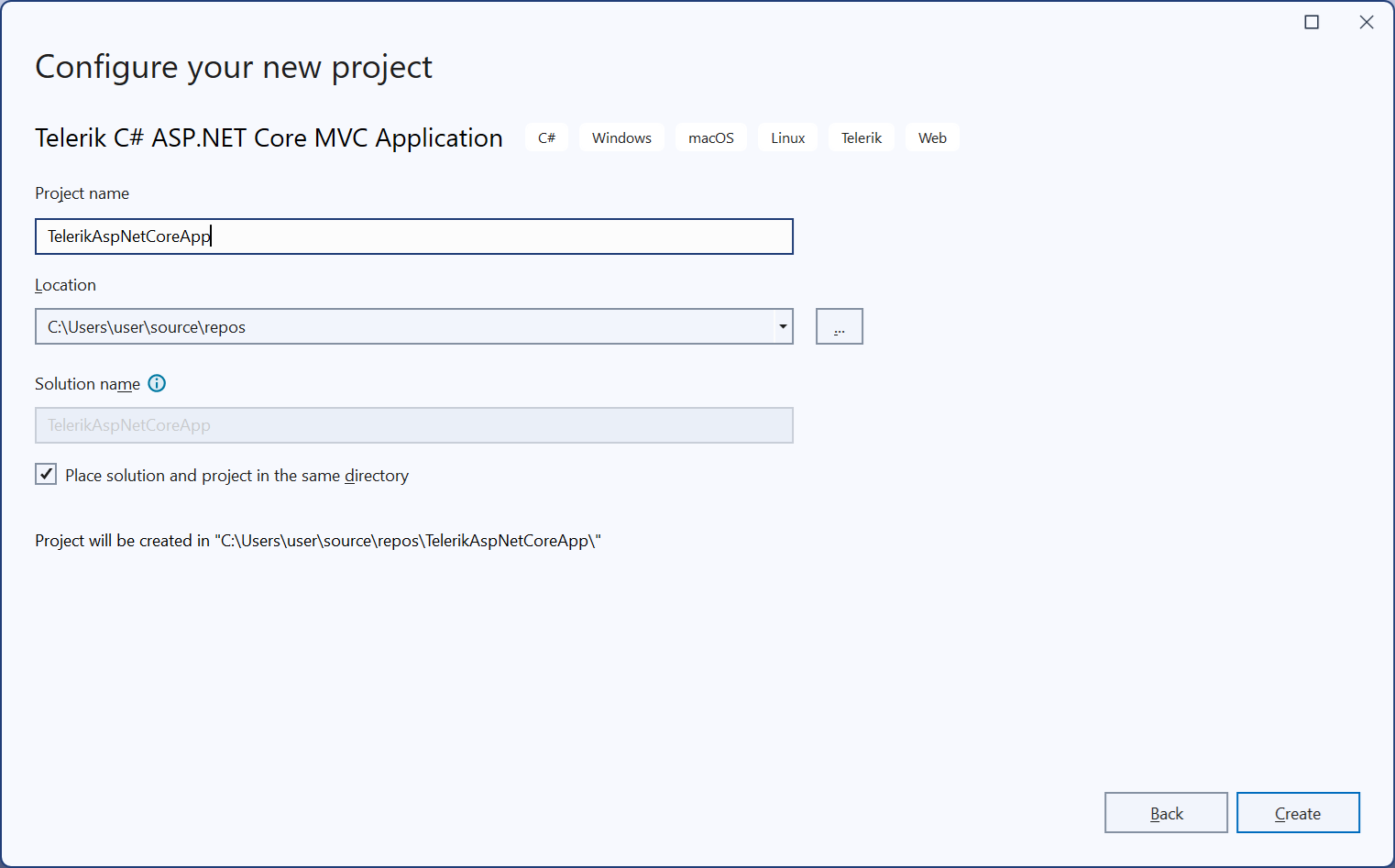
-
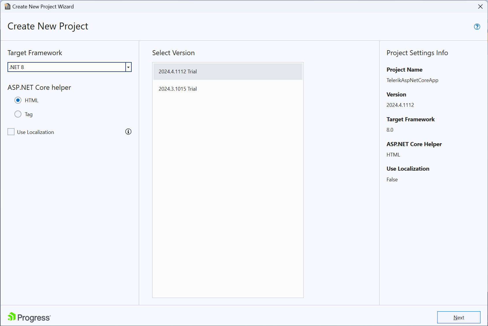
From the drop-down box, select the latest ASP.NET Core version for .NET target framework.
Telerik UI supports all newer ASP.NET Core versions.
-
Select HTML or Tag Helpers.
Telerik UI for ASP.NET Core is a set of server-side wrappers (HTML and Tag Helpers) that allow you to use the Kendo UI widgets in .NET Core. When you select the helper type in the Create New Project Wizard, the wizard will configure the project for the selected helpers.
In Razor files, Tag Helpers come with predefined strongly-typed attributes that enable server-side code to participate in the creation and rendering of HTML elements. The resulting markup is cleaner and easier to read than with traditional HTML Helpers, which are invoked as methods that are mixed with HTML inside your Razor views.
-
From the Select Version list, select the latest Telerik UI version, and then select Next.
- If you use the Telerik UI extensions for the first time, you will see a login window. Enter the credentials for your Telerik account to download the controls.
- If you haven't purchased a license, download the trial version of the Telerik UI controls.
-
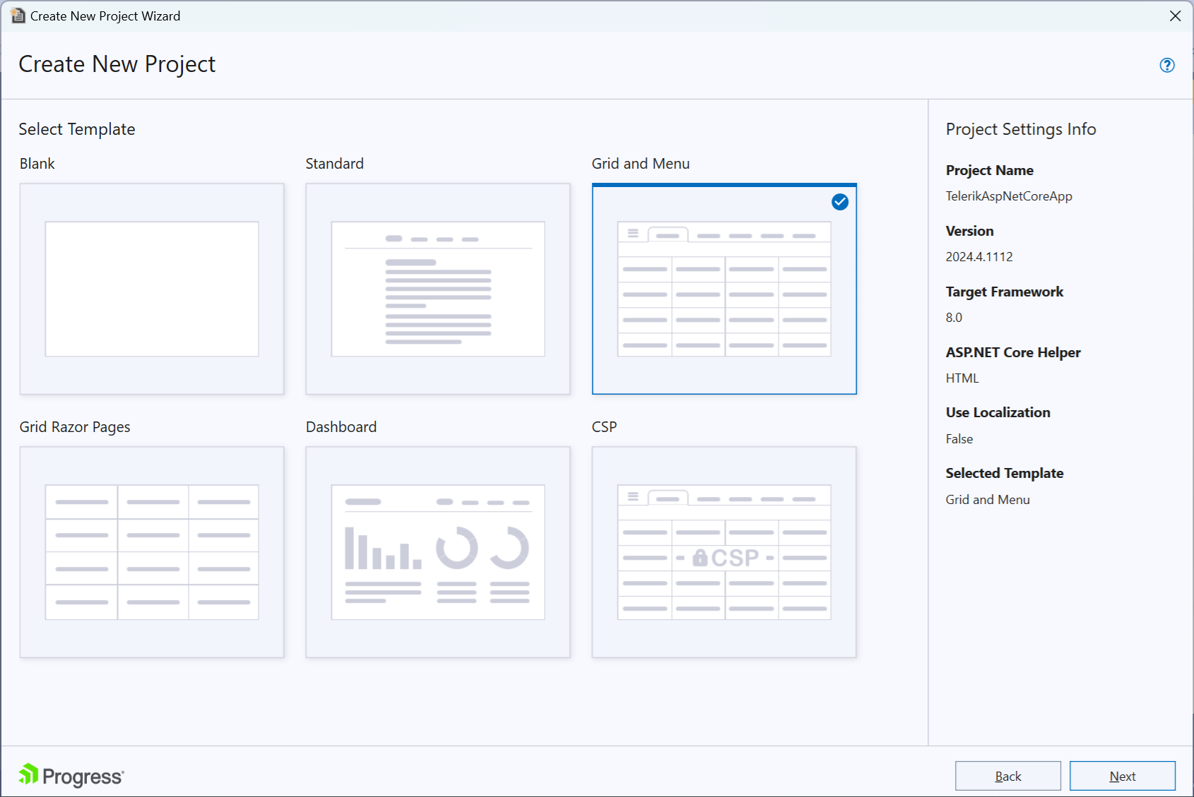
From the available options Select Grid and Menu, and then select Next.
The wizard offers various templates for projects with pre-configured Grid and Menu controls and for projects using Razor Pages. This tutorial uses the Grid and Menu MVC version.
-
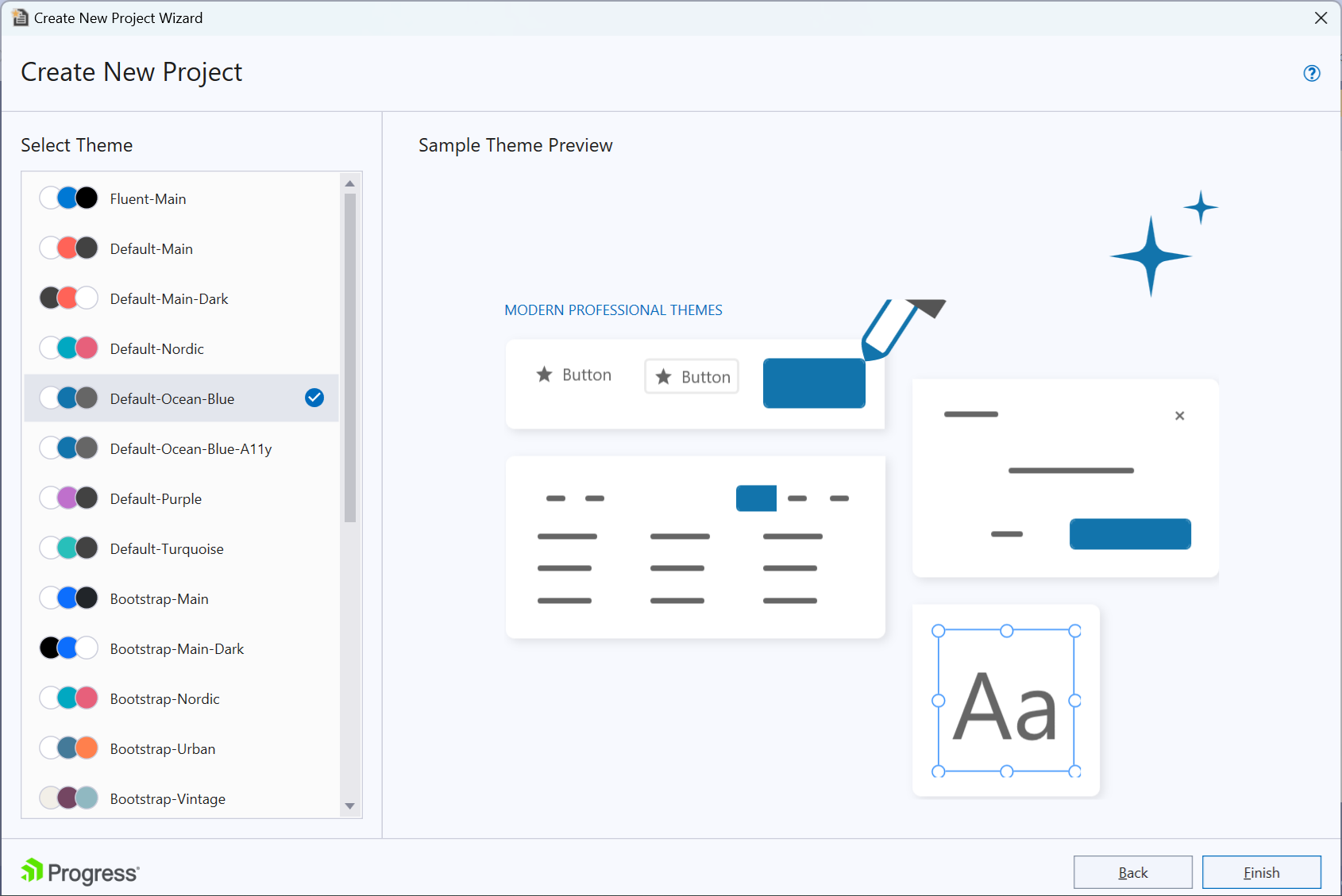
Select the default theme and then select Finish.
The selected theme defines the appearance of the Telerik UI components. You can change the theme at any time.
Congratulations! The created project:
Is a working app.
Has all resources required by Telerik UI, and you can start adding components immediately.
The Grid and Data Binding
The next step is to examine the Telerik UI Grid which the template wizard added to your project. The Grid is the richest component in the entire toolset, but this sample will only demonstrate a basic implementation.
Binding the Grid requires adding a model and controller. The Wizard has done the following automatically:
-
Added a
Modelsfolder to the project. Created anOrderViewModelclass and added it to theModelsfolder.The model represents the shape of the data that the Grid will display.
    public class OrderViewModel
    {
        public int OrderID
        {
            get;
            set;
        }

        public decimal? Freight
        {
            get;
            set;
        }

        public DateTime? OrderDate
        {
            get;
            set;
        }

        public string ShipCity
        {
            get;
            set;
        }

        public string ShipName
        {
            get;
            set;
        }
    }
When the Grid is bound to a strongly-typed model such as the OrderViewModel, it automatically detects the data types of the fields.
-
Created a new Controller and named the file
GridController.The controller handles the incoming requests, retrieves the model data, and then returns the requested data.
-
In
GridController.cs, added the following declarations at the top. They enable the data processing by the Telerik UI extensions:using Kendo.Mvc.Extensions; using Kendo.Mvc.UI; using Microsoft.AspNetCore.Mvc; using System; using System.Linq; using TelerikAspNetCoreApp.Models; -
In
GridController.cs, added an ActionMethod that will return the data for the Grid.public class GridController : Controller { public ActionResult Orders_Read([DataSourceRequest] DataSourceRequest request) { var result = Enumerable.Range(0, 50).Select(i => new OrderViewModel { OrderID = i, Freight = i * 10, OrderDate = new DateTime(2016, 9, 15).AddDays(i % 7), ShipName = "ShipName " + i, ShipCity = "ShipCity " + i }); var dsResult = result.ToDataSourceResult(request); return Json(dsResult); } } -
In the
~/Views/Home/Index.cshtmlfile, added the Grid:@(Html.Kendo().Grid <TelerikAspNetCoreApp.Models.OrderViewModel>() .Name("grid") .Columns(columns => { columns.Bound(p => p.OrderID).Filterable(false); columns.Bound(p => p.Freight); columns.Bound(p => p.OrderDate).Format("{0:MM/dd/yyyy}"); columns.Bound(p => p.ShipName); columns.Bound(p => p.ShipCity); }) .Pageable() .Sortable() .Scrollable() .Filterable() .HtmlAttributes(new { style = "height:550px;" }) .DataSource(dataSource => dataSource .Ajax() .PageSize(20) .Read(read => read.Action("Orders_Read", "Grid")) ) )<kendo-grid name="grid" height="550"> <columns> <column field="OrderID" title="Order ID"> <filterable enabled="false"></filterable> </column> <column field="Freight" title="Freight" /> <column field="OrderDate" title="Order Date" format="{0:MM/dd/yyyy}" /> <column field="ShipName" title="Ship Name" /> <column field="ShipCity" title="Ship City" /> </columns> <scrollable enabled="true" /> <sortable enabled="true" /> <pageable enabled="true" /> <filterable enabled="true" /> <datasource type="DataSourceTagHelperType.Ajax" page-size="20"> <transport> <read url="@Url.Action("Orders_Read", "Grid")" /> </transport> </datasource> </kendo-grid> -
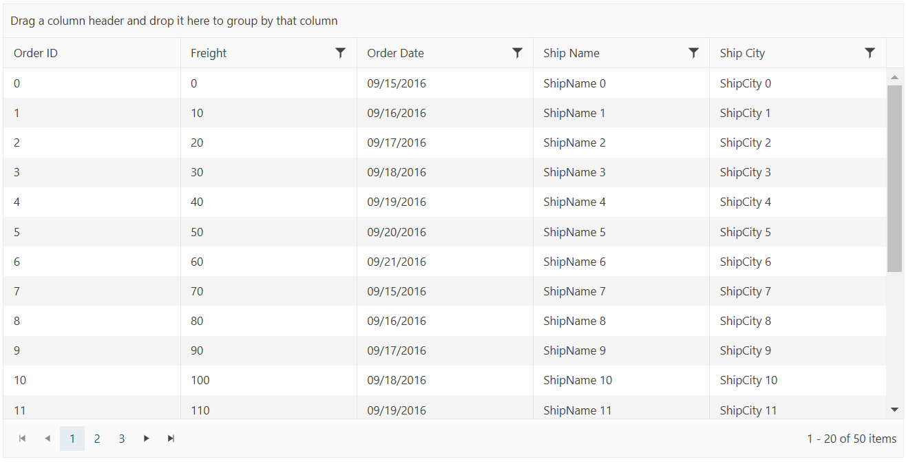
Now you can run the project and enjoy the neat result:
For more information on data processing and data binding, see the following articles:
Adding a DatePicker
Next, you will add another Telerik UI component to the project—the Telerik UI DatePicker. You can add the DatePicker as an HTML or Tag Helper. Whether you select the HTML or Tag Helper syntax depends on what you have configured when you have created the project.
Utilize the Telerik UI DatePicker component by adding the snippet from the following example to ~/Views/Home/Index.cshtml.
    <div class="text-center">
        <h2>Telerik UI DatePicker for ASP.NET Core</h2>
        @(Html.Kendo().DatePicker()
            .Name("my-picker")
        )
    </div>
    <div class="text-center">
        <h2>Telerik UI DatePicker for ASP.NET Core</h2>
        <kendo-datepicker name="my-picker"/>
    </div>
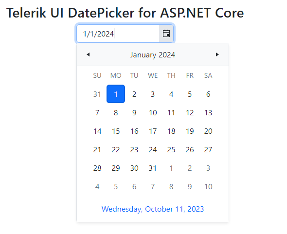
Run the project. The following result is visualized in the browser:
Next, you can change the look and feel of your application by selecting another visual theme.
Changing the App Theme
The UI for ASP.NET Core suite comes with a set of 20+ built-in LESS-based and Sass-based themes that allow you to alter the visual appearance of the Telerik components. The most prominent themes are Default (our own styling), Material (based on the Material Design guidelines), and Bootstrap (a theme that matches Bootstrap guidelines).
The themes are usually referenced in the _Layout file of the application. To change the theme, substitute the existing CSS reference in the _Layout with the new theme.
If during the creation the project you've chosen the Bootstrap theme, the _Layout.cshtml file must contain the following CSS link:
<link href="https://kendo.cdn.telerik.com/themes/10.0.1/bootstrap/bootstrap-main.css" rel="stylesheet" type="text/css" />
To change the theme to the Default theme, substitute the link above with the following:
<link href="https://kendo.cdn.telerik.com/themes/10.0.1/default/default-main.css" rel="stylesheet" type="text/css" />
Since both the Bootstrap and Default themes are Sass-based themes, no additional CSS files are required. LESS theme files are no longer support after the R1 2023 SP1 release. If you need to reference LESS CSS files in an older version of the Telerik UI for ASP.NET Core, you must add a common and a theme CSS files. The following example shows how to reference the Default LESS theme (applicable to versions of Telerik UI for ASP.NET Core before R1 2023 SP1):
    <link rel="stylesheet" href="https://kendo.cdn.telerik.com/2022.3.1109/styles/kendo.common.min.css" />
    <link rel="stylesheet" href="https://kendo.cdn.telerik.com/2022.3.1109/styles/kendo.default.min.css" />
The default casing for JSON strings in ASP.NET Core is camelCase. The Telerik UI components that are data-bound depend on PascalCase formatted response from the server. If the JSON serialization isn't configured properly, the UI components will display wrong data. To find out how to configure the application to return the data in Pascal-case, refer to the JSON Serialization article.
Adding Your License File
Using any client-side assets from the Kendo UI CDN or the @progress/kendo-ui NPM package requires you to add a Kendo UI for jQuery license file to your application. A missing license file triggers a banner, a watermark, and causes a warning message in the browser's console.
To generate your license file and add it to your application, follow the instructions in the Adding a License File article.
Next Steps
- Check out the free Telerik UI onboarding course
- Getting Started with Telerik UI Video Tutorial
- Using Telerik UI in Razor Pages projects
- Create your own custom bundles
- Switch from Trial to Commercial License