Creating Advanced Maps with BarChart Series
In this article, you will learn how to create a Map report item with a BarChart series.
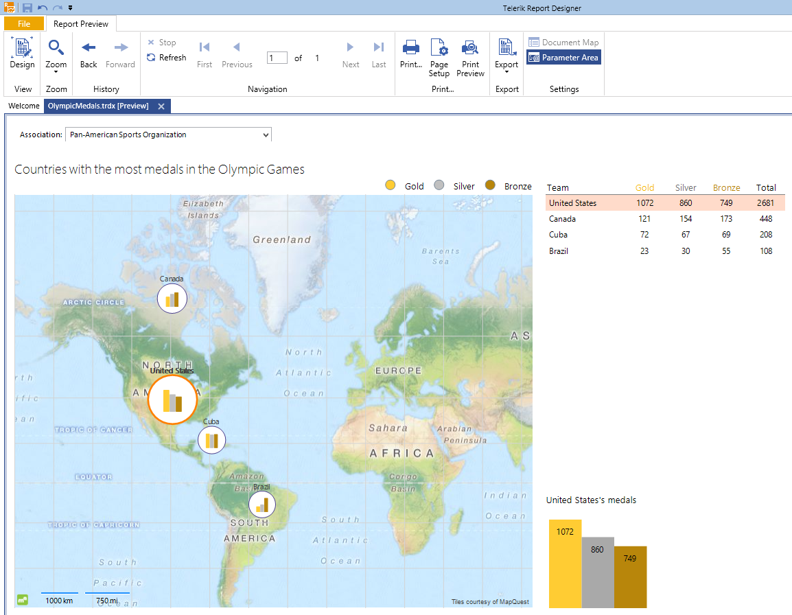
The suggested scenario will demonstrate how to create a Map which will present the countries with the most medals won in Olympic Games divided by their continental Association of National Olympic Committees. The example will also add some interactivity to the report, enabling the user to choose which countries will be displayed on the Map, highlighting the currently selected country, and displaying an additional chart with detailed information about it. The suggested implementation uses the Standalone Report Designer and does not require the writing of any code.
The suggested implementation corresponds to the sample OlympicMedalsByNationalTeams.trdp report definition that may be found in the installation folder of the Telerik Reporting product. By default, this is C:\Program Files (x86)\Progress\Telerik Reporting 2025 Q4\Report Designer\Examples.
Prerequisites
- Obtain a valid Location Provider key that will authenticate your geocoding requests.
- If you don't want to use a location provider, provide the geographical coordinates of your points yourself and configure the
MapSeriesaccordingly. For more information, refer to the article on location providers.
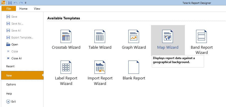
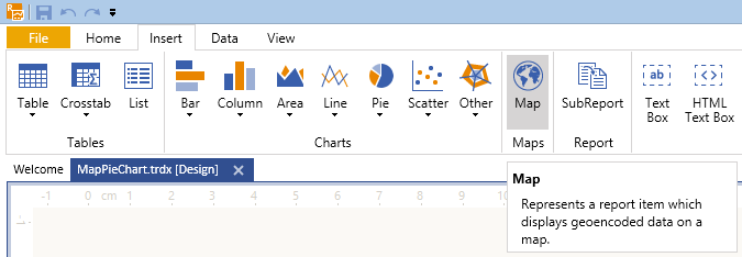
1. Start the Map Wizard
-
(For new reports) Select the Map Wizard icon from the Available Templates page.
-
(For existing reports) Select the Map item from the Insert menu. As a result, the Map Wizard will appear and guide you through the creation process.
2. Add the Data Source
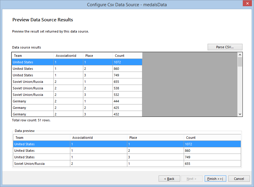
Now, you'll add a new CSV data source and name it medalsData. This data source will hold the information about the countries, the ID of their respective Olympic association, which place and how many times they have occupied it.
- Copy the data from the medalsData CsvDataSource of the sample
OlympicMedalsByNationalTeams.trdpreport definition, save it locally, and insert its path into the Select a file to import textbox. The information in this file is a sample data set that shows how many times a national Olympic team had occupied a first, a second, or a third place in the Olympic Games. It has also a relation with the Association of National Olympic Committees table that you will build later. - Click Next until you get to the CSV Headers page. Note that the CSV file has headers and you have to check the The CSV has headers checkbox.
- On the Map columns to type page, set the type of the
AssociationId,PlaceandCountcolumns to Integer. -
When you click Parse CSV... on the next page, you will see the result of the parsed file, which will look similar to the following image:
Click Finish when you are ready.
3. Build the Map Charts
In the Available data sources list, you will see the data source you've already created. Select it and click Next.
-
On the next page, select the fields which will be used to build the Map charts.
Since the Map will use a Location Provider, you don't have to provide the Latitude and Longitude coordinates by yourself and can leave these boxes empty. Only define the location group which will set the geocoding string.
From the Datapoints type box, select the Column Chart radio button.
- Select the Place field and drag it to the Series (color) box.
- Select the Team field and drag it to the Categories (location) box.
-
Select the Count field and drag it to the Size box, where it will be transformed to Sum(Count). The Arrange map fields page will look similar to the following:
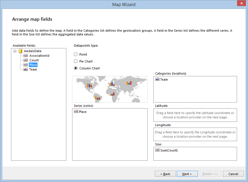
Once the mandatory fields are set up, the Next button will be enabled. Click it to go to the next page.
4. Set Up the Location Provider
-
On the Choose a location provider page, select the location provider that will be used to geocode the State field that was dragged in the Categories (location) box on the previous page.
Currently, the supported providers are
MapQuestOpenAPILocationProvider,MapQuestLocationProvider,BingLocationProvider, andAzureLocationProvider. They all require a valid client token (key) to authenticate the geocoding requests that will be sent from the Map item. Once you have obtained the key, paste it in the Client token box: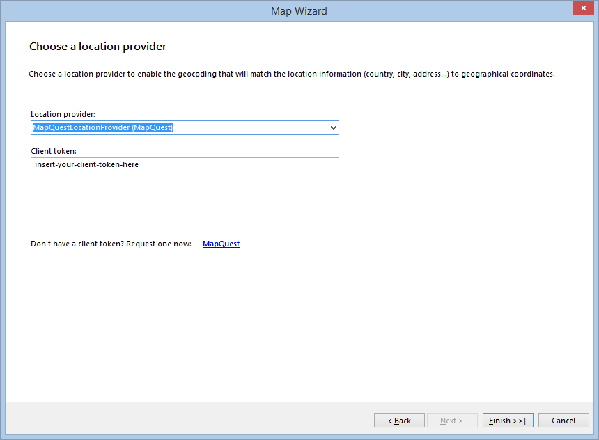
-
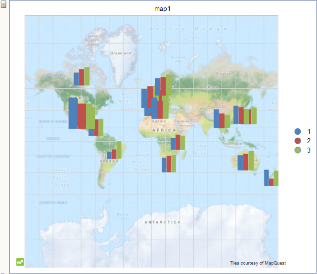
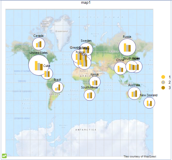
When you click Finish, the Wizard will create the definition of the Map item, show it in the designer, and will start to request the geocode and tiles information from the providers asynchronously. Initially, it will take a few seconds to fetch all the data from the geocoding service, but the following requests will be executed faster. The tiles, needed to prepare the Map background, will be displayed as they arrive, but the Map will stay responsive and you can examine and change its definition. When finished, the Map will look similar to the following:
5. Add the PointMapSeries
Now you will add a PointMapSeries that will display a circle around each column chart. The circle size will be relevant to the whole number of medals each team has won. To add the series, select it and then start the respective Wizard. For the purposes of this example, start the Map Wizard again by clicking the Map toolbar icon.
On the Arrange map fields page, perform the following steps:
- Select the Point radio button from the Datapoints type box.
- Select the Team field and drag it to the Categories (location) box.
-
Select the Count field and drag it to the Size box, where it will be transformed to Sum(Count). The Arrange map fields page will look similar to one in the following image:
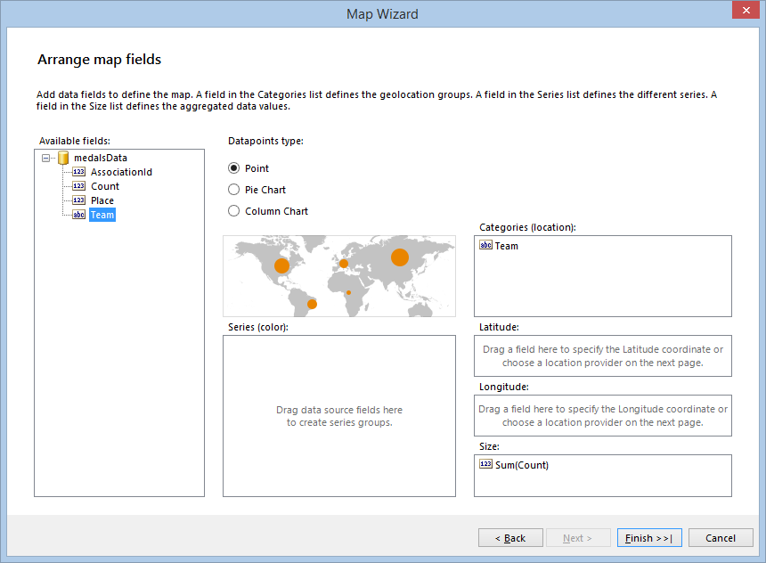
Click the Finish button. As a result, the Map will display the two series together, rendered in the order they have been created. That's why you will see the column charts being overlapped by the circles.
6. Style the Appearance
The Map needs some more configuration and styling to improve its rendering. Select the Map item, click the Series item in the Property grid, and perform the following steps in the opened MapSeries Collection Editor:
- In the Members: left pane, select the pointMapSeries1 item and move it up by using the arrow buttons. This will display the circles as a background for the column charts.
- Since the
PointMapSerieswill use the same grouping as theColumnMapSeries, set itsGeoLocationGroupto teamGroup and itsSeriesGroupto seriesGroup, which were created along with theColumnMapSeries. - As you have the pointMapSeries1 selected, set its
DataPointStyleBackgroundColortoWhiteand theLineColorto a color of your choice. The example report uses theDarkSlateBluecolor from the Web palette. - Set the
DataPointLabelexpression to=Fields.Teamto display the name of the national team above the point. - Set the
DataPointLabelStyle. Visible property toTrue. - Select the columnMapSeries1 item from the Members: pane and set its
MarkerMinSizeto6mmandMarkerMaxSizeto10mm. -
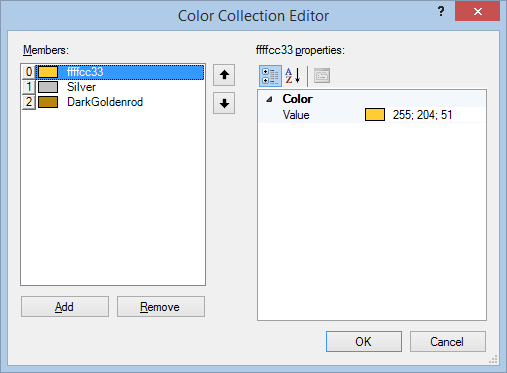
To match the column series colors with the real world medal colors, define a custom ColorPalette. The following screenshot illustrates the colors used in this example:
-
To change the Map size, adjust the fonts properties and try various styling. Finally, the Map will look similar to the following image:
7. Configure the Legend
As you may have noticed, the information about the occupied places is present in the CSV data as integer numbers, that's why the legend displays it this way. But the report will look better if the information about the places is displayed with medal names - Gold, Silver, and Bronze.
To achieve the desired scenario, you may use an expression for the LegendItem Value. In our demo though, we will use a calculated field added to the CSV data source. The benefit of this approach is that you can use the calculated field as any other field, without having to use an expression every time you need to address it.
-
Select the medalsData data source, add a calculated field named Medal of type
Stringto it and set its expression in the following way:=IIF(Fields.Place = 1, 'Gold', IIF(Fields.Place = 2, 'Silver', IIF(Fields.Place = 3, 'Bronze', 'none'))) Set the
LegendItemValueexpression of thecolumnMapSeriesto=Fields.Medaland style the legend by your choice.
8. Reduce the Displayed Information
To reduce the amount of displayed information on the Map, use the report parameters and apply filtering. In this case, the filtering criteria will be based on the AssociationId field. To display the meaningful names of the Olympic associations, you will add another CSV data source, which has a relation with the current AssociationId field of the data source and will be used only for displaying the report parameters.
-
Add a new CSV data source, select the Enter CSV as text tab, and paste the following text in the box:
Id,Name
1,Pan-American Sports Organization
2,European Olympic Committees
3,Olympic Council of Asia
4,Oceania National Olympic Committees
5,Association of National Olympic Committees of Africa
The same data source is available also in our sample
OlympicMedalsByNationalTeams.trdpreport definition. On the CSV Headers page, check the The CSV has headers box.
- On the Map columns to type page, set the type of the
Idcolumn to Integer. - When you click Parse CSV... on the next page, you will see the result of the parsed file. Click Finish when you are ready and, when the Wizard closes, name the dataSource associationsData.
-
Add a new report parameter named associationParam and set its properties as shown at the following screenshot:
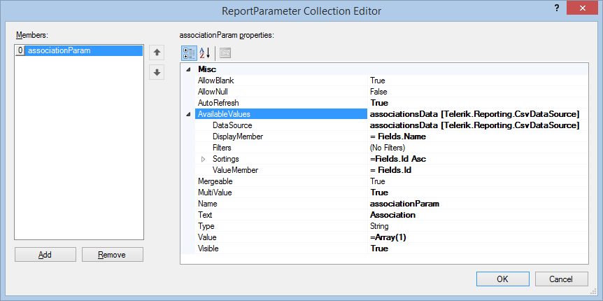
By default, the parameter will be set to the association with
Id = 1, which means that the report will initially show all the teams that are members of Pan-American Sports Organization. However, because it is a multi-value parameter, you can add all the Association IDs in its Value property. Select the Map item and add a filter rule that will filter out the teams with an
AssociationIddifferent than the ones selected in the associationParam. Set the Expression to=Fields.AssociationId, the Operator toIn, and the Value to=Parameters.associationParam.Value. When you close the Filter Rules dialog, the designer gets updated and the Map will show only the teams from the Pan-American Sports Organization. When you preview the report, you will be able to change the Map extent only by selecting different combinations of parameter values.
9. Add the CrossTab
Since the column charts on the Map are not suitable to display any labels on them, here you will add an additional CrossTab, which will show the number of medals and calculate their amount for each national team.
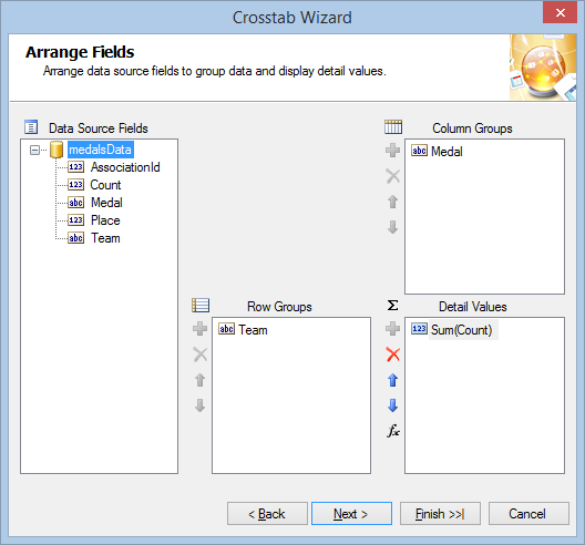
- Start the
Crosstab Wizardand choose the medalsData data source on its Choose a Data Source page. - Select the Medal field and drag it to the Column Groups box.
- Select the Team field and drag it to Row Groups box.
-
Select the Count field and drag it to Detail Values box, where it will be transformed to Sum(Count). Your Arrange fields page should look like the one shown below:
On the Choose Layout page select Blocked layout, subtotals below option and select Finish if you do not need to choose from any predefined stylings.
- Once the
Crosstab Wizardis closed, your crosstab is done, but now it needs to be filtered the same way as the Map item. Apply the same filter rule as you did in the previous step (=Fields.AssociationIdIn=Parameters.associationParam.Value). -
If you want to apply a different color for any of the medals columns, you have to set up three ConditionalFormatting Rules to the textbox with the value
=Fields.Medal, as shown below: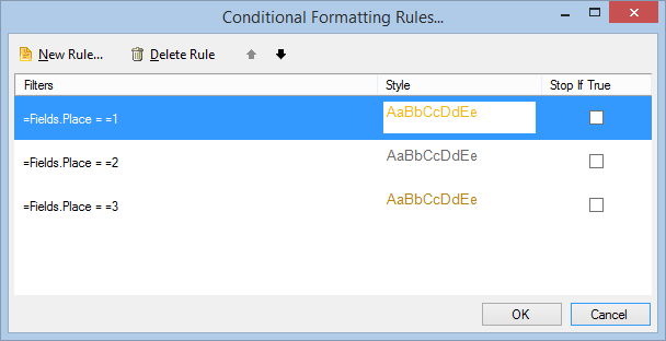
To have the information in your crosstab sorted properly, you can set
=Sum(Fields.Count) Descas a sorting for the row group and=Fields.Place Ascas a sorting for the column group.-
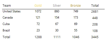
You can change the table styling by your choice, but finally when you preview the report, the crosstab should look like the one below:
10. Add Interactivity
In this step, you will add some interactivity to your report, allowing the user to select a national team from the crosstab and changing the Map extent according to its selection. The drill-through action will use an invisible report parameter which will store the selected team name and utilize it in conditional formatting and filtering options.
- Add new report parameter named teamParam. Set its
AllowNullproperty toTrueand leave the other properties as set by its default constructor. - If you haven't saved your report so far, save it now. Select the crosstab textbox that displays the team name and add a Navigate to Report action. Click the Select a Report Source button, select the URL or File option. From the Select a file or enter a valid URL: drop-down list, click the
< Select a file >option. - From the Open file dialog, select the report you're currently working on. This will cause the report to call itself every time this action is performed.
- Click the Edit Parameters... button, which will bring up the Edit Parameters dialog. When you click the New toolbar button, the associationParam and teamParam report parameters will be loaded in the Parameter Name drop-down list.
-
From the Parameter Name drop-down list, select
associationParamand choose=Parameters.associationParam.Valuefor the Parameter Value. From the Parameter Name drop-down list, selectteamParamand add the=ReportItem.Textexpression as a Parameter Value.This setup means that on every report call, the value of the associationParam will be preserved and the teamParam value will be set from the textbox that initiated the action.
-
To make the currently selected crosstab row more distinctive, you can apply a conditional formatting to it. Select the whole row by clicking its header. This action will select its three cells.
Add a new conditional formatting rule and set its expression to
=Fields.Teamand its value to=Parameters.teamParam.Value. Set an appropriate color as a style background to denote the selected state of the row. -
Apply conditional formatting to the Map series as well, outlining the currently selected national team so it will be easier to find it among the data points on the Map. Select the PointMapSeries and set a new
DataPointConditionalFormattingrule: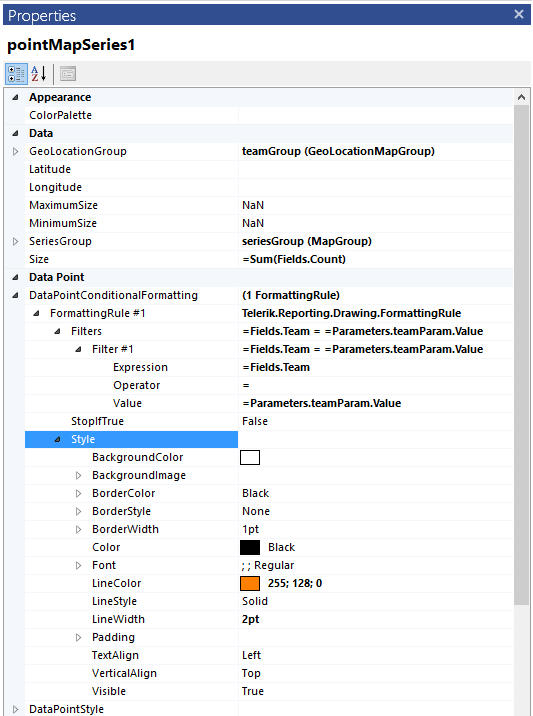
11. Add a Graph
Finally, you will add a small Graph showing a Column Chart that will be used to display the amount of medals won by each team.
- From the Insert toolbar of the Standalone Report Designer, start the Graph Wizard by selecting Column > Clustered Column.
- Select medalsData as the data source of the Graph.
- On the next page, select the Medal field and drag it to the Series box. Select the Count field and drag it to the Values box where it will be transformed to Sum(Count). Click Finish when you are ready.
- Since the purpose of the Graph is to show the medals of the currently selected team, apply filtering by Team to it by setting
=Fields.Team==Parameters.teamParam.Value. -
To make it look the same way as the column charts of the Map, set the Sorting of the first member of the Graph series groups to
=Fields.Place ASCand apply the sameColorPaletteyou have previously defined to the Graph item.Additionally, make the Graph axes invisible by setting the Minumum property of the Y axis to
0and change the styling properties of its data points and data point labels. -
When you are finished, preview your report which will look similar to the one in the following image: