Using Font Icons
Environment
| Product Version | 1.5.0 |
| Product | Unite UX |
Description
How can I use the font icons in Unite UX? Why can't I change all icons in Unite UX?
Solution
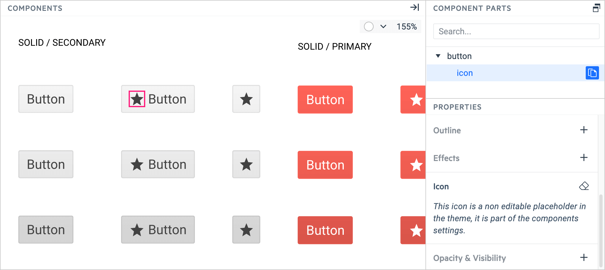
In Unite UX, you can change the font icons that are part of the components, for example, the Chip component and its close icon. However, you cannot change icons that are placeholders and depend on the component configuration, for example, the star icon in the Button component. You can customize placeholder icons by creating CSS rules.
Changing Icons in Unite UX
To change an icon that is part of the component:
In the DESIGN pane, select the component that uses the desired icon.
In the DESIGN PARTS pane, select the icon.
In the DESIGN STYLES pane, select Copy Styles to copy the properties of the icon.
-
In the COMPONENTS pane, select the desired component.
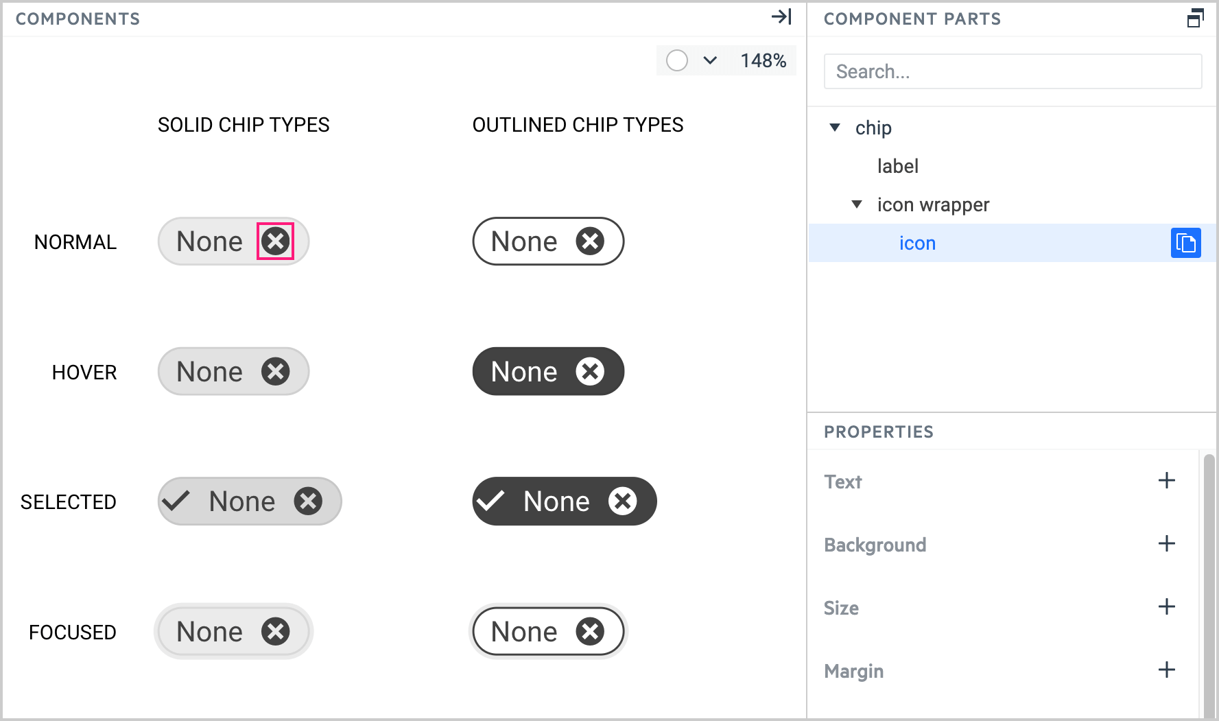
In the COMPONENT PARTS pane, select the icon part, and then select the Paste Styles button.
Changing Icons Manually
If you don't want to use the copy-pasting approach, you can configure the icon manually:
In the PROPERTIES pane, select Text.
-
In the Select Text Token dropdown, enter the font family for the desired icon.
The font family name for the icons that you export with the Unite UX plugin is always the project name plus the word 'Icons'.
In the PROPERTIES pane, select Icon and enter the Unicode for the desired icon.
Changing Icons through CSS
Some components like the Button contain placeholder icons that you cannot change in Unite UX. Instead, you must use CSS rules to configure the component.
-
Create the CSS rule that applies the desired icon.
.icon-calendar { font-family: 'ProjectName Icons' !important; font-style: normal; font-weight: normal; font-variant: normal; text-transform: none; line-height: 1; -webkit-font-smoothing: antialiased; -moz-osx-font-smoothing: grayscale; } .icon-calendar::before { content: "\e035"; /* Icon Content Code */ } -
Use the CSS rule in the configuration of the component, for example, the KendoReact Button.
import { Button } from '@progress/kendo-react-buttons';
...
<Button iconClass="icon-calendar"/>