Demo of Desktop Tests Capabilities
The Desktop testing functionality in Test Studio empowers users to automate the testing of Windows desktop applications. It possesses UI technology independence, meaning it supports various UI technologies such as WPF, WinForms, Delphi, and others.
This article guides you through a sample scenario and demonstrates the capabilities of Desktop testing in Test Studio:
- Prerequisites
- Desktop Testing in Test Studio Explained
- The Testing Framework Capabilities and an Example
- What is DesktopInvokePattern and an Example
- What are the Automation Properties
- What are the Automation Controls
- What are the Control Patterns
Prerequisites
The only prerequisite for utilizing the Desktop testing capabilities is that the targeted application must implement UI Automation peers. UI Automation peers are a concept within the field of user interface (UI) automation in the context of Microsoft’s UI Automation framework. UI Automation is an accessibility framework provided by Microsoft that enables software applications to expose their UI elements and interact with them programmatically.
Each UI element in an application typically has a corresponding UI Automation peer associated with it. Peers encapsulate the accessibility-related information for the elements they represent. They expose properties such as name, control type, keyboard focus, enabled state, and more.
Desktop Testing in Test Studio Explained
Test Studio’s desktop testing feature comprises two primary sub-features: the testing framework itself and the Test Studio’s recorder and playback functionality.
The Testing Framework
The Test Studio Testing framework allows the users to:
search UI Automation tree and its elements;
read element properties and invoke elements actions ;
extract element patterns and invoke patterns properties and members;
perform keyboard and mouse actions against desktop elements.
Tip
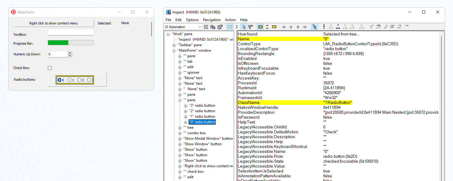
We recommend using the Inspect tool when working on coded desktop tests. This tool displays the UI Automation tree and element’s properties in the target application. With the Inspect tool you can explore an element from the application and know how to interact with it.
Example
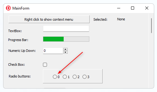
In the following example we use a sample desktop application to locate a radio button within and select it.
Launch the Inspect tool and highlight the desired element to reveal its properties. Because of the UI Automation peers enabled we have all the element’s properties exposed. For building the find expression we will use the name and the class name properties.
Make sure you have the following using statements included:
    using ArtOfTest.WebAii.DesktopAutomation;
    using ArtOfTest.WebAii.DesktopAutomation.Controls;
    using ArtOfTest.WebAii.DesktopAutomation.FindExpressions;
By following the below code flow, users can automate the selection of a radio button within a Windows desktop application using the Test Studio Framework.
    //The code begins by obtaining the root element of the desktop using ‘DesktopElement.FromDesktopRoot()’.

    var desktop = DesktopElement.FromDesktopRoot();

    //A find expression is created using the name and class name attributes. The expression is defined as follows:

    var radioButtonExpression = new DesktopFindExpression("name=0", "className=TRadioButton");

    //Using the created find expression, the code locates the desired radio button within the desktop:

    var radioButton = desktop.Find.ByExpression(radioButtonExpression).As<DesktopRadioButton>();

    //An assertion is then made to ensure that the radio button is not null:
    Assert.IsNotNull(radioButton);

    //Finally, the code selects the radio button:

    radioButton.Select();
DesktopInvokePattern Example
Test Studio also provides support for invoking patterns on desktop applications. Here is a general overview of how to use the DesktopInvokePattern. The DesktopInvokePattern is one of the supported control patterns by Test Studio testing framework. It allows you to invoke an action or command on a UI element in a desktop application.
Here are the general steps to use the DesktopInvokePattern with the radio button from the above example.
    //Find the targer UI element
    var desktop = DesktopElement.FromDesktopRoot();

    var radioButtonExpression = new DesktopFindExpression("name=0", "className=TRadioButton");
    var radioButton = desktop.Find.ByExpression(radioButtonExpression);

    //Retrieve the DesktopInvokePattern
    var invokePattern = new DesktopInvokePattern(radioButton);

    //Invoke the desired action
    invokePattern.Invoke();
Automation Properties
Automation properties are attributes or characteristics associated with user interface elements which provide information about their state, behavior, or appearance. These properties are used in UI automation for finding and interacting with UI elements programmatically. By accessing these properties, automation tools or frameworks can retrieve information about UI controls, perform actions on them, or make decisions based on their current state.
Here are few of the commonly used automation properties:
Name - The name property represents the accessible name of a UI element. It provides a descriptive name that can be used to find the control.
AutomationId - The automation ID property is a unique identifier assigned to a UI element, often set by the application developer explicitly. It allows for reliable identification of controls even if their other properties change.
ControlType - The control type property indicates the type or class of the UI element, such as
Button,TextBox,ComboBox, orMenuItem. It helps in distinguishing between different types of controls.ClassName - The class name property represents the underlying class or control type of a UI element. It can be useful for finding controls based on their implementation details.
Full list of supported properties:
| AutomationId | ClassName | ControlType |
| ControlTypeName | Enabled | ExpandCollapse.ExpandCollapseState |
| IsExpandCollapsePatternAvailable | FrameworkId | Grid.ColumnCount |
| Grid.RowCount | IsGridPatternAvailable | HasKeyboardFocus |
| HelpText | IsInvokePatternAvailable | IsKeyboardFocusable |
| IsLegacyIAccessiblePatternAvailable | LegacyIAccessible.ChildId | LegacyIAccessible.DefaultAction |
| LegacyIAccessible.Description | LegacyIAccessible.Help | LegacyIAccessible.KeyboardShortcut |
| LegacyIAccessible.Name | LegacyIAccessible.Role | LegacyIAccessible.State |
| LegacyIAccessible.Value | LocalizedControlType | Name |
| ProcessId | IsRangeValuePatternAvailable | RangeValue.IsReadOnly |
| RangeValue.LargeChange | RangeValue.Minimum | RangeValue.Maximum |
| RangeValue.SmallChange | RangeValue.Value | RuntimeId |
| IsSelectionPatternAvailable | Selection.CanSelectMultiple | Selection.IsSelectionRequired |
| Selection.Selection | IsSelectionItemPatternAvailable | SelectionItem.IsSelected |
| SelectionItem.SelectionContainer | IsTablePatternAvailable | Table.ColumnHeaders |
| Table.RowHeaders | Table.RowOrColumnMajor | IsTogglePatternAvailable |
| Toggle.ToggleState | IsTransformPatternAvailable | Transform.CanMove |
| Transform.CanResize | Transform.CanRotate | IsValuePatternAvailable |
| Value.IsReadOnly | Value.Value | IsWindowPatternAvailable |
| Window.CanMaximize | Window.CanMinimize | Window.WindowInteractionState |
| Window.IsModal | Window.IsTopmost | Window.WindowVisualState |
| XPath |
Automation Controls
Automation control types categorize different user interface elements based on their functionality and behavior. These control types help in identifying and distinguishing between various UI controls programmatically. UI automation frameworks and tools use control types to interact with UI elements consistently across different platforms and technologies.
Here are few of the commonly used UI automation control types:
Button - Represents controls that perform an action when clicked, such as buttons, links, or icons.
CheckBox - Represents controls that allow users to select or deselect options.
ComboBox - Represents controls that provide a dropdown list of options, from which users can select one or more items.
Edit - Represents controls that accept and display text input, such as text boxes or input fields.
Full list of supported controls:
| DesktopButton | DesktopCheckBox | DesktopComboBox |
| DesktopDataItem | DesktopEdit | DesktopGrid |
| DesktopListView | DesktopListViewItem | DesktopProgressBar |
| DesktopRadioButton | DesktopTab | DesktopTabItem |
| DesktopText | DesktopTreeView | DesktopTreeViewItem |
| DesktopWindow |
Control Patterns
Control patterns refer to a set of standardized behaviors and properties that define the capabilities of a user interface (UI) control. Control patterns allow automation tools or frameworks to interact with and manipulate UI controls in a consistent and predictable manner.
Control patterns provide a way to identify and access specific elements within a UI, such as buttons, checkboxes, text boxes, menus, and more. By leveraging control patterns, automation frameworks can perform actions like clicking buttons, entering text, selecting options, and validating the state of UI controls.
Some commonly used control patterns in UI automation include:
Button Pattern - This pattern represents controls that perform an action when clicked, such as buttons, links, or icons.
Edit Pattern - This pattern represents controls that accept text input, such as text boxes, input fields, or text areas.
Scroll Pattern - This pattern represents controls that allow scrolling through content, such as scroll bars or panning gestures.
Full list of supported control patterns:
| DesktopExpandCollapsePattern | DesktopGridPattern | DesktopInvokePattern |
| DesktopLegacyIAccessiblePattern | DesktopRangeValuePattern | DesktopSelectionItemPattern |
| DesktopSelectionPattern | DesktopTablePattern | DesktopTogglePattern |
| DesktopTransformPattern | DesktopValuePattern | DesktopWindowPattern |