Use Bindings to Control the Coordinate System Properties in the Graph
Environment
| Product | Progress® Telerik® Reporting Graph Report Item |
Description
How can I use bindings to control the coordinate system properties in the Grpah?
Solution
The suggested solution shows how to set up the axes and scales of the coordinate system at runtime by using bindings. This approach is really useful when your scenario involves nested Graph items and you need to adjust more precisely its properties. For more information about the nested data items subject, refer to the article on using the ReportItem.DataObject property in expressions.
The nested Graph data will show the sales of some of the most popular electric vehicles models over the last years. The data will be grouped by vehicle model, presenting the amount of sales for each model in a separate chart. The data sample used to create the charts is taken from Model 3 and you can read the whole article in March 2013 sets several records for EV Sales.
The suggested solution is valid for both the Telerik Reporting Standalone Report Designer and Visual Studio Report Designer, and can also be reproduced with code.
1. Add a Blank Report
- Open the Telerik Report Designer of your choice and create a new blank report.
- Since you will not be using the page header and footer, remove them.
2. Connect to Data
Expand the
DataSourceproperty of the report and click the Add new DataSource... link at the bottom.Select the CSV Data Source icon to add a new DataSource. Name it dsEVSalesData. This data source will contain information about the vehicles and the amount of their sales for a particular month.
Download the
EVSalesData.csvfile, save it locally, and insert its path into the Select a file to import textbox.Click Next until you get to the Configure the separators page. The
CSVfile uses a semicolon(;)as a field separator and you need to check the respective checkbox and uncheck the other ones.Click Next until you get to the CSV Headers page. Note that the
CSVfile has headers and you need to check the The CSV has headers checkbox.On the Map columns to type page, set the type of
MonthYearfield to DateTime and theSalesAmountcolumns to Integer. Apply the "MMM-yy" format to the Date Format field.-
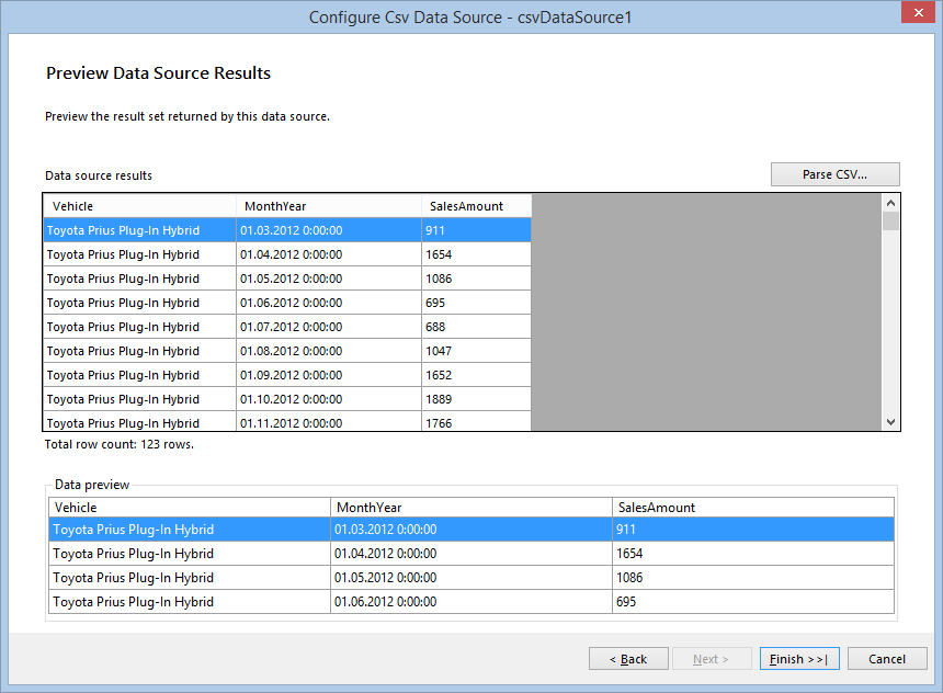
When you click Parse CSV... on the next page, you will see the result of the parsed file:
Click Finish when you are ready.
3. Configure the Groupings
Define the groupings for a data item by using the GroupExplorer tool window. If it is not visible, activate it with the Telerik Reporting menu in Visual Studio or the View tab in the Standalone Report Designer.
Select the report, right-click the Detail group, displayed in the Group Explorer, and select Add Parent Group from the context menu. This will show the Edit Grouping dialog.
Add a new group by using the field Vehicle as a grouping member.
Add ascending sorting by the same field by using the button at the end of the Grouping column in Group Explorer.
4. Configure the Group Header
The group header will contain all the items used to display all the information and you can make the details and group footer sections invisible by setting their
Visibleproperty tofalse.Add a new TextBox to the group header, set its
Font.Sizeto 18pt and its value to=Fields.Vehicle.Add a Graph item to the group header.
-
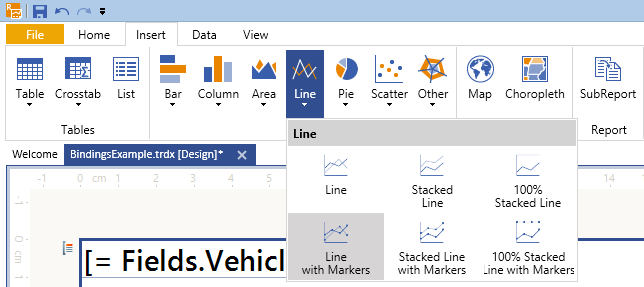
(For the Standalone Report Designer) Click the Insert menu, select Line, and Line with Markers.
(For the Visual Studio Report Designer) Drag the Graph Wizard from the Visual Studio toolbox. Select Line and Line with Markers, and click OK. This will start the Graph Wizard.
You will later on set the Graph data source through Bindings but still it is more convenient to use the wizard to configure its series, category groups, and values.
On the first page, select the previously created dsEVSalesData data source.
On the Arrange graph fields page, select the fields that will be used to build the chart. Since the report will display aggregated sums of the vehicle sales by month/year, you need the MonthYear and SalesAmount fields.
Select the MonthYear field and drag it to the Categories box.
Select the SalesAmount field and drag it to the Values box. It will be shown as Sum(SalesAmount) because Sum is the default aggregate function.
Click Finish once you are ready.
-
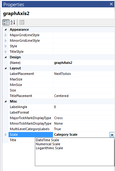
To change the scale type, select the X-axis by clicking it or its labels, and, in the Property Browser window, select DateTime Scale for the Scale property:
For better rendering, set the X-axis
LabelFormatproperty to={0:MMM-yy}. You can add some additional styling to its data points as well, for example, hide the graph legend, edit its title, and set theMarkerTypeto Circle, and increase itsMarkerSizeto 10px.Currently, the Graph displays data for all the vehicle models, but according to the suggested scenario, it needs to display the data only for the current group. To do this, add a Binding to the Graph item, setting
DataSourceas a PropertyPath and=ReportItem.DataObjectas an Expression. You can delete its current data source if you wish.
5. Fix Issues
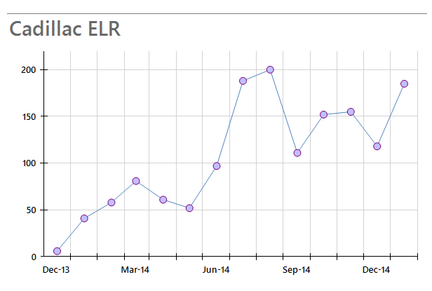
Your report now displays a label and a graph for each vehicle in the data source. However, the layout of the second graph that shows the Cadillac ELR data needs some improvements.
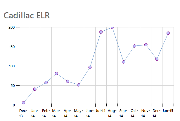
The datapoint marker on August'14 is cut, because the Y axis scale maximum value is automatically calculated as 200, which is exactly the value that this data point represents. In this case, it will be useful to gain control over the minimum and maximum values of the scale according to the current data.
The labels on the X axis scale are too close to each other and that makes the chart unreadable. For this case you have to dynamically set the LabelStep property for a particular set of data. Otherwise, it may be unnecessarily applied.
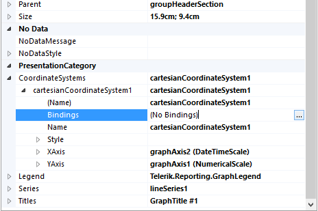
To solve the issues, use the Bindings of the coordinate system:
-
Expand the coordinate system properties in the PropertyGrid and show the Bindings dialog by clicking the button on the right side of the Bindings property.
-
Add a new binding and select
YAxis.Scale.Maximumas a Property path. Since you want to bind the scale maximum with the current graph data, raise the maximum by 10% by setting the following expression on the right:=CDbl(Max(Fields.SalesAmount) + Max(Fields.SalesAmount) * 0.1)The expression result will be of the same type as the property which it applies to. In this case, the
Maximumis of typedoubleand you need to cast the expression result todouble. Otherwise, it won't be applied. -
Add another binding and select
XAxis.Scale.LabelStepas a Property path. The expression will set theLabelStepto 3 if there are more than 10 data points to be displayed:=IIF(CountDistinct(Fields.MonthYear) > 10, 3, 1).However, the
LabelStepproperty will not be applied if theLabelUnitis set toAuto, so you need to change it dynamically toMonthswith the following expression:=IIF(CountDistinct(Fields.MonthYear) > 10, 'Months', 'Auto').When you preview the report with the bindings applied, the graph that shows the Cadillac ELR data looks similar to the following: