Menu Overview
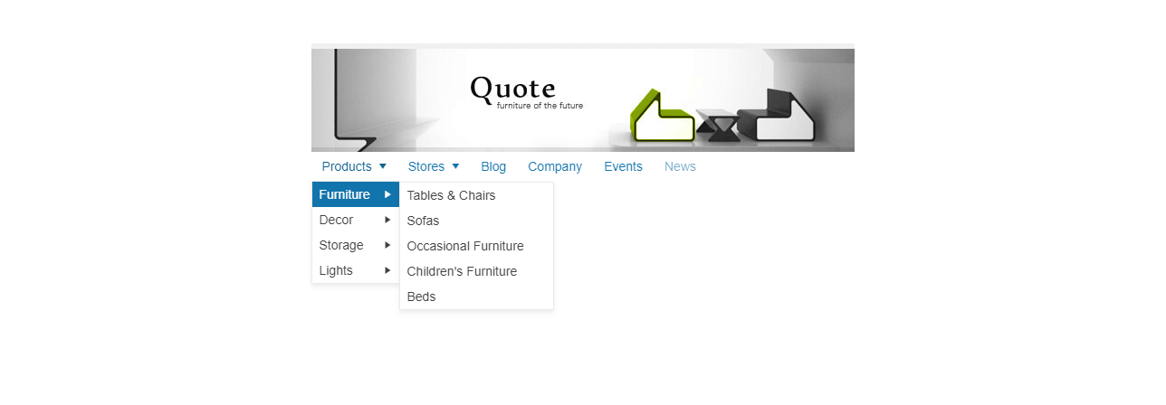
The Menu displays hierarchical data as a multi-level menu.
It provides rich styling for unordered lists of items, and can be used for both navigation and execution of JavaScript commands. Items can be defined and initialized from HTML, or through the configuration options.
The Menu is part of Kendo UI for jQuery, a
professional grade UI library with 110+ components for building modern and feature-rich applications. To try it out sign up for a free 30-day trial.
Initializing the Menu
You can initialize the Menu by using HTML markup or a JSON data
object.
As the Menu has to be initialized after the DOM is fully loaded, create the widget within a
$(document).ready()
statement.
From HTML
The following example demonstrates how to initialize the Menu by using HTML markup.
<ul id="menu">
<li>Normal Item
<ul>
<li><span class="k-sprite icon-class"></span>Item with a Sprite</li>
<li><img src="Icons/contacts.gif" />Item with an Icon</li>
</ul>
</li>
<li><a href="https://www.google.com">Navigation Item</a></li>
<li class="k-state-active">Active Item</li>
<li>Template Item
<div class="k-group k-content">
Test button - <a class="k-button">Button</a>
</div>
</li>
</ul>
<script>
$(document).ready(function() {
$("#menu").kendoMenu();
});
</script>
From JSON
When you initialize the Menu from JSON, you can use a select handler for each item by assigning a function to the select
property.
The following example demonstrates how to initialize the Menu by using a JSON data
object.
<ul id="menu"></ul>
<script>
$(document).ready(function () {
$("#menu").kendoMenu({
dataSource: [{
text: "Item 1",
cssClass: "myClass", // (Optional) Add a custom CSS class to the item.
// Added 2012 Q3 SP1.
url: "https://www.telerik.com" // (Optional) Link a URL if you need navigation.
},
{
text: "<b>Item 2</b>",
encoded: false, // Allow the use of HTML for item text
content: "text" // content within an item.
},
{
text: "Item 3",
imageUrl: "https://www.telerik.com/test.jpg", // (Optional) An item image URL.
items: [{ // A sub-item collection.
text: "Sub Item 1"
},
{
text: "Sub Item 2"
}]
},
{
text: "Item 4",
spriteCssClass: "imageClass3" // (Optional) An item image sprite CSS class.
},
{
text: "Item 5"
}],
select: function (e) { // (Optional) An item select event handler.
// e.sender - Returns a reference to the Menu.
// e.target - Returns the clicked element. Typically, the span.k-link element.
// Handle the event.
}
})
});
</script>
Basic Configuration
The following example demonstrates the basic approach to build a Menu by using HTML markup.
<ul id="MenuID">
<li>root item 1</li>
<liroot item 2
<ul>
<li>child item 1</li>
<li>child item 2</li>
</ul>
</li>
<li>root item 3
<ul>
<li>
<div>Menu template content</div>
</li>
</ul>
</li>
</ul>
To create a Menu based on the previous example, elaborate on the DOM elements in the following way.
- All
<ul>
and<li>
elements receive some of the Kendo UI CSS classes. - If a navigation URL is specified, each menu item text is wrapped in a
span.k-link
element, ora.k-link
element. -
A drop-down arrow (
<span class="k-icon k-i-arrow-s"></span>
) is appended to the.k-link
element of each expandable Menu item.
Once a Menu group is opened, the ul.k-group
element is wrapped by a div.k-animation-container
and the DOM structure is transformed in the following way.
<li class="k-item k-state-default">
<span class="k-link">root item 2
<span class="k-icon k-i-arrow-s"></span>
</span>
<div class="k-animation-container">
<ul class="k-group k-menu-group">
<li class="k-item k-state-default"><span class="k-link">child item 1</span></li>
<li class="k-item k-state-default"><span class="k-link">child item 2</span></li>
</ul>
</div>
</li>