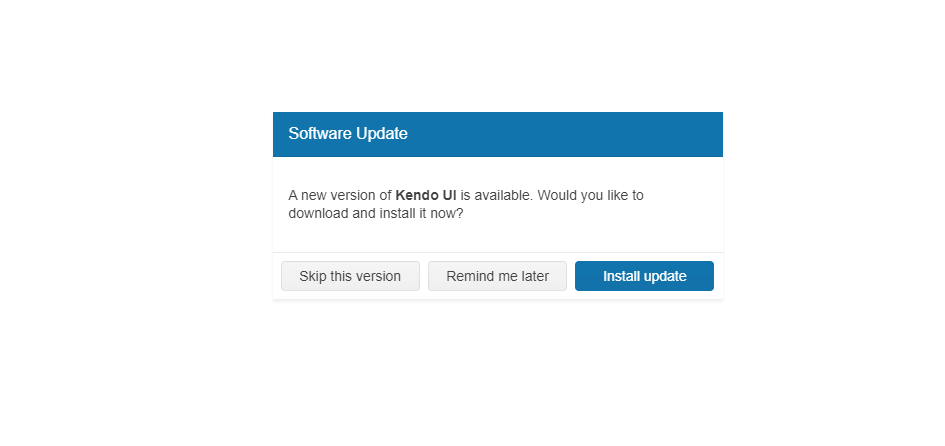
Kendo UI for jQuery Dialog Overview
The Dialog is a modal popup that brings information to the user.
The component also provides actions through its action buttons to prompt the user for input or to ask for a decision. The Dialog can also contain more complex UI elements that require the focus of the user.
The Dialog is a subset of the Kendo UI for jQuery Window where the most prominent difference is the added functionality for actions and predefined dialogs.
The Dialog is part of Kendo UI for jQuery, a professional grade UI library with 110+ components for building modern and feature-rich applications. To try it out sign up for a free 30-day trial.

Functionality and Features
- Basic operations—The jQuery Dialog enables you to perform basic operations such as opening, closing, and destroying the component.
- Predefined Dialog types—You can seamlessly integrate the predefined Dialog types and implement alert, prompt, and confirm dialogs for common use cases in your project.
- Action buttons—The Dialog can also render action buttons, such as OK and Cancel, and allows you to define custom actions for each button.
- Printing—You can also add a printing functionality to the Dialog component and enable the user to print its content.
- Appearance—The Dialog allows you to customize its appearance by setting CSS classes, templates, and other styling options.