Display a Loading animation to TabView Header
Environment
| Product Version | 2020.3.916 |
| Product | TabView for Xamarin |
Description
A common requested user experience is to show that the contents of a tab are being loaded, even if the user is not on that current tab. This tutorial will walk you through adding a RadBusyIndicator to a custom TabViewItem.Header and remotely toggling IsBusy via data binding.
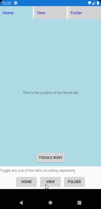
Here's an animation of the final result
Solution
Step 1
First, you need to learn how to use a custom header for a TabViewItem. We have a tuorial already prepared for this, go to Custom TabViewHeader tutorial and complete the tutorial.
Once that is complete, move to Step 2.
Step 2
In your data model class, do two things:
- Add a bool property
IsLoading - Add a Command property named
ToggleLoadingCommand
Here is an example being used in this tutorial's demo
ItemModel.cs
public class ItemModel : NotifyPropertyChangedBase
{
    private bool isLoading;

    public ItemModel(string title, object content)
    {
        TabTitle = title;
        TabContent = content;

        ToggleLoadingCommand = new Command(ToggleLoading);
    }

    public string TabTitle { get; set; }

    public object TabContent { get; set; }

    public bool IsLoading
    {
        get => isLoading;
        set => UpdateValue(ref isLoading, value);
    }

    public Command ToggleLoadingCommand { get; set; }

    private void ToggleLoading()
    {
        IsLoading = !IsLoading;
    }
}
<ControlTemplate x:Key="HeaderControlTemplate">
    <Grid BackgroundColor="LightGray"
          HeightRequest="50">
        <Grid.Triggers>
            <DataTrigger TargetType="Grid"
                         Binding="{TemplateBinding IsSelected}"
                         Value="True">
                <Setter Property="BackgroundColor"
                        Value="LightBlue" />
            </DataTrigger>
            <DataTrigger TargetType="Grid"
                         Binding="{TemplateBinding IsSelected}"
                         Value="False">
                <Setter Property="BackgroundColor"
                        Value="LightGray" />
            </DataTrigger>
        </Grid.Triggers>
        <StackLayout Orientation="Horizontal"
                     Margin="10">
            <Label Text="{TemplateBinding Text}"
                   FontSize="16"
                   TextColor="Blue"
                   HorizontalOptions="Center"
                   VerticalOptions="Center" />
            <telerikPrimitives:RadBusyIndicator IsBusy="{Binding IsLoading, Source={RelativeSource AncestorType={x:Type local:ItemModel}}}"
                                                WidthRequest="50"
                                                HeightRequest="50"
                                                AnimationContentWidthRequest="30"
                                                AnimationContentHeightRequest="30"
                                                AnimationContentColor="Blue" />
        </StackLayout>
    </Grid>
</ControlTemplate>
public class MainViewModel
{
    public MainViewModel()
    {
        TabOneContext = new ItemModel("Home", "This is the content of the Home tab");
        TabTwoContext = new ItemModel("View", "This is the content of the View tab");
        TabThreeContext = new ItemModel("Folder", "This is the content of the Folder tab.");
    }

    public ItemModel TabOneContext { get; set; }

    public ItemModel TabTwoContext { get; set; }

    public ItemModel TabThreeContext { get; set; }
}
MainPage.xaml
<?xml version="1.0" encoding="utf-8" ?>
<ContentPage xmlns="http://xamarin.com/schemas/2014/forms"
             xmlns:x="http://schemas.microsoft.com/winfx/2009/xaml"
             xmlns:d="http://xamarin.com/schemas/2014/forms/design"
             xmlns:mc="http://schemas.openxmlformats.org/markup-compatibility/2006"
             mc:Ignorable="d"
             xmlns:telerikPrimitives="clr-namespace:Telerik.XamarinForms.Primitives;assembly=Telerik.XamarinForms.Primitives"
             xmlns:local="clr-namespace:YourApp.Portable;assembly=YourApp.Portable"
             x:Class="YourApp.Portable.MainPage">

    <ContentPage.Resources>
        <Style x:Key="BodyTextStyle"
               TargetType="Label">
            <Setter Property="Margin"
                    Value="10" />
            <Setter Property="HorizontalOptions"
                    Value="Center" />
            <Setter Property="VerticalOptions"
                    Value="Center" />
        </Style>
        <Style x:Key="ToggleBusyButtonStyle"
               TargetType="Button">
            <Setter Property="Text"
                    Value="Toggle Busy" />
            <Setter Property="Margin"
                    Value="10" />
            <Setter Property="HorizontalOptions"
                    Value="Center" />
            <Setter Property="VerticalOptions"
                    Value="End" />
        </Style>

        <ControlTemplate x:Key="HeaderControlTemplate">
            <Grid BackgroundColor="LightGray"
                  HeightRequest="50">
                <Grid.Triggers>
                    <DataTrigger TargetType="Grid"
                                 Binding="{TemplateBinding IsSelected}"
                                 Value="True">
                        <Setter Property="BackgroundColor"
                                Value="LightBlue" />
                    </DataTrigger>
                    <DataTrigger TargetType="Grid"
                                 Binding="{TemplateBinding IsSelected}"
                                 Value="False">
                        <Setter Property="BackgroundColor"
                                Value="LightGray" />
                    </DataTrigger>
                </Grid.Triggers>
                <StackLayout Orientation="Horizontal"
                             Margin="10">
                    <Label Text="{TemplateBinding Text}"
                           FontSize="16"
                           TextColor="Blue"
                           HorizontalOptions="Center"
                           VerticalOptions="Center" />
                    <telerikPrimitives:RadBusyIndicator IsBusy="{Binding IsLoading, Source={RelativeSource AncestorType={x:Type local:ItemModel}}}"
                                                        WidthRequest="50"
                                                        HeightRequest="50"
                                                        AnimationContentWidthRequest="30"
                                                        AnimationContentHeightRequest="30"
                                                        AnimationContentColor="Blue" />
                </StackLayout>
            </Grid>
        </ControlTemplate>
    </ContentPage.Resources>

    <Grid>
        <Grid.RowDefinitions>
            <RowDefinition />
            <RowDefinition Height="Auto" />
        </Grid.RowDefinitions>

        <telerikPrimitives:RadTabView x:Name="tabView">
            <telerikPrimitives:RadTabView.Items>

                <telerikPrimitives:TabViewItem BindingContext="{Binding TabOneContext}">
                    <telerikPrimitives:TabViewItem.Header>
                        <telerikPrimitives:TabViewHeaderItem Text="Home"
                                                             ControlTemplate="{StaticResource HeaderControlTemplate}" />
                    </telerikPrimitives:TabViewItem.Header>
                    <telerikPrimitives:TabViewItem.Content>
                        <Grid BackgroundColor="LightBlue">
                            <Label Text="{Binding TabContent}"
                                   Style="{StaticResource BodyTextStyle}" />
                            <Button Command="{Binding ToggleLoadingCommand}"
                                    Style="{StaticResource ToggleBusyButtonStyle}" />
                        </Grid>
                    </telerikPrimitives:TabViewItem.Content>
                </telerikPrimitives:TabViewItem>

                <telerikPrimitives:TabViewItem BindingContext="{Binding TabTwoContext}">
                    <telerikPrimitives:TabViewItem.Header>
                        <telerikPrimitives:TabViewHeaderItem Text="{Binding TabTitle}"
                                                             ControlTemplate="{StaticResource HeaderControlTemplate}" />
                    </telerikPrimitives:TabViewItem.Header>
                    <telerikPrimitives:TabViewItem.Content>
                        <Grid BackgroundColor="LightBlue">
                            <Label Text="{Binding TabContent}"
                                   Style="{StaticResource BodyTextStyle}" />
                            <Button Command="{Binding ToggleLoadingCommand}"
                                    Style="{StaticResource ToggleBusyButtonStyle}" />
                        </Grid>
                    </telerikPrimitives:TabViewItem.Content>
                </telerikPrimitives:TabViewItem>

                <telerikPrimitives:TabViewItem BindingContext="{Binding TabThreeContext}">
                    <telerikPrimitives:TabViewItem.Header>
                        <telerikPrimitives:TabViewHeaderItem Text="{Binding TabTitle}"
                                                             ControlTemplate="{StaticResource HeaderControlTemplate}" />
                    </telerikPrimitives:TabViewItem.Header>
                    <telerikPrimitives:TabViewItem.Content>
                        <Grid BackgroundColor="LightBlue">
                            <Label Text="{Binding TabContent}"
                                   Style="{StaticResource BodyTextStyle}" />
                            <Button Command="{Binding ToggleLoadingCommand}"
                                    Style="{StaticResource ToggleBusyButtonStyle}" />
                        </Grid>
                    </telerikPrimitives:TabViewItem.Content>
                </telerikPrimitives:TabViewItem>
            </telerikPrimitives:RadTabView.Items>
        </telerikPrimitives:RadTabView>

        <StackLayout Spacing="5" Grid.Row="1">
            <Label Text="Toggle any one of the tab's IsLoading separately" />
            <StackLayout HorizontalOptions="Center"
                         Orientation="Horizontal"
                         Padding="5"
                         Spacing="5">
                <Button Text="HOME"
                        Clicked="Button_OnClicked" />
                <Button Text="VIEW"
                        Clicked="Button_OnClicked" />
                <Button Text="FOLDER"
                        Clicked="Button_OnClicked" />
            </StackLayout>
        </StackLayout>
    </Grid>
</ContentPage>
MainPage.xaml.cs
public partial class MainPage : ContentPage
{
    public MainPage()
    {
        InitializeComponent();
        BindingContext = new MainViewModel();
    }

    private void Button_OnClicked(object sender, EventArgs e)
    {
        if (sender is Button btn && BindingContext is MainViewModel vm)
        {
            switch (btn.Text)
            {
                case "HOME":
                    vm.TabOneContext.IsLoading = !vm.TabOneContext.IsLoading;
                    break;
                case "VIEW":
                    vm.TabTwoContext.IsLoading = !vm.TabTwoContext.IsLoading;
                    break;
                case "FOLDER":
                    vm.TabThreeContext.IsLoading = !vm.TabThreeContext.IsLoading;
                    break;
            }
        }
    }
}
Resources
For more information, visit the following RadTabView documentation articles.