Getting Started
This article will guide you through the steps needed to add a basic RadSlideView control in your application.
- Setting up the app
- Adding the required Telerik references
- Adding RadSlideView control
- Populating RadSlideView with data
1. Setting up the app
Take a look at these articles and follow the instructions to setup your app:
2. Adding the required Telerik references
You have two options:
- Add the Telerik UI for Xamarin Nuget package following the instructions in Telerik NuGet package server topic.
If you don't want to add the all Telerik.UI.for.Xamarin nuget package, you have the option to add a separate nuget package. For RadSlideView control you have to install the Telerik.UI.for.Xamarin.Primitives nuget package. This nuget will automatically refer the Telerik.UI.for.Xamarin.Common and Telerik.UI.for.Xamarin.SkiaSharp nuget packages.
- Add the references to Telerik assemblies manually, check the list below with the required assemblies for RadSlideView component:
| Platform | Assemblies |
|---|---|
| Portable | Telerik.XamarinForms.Common.dll Telerik.XamarinForms.Primitives.dll |
| Android | Telerik.Xamarin.Android.Common.dll Telerik.Xamarin.Android.Primitives.dll Telerik.XamarinForms.Common.dll Telerik.XamarinForms.Primitives.dll |
| iOS | Telerik.Xamarin.iOS.dll Telerik.XamarinForms.Common.dll Telerik.XamarinForms.Primitives.dll |
| UWP | Telerik.Core.dll Telerik.UI.Xaml.Primitives.UWP.dll Telerik.XamarinForms.Common.dll Telerik.XamarinForms.Primitives.dll |
3. Adding RadSlideView control
You could use one of the following approaches:
Drag the control from the Toolbox.
Take a look at the following topics on how to use the toolbox:
Create the control definition in XAML or C#.
The snippet below shows a simple RadSlideView definition:
<telerikPrimitives:RadSlideView x:Name="slideView" />
var listView = new SlideView();
In addition to this, you need to add the following namespace:
xmlns:telerikPrimitives="clr-namespace:Telerik.XamarinForms.Primitives;assembly=Telerik.XamarinForms.Primitives"
using Telerik.XamarinForms.Primitives;
4. Populating RadSlideView with data
RadSlideView is populated via its ItemsSource property. The control will display an indicator for each item in the ItemsSource and display the view of the selected item.
The next snippet shows how you could set the control's ItemsSource property and populate it with some data.
<telerikPrimitives:RadSlideView x:Name="slideView">
    <telerikPrimitives:RadSlideView.ItemsSource>
        <x:Array Type="{x:Type ContentView}">
            <ContentView>
                <telerikInput:RadCalendar Margin="50, 30"/>
            </ContentView>
            <ContentView>
                <Label HorizontalOptions="Center" VerticalOptions="CenterAndExpand" Text="Other View" TextColor="Blue" />
            </ContentView>
            <ContentView>
                <Label HorizontalOptions="Center" VerticalOptions="CenterAndExpand" Text="Another View" TextColor="Red" />
            </ContentView>
        </x:Array>
    </telerikPrimitives:RadSlideView.ItemsSource>
</telerikPrimitives:RadSlideView>
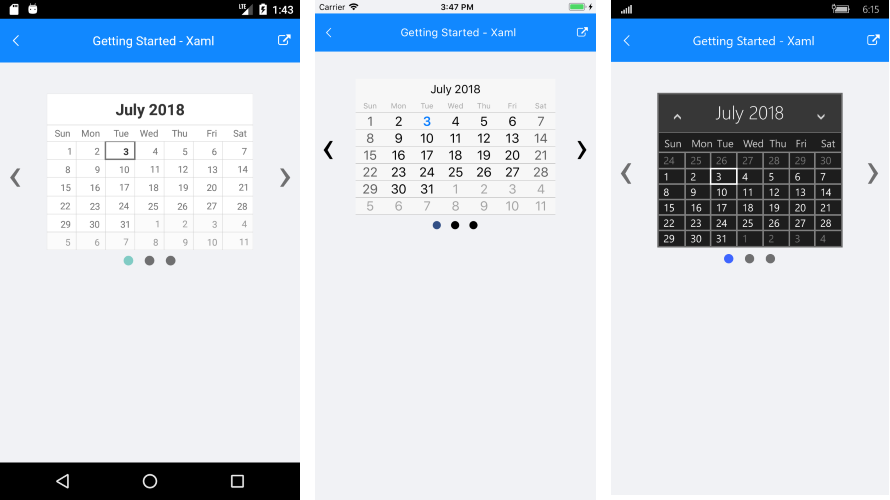
Figure 1: RadSlideView example
Check the ItemTemplate article to see how to populate the control with business items and customize their appearance.
SDK Browser and QSF applications contain different examples that show RadSlideViews's main features. You can find the applications in the Examples and QSF folders of your local Telerik UI for Xamarin installation.