Theming and Style
RadMaskedInput exposes the following properties for customizing the appearance of the control:
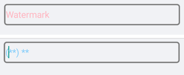
- WatermarkText(string): Specifies the text used as watermark.
- WatermarkTextColor(Color): Specifies the color of the text of the watermark.
- DisplayedText(string): Gets the displayed text.(ReadOnly)
- DisplayedTextColor(Color): Defines the color of the displayed text.
- DisplayedTextFont(string): Defines the font of the displayed text.
- DisplayedTextFontSize(double): Defines the size of the font used for the displayed text.
- BorderStyle(of type Telerik.XamarinForms.Input.BorderStyle) Gets or sets a Telerik.XamarinForms.Input.RadMaskedInput.BorderStyle defining the look of the border around the entry. The default value is defined by the OS.
- Placeholder(char): Specifies the symbol that will be used to mark an empty position. The default value is '_'.
Example
Here is the RadMaskedInput definition with the properties described above applied:
<StackLayout>
    <telerikInput:RadMaskedInput x:Name="maskedInput"
                                 WatermarkText="Watermark"
                                 WatermarkTextColor="LightPink"
                                 DisplayedTextColor="LightSkyBlue"
                                 DisplayedTextFontSize="20"
                                 Placeholder="*"
                                 Mask="(CC) 00"
                                 MaskType="Text">
        <telerikInput:RadMaskedInput.BorderStyle>
            <telerikInput:BorderStyle BorderColor="Gray"
                                      BorderThickness="3"
                                      CornerRadius="5"/>
        </telerikInput:RadMaskedInput.BorderStyle>
    </telerikInput:RadMaskedInput>
</StackLayout>
Here is how the control looks when the above properties are applied:
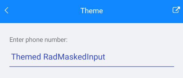
And here is how the control looks when Theming is applied:
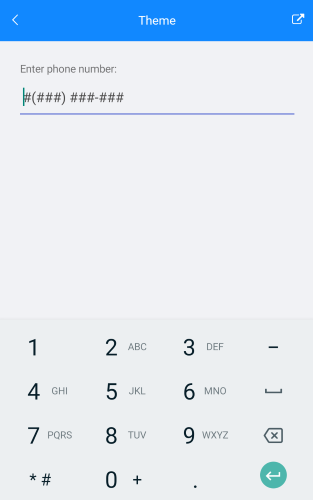
And how the MaskedInput control looks when in edit mode with Keyboard type Telephone.
You can find a working demo labeled Theme in the MaskedInput/Features folder of the SDK Samples Browser application.