Load On Demand
In specific cases you may need to load data in the DataGrid when the control is already displayed as this can improve the performance and save computing resources. Loading a large data set on a mobile device has its challenges. One of the most popular approaches is using incremental data loading in the moment the items need to be visualized.
Configuration
DataGrid offers two loading modes which are present in the LoadOnDemandMode enumeration:
-
Automatic: The load-on-demand mechanism is activated when you scroll down near the last item present in the view port.
You can control when the items will start loading more precisely by setting the LoadOnDemandBufferItemsCount property. It indicates at what point the additional items will start loading. For example, setting it to 20 will cause the new items to be loaded when you have scrolled the RadDataGrid so that only 20 of the originally loaded items are left below.
Manual: A "Load More" button is present at the bottom of the RadDataGrid. Clicking it will load additional items based on the approach you have chosen for loading the items(through the event, the command or the collection).
Methods to Load Data on Demand
There are three different options to load the data on demand, regardless of whether you use the Automatic or Manual loading mode. You can choose the most convenient for you based on your application requirements:
All three approaches for loading items on demand in ListView work with both Automatic and Manual LoadOnDemandMode.
Using the LoadOnDemand Collection
In order to use this approach, you should feed the RadDataGrid with a collection of type LoadOnDemandCollection. It is a generic type, so you need to point the type of objects it will contain. It extends the ObservableCollection<T> class and expects a Func<CancellationToken, IEnumerable> in the constructor.
Here is a simple setup that shows how to use the collection:
-
Define a sample ViewModel class with Items property of type LoadOnDemandCollection:
public class LoadOnDemandViewModel { public LoadOnDemandViewModel() { this.Items = new LoadOnDemandCollection<Person>((cancelationToken) => { var list = new List<Person>(); for (int i = 0; i < 10; i++) { var person = new Person { Name = "LOD Person " + i, Age = i + 18, Gender = i % 2 == 0 ? Gender.Male : Gender.Female }; list.Add(person); } return list; }); //set initial items for (int i = 0; i < 20; i++) { var person = new Person { Name = "Person " + i, Age = i + 18, Gender = i % 2 == 0 ? Gender.Male : Gender.Female }; this.Items.Add(person); } } public LoadOnDemandCollection<Person> Items { get; set; } } -
Add the sample Person data item:
public class Person { public string Name { get; set; } public int Age { get; set; } public Gender Gender { get; set; } } -
Define RadDataGrid instance and bind its ItemsSource to the data in the ViewModel. Note the approach will work with both Manual and Automatic loading modes.
<telerikGrid:RadDataGrid x:Name="dataGrid" ItemsSource="{Binding Items}" LoadOnDemandMode="Manual" /> -
Set the ViewModel as BindingContext in the page constructor:
this.BindingContext = new LoadOnDemandViewModel();A sample LoadOnDemandCollection example is available in DataGrid -> LoadOnDemand folder of the SDK Browser application.
You can directly explore the code in the SDK Samples Browser repository on GitHub.
Using LoadOnDemand Event
You can load new items by utilizing the LoadOnDemand event. It uses LoadOnDemandEventArgs arguments through which you need to indicate when the data is loaded so that the event is correctly fired afterwards.
The example below demonstrates how to use the LoadOnDemand event:
-
Define RadDataGrid instance with LoadOnDemand event assigned:
<telerikGrid:RadDataGrid x:Name="dataGrid" LoadOnDemand="DataGrid_LoadOnDemand" LoadOnDemandMode="Automatic" LoadOnDemandBufferItemsCount="10" /> -
Set DataGrid ItemsSource in page constructor:
var items = new ObservableCollection<Person>(); for (int i = 0; i < 20; i++) { var person = new Person { Name = "Person " + i, Age = i + 18, Gender = i % 2 == 0 ? Gender.Male : Gender.Female }; items.Add(person); } this.dataGrid.ItemsSource = items; -
Add the sample Person data item:
public class Person { public string Name { get; set; } public int Age { get; set; } public Gender Gender { get; set; } } -
Add the LoadOnDemand event handler:
private void DataGrid_LoadOnDemand(object sender, Telerik.XamarinForms.DataGrid.LoadOnDemandEventArgs e)
{
for (int i = 0; i < 15; i++)
{
    ((sender as RadDataGrid).ItemsSource as ObservableCollection<Person>).Add(new Person() { Name = "Person " + i, Age = i + 18, Gender = i % 2 == 0 ? Gender.Male : Gender.Female });
}
e.IsDataLoaded = true;
}
A sample LoadOnDemand Event example is available in DataGrid -> LoadOnDemandEvent folder of the SDK Browser application.
You can directly explore the code in the SDK Samples Browser repository on GitHub.
Using LoadMoreData Command
The LoadMoreData command is another alternative which you can use which is suitable for MVVM scenarios.
Check below an example on how to create a LoadMoreData command:
-
Add a CustomLoadMoreDataCommand class which inherits from
DataGridCommandclass and set its Id toDataGridCommandId.LoadMoreData. Inside the Execute method add the needed logic for loading the data.public class CustomLoadMoreDataCommand : DataGridCommand { public CustomLoadMoreDataCommand() { this.Id = DataGridCommandId.LoadMoreData; } public override bool CanExecute(object parameter) { return true; } public async override void Execute(object parameter) { if (parameter == null) { return; } ((LoadOnDemandContext)parameter).ShowLoadOnDemandLoadingIndicator(); await System.Threading.Tasks.Task.Delay(1500); var viewModel = this.Owner.BindingContext as LoadMoreDataCommandViewModel; if (viewModel != null) { for (int i = 0; i < 10; i++) { viewModel.Items.Add(new Person { Name = "Person " + i, Age = i + 18, Gender = i % 2 == 0 ? Gender.Male : Gender.Female }); } } ((LoadOnDemandContext)parameter).HideLoadOnDemandLoadingIndicator(); } }Invoking the ShowLoadOnDemandLoadingIndicator and HideLoadOnDemandLoadingIndicators is a noteable part as without calling these methods the BusyIndicator used for the functionality will not be visualized.
-
Add a sample ViewModel class in order to load initial data:
public class LoadMoreDataCommandViewModel { public LoadMoreDataCommandViewModel() { this.Items = new ObservableCollection<Person>(); for (int i = 0; i < 20; i++) { var person = new Person { Name = "Person " + i, Age = i + 18, Gender = i % 2 == 0 ? Gender.Male : Gender.Female }; this.Items.Add(person); } } public ObservableCollection<Person> Items { get; set; } } -
Add the sample Person data item:
public class Person { public string Name { get; set; } public int Age { get; set; } public Gender Gender { get; set; } } -
Define the RadDataGrid instance in XAML with the
CustomLoadMoreDataCommandcommand added to its Commands collection:<telerikGrid:RadDataGrid x:Name="dataGrid" ItemsSource="{Binding Items}" LoadOnDemandMode="Automatic" LoadOnDemandBufferItemsCount="10"> <telerikGrid:RadDataGrid.Commands> <local:CustomLoadMoreDataCommand /> </telerikGrid:RadDataGrid.Commands> </telerikGrid:RadDataGrid> -
Set the ViewModel as BindingContext in the page constructor:
this.BindingContext = new LoadMoreDataCommandViewModel();A sample LoadOnDemand Event example is available in DataGrid -> LoadMoreDataCommand folder of the SDK Browser application.
You can directly explore the code in the SDK Samples Browser repository on GitHub.
Styling
Besides the different approaches for loading the data, RadDataGrid exposes several mechanisms related to the styling of the functionality which you can use according to the approach you have chosen.
LoadOnDemandAutoTemplate
Setting this property will modify the appearance of the load on demand indicator when the LoadOnDemandMode is Automatic.
Here is an example of custom DataTemplate:
<DataTemplate x:Key="CustomLoadOnDemandAutoTemplate">
    <Label HorizontalOptions="FillAndExpand"
           VerticalOptions="CenterAndExpand"
           Text="Auto Loading"
           FontSize="25"
           TextColor="Orange"
           BackgroundColor="PaleTurquoise"
           IsVisible="{Binding IsDataLoading}"/>
</DataTemplate>
And how you set it to the LoadOnDemandAutoTemplate property of the RadDataGrid:
<grid:RadDataGrid x:Name="dataGrid" ItemsSource="{Binding Items}"
                             LoadOnDemand="dataGrid_LoadOnDemand"
                             LoadOnDemandMode="Automatic"
                             LoadOnDemandAutoTemplate="{StaticResource CustomLoadOnDemandAutoTemplate}"
                             LoadOnDemandBufferItemsCount="{Binding Source={x:Reference slider}, Path=Value}"/>
Figure 1: The appearance of the row after setting the LoadOnDemandAutoTemplate

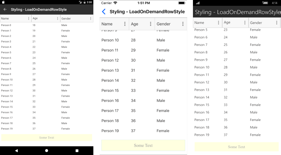
LoadOnDemandRowStyle
This property can be used to style the appearance of the row that contains the "Load More" button when the LoadOnDemandMode is Manual.
The custom style is of type DataGridLoadOnDemandRowStyle:
<telerikDataGrid:DataGridLoadOnDemandRowStyle x:Key="CustomDataGridLoadOnDemandRowStyle"
                                              BackgroundColor="LightYellow"
                                              BorderColor="LightBlue"
                                              IndicatorAnimationColor="Orange"
                                              IndicatorAnimationType="Animation5"
                                              HorizontalTextAlignment="Center"
                                              VerticalTextAlignment="Center"
                                              OverlayOpacity="0.5"
                                              Text="Some Text"
                                              TextFontSize="16"
                                              TextColor="DarkGray"
                                              TextFontFamily="Times New Roman"/>
And you should set it to the LoadOnDemandRowStyle property of the RadDataGrid:
<grid:RadDataGrid x:Name="dataGrid" ItemsSource="{Binding Items}"
                             LoadOnDemand="dataGrid_LoadOnDemand"
                             LoadOnDemandMode="Manual"
                             LoadOnDemandRowStyle="{StaticResource CustomDataGridLoadOnDemandRowStyle}"/>
Figure 2: The appearance of the row after setting the LoadOnDemandRowStyle
LoadOnDemandRowTemplate
This property can be used to set the template of the row that contains the "Load More" button when the LoadOnDemandMode is Manual.
Here is a custom DataTemplate:
<DataTemplate x:Key="CustomLoadOnDemandRowTemplate">
    <Label Text="Load more from Template"
           Margin="0,30,0,30"
           HorizontalOptions="CenterAndExpand"
           VerticalOptions="CenterAndExpand"
           IsEnabled="{Binding IsDataLoading}">
        <Label.Triggers>
            <Trigger TargetType="Label"
                     Property="IsEnabled" Value="False">
                <Setter Property="BackgroundColor" Value="LightBlue" />
            </Trigger>
        </Label.Triggers>
    </Label>
</DataTemplate>
And how you set the property:
<grid:RadDataGrid x:Name="dataGrid" ItemsSource="{Binding Items}"
                             LoadOnDemand="dataGrid_LoadOnDemand"
                             LoadOnDemandMode="Manual"
                             LoadOnDemandRowTemplate="{StaticResource CustomLoadOnDemandRowTemplate}"/>
Figure 3: The appearance of the row after setting the LoadOnDemandRowTemplate
