Key Features
The purpose of this help article is to show you the key features of the RadCheckBox control.
CheckBox States
RadCheckBox provides three states – Checked, Unchecked and Indeterminate. The state is controlled through the IsChecked property which is of type bool?. All the states could be set either through the UI or programmatically ( Indeterminate could be applied through UI only for three-state checkboxes).
- Checked/Unchecked state - when IsChecked is true/false respectively;
- Indeterminate state - when IsChecked is null;
- IsThreeState (bool) - Defines whether the Indeterminate state could be applied through the UI. When IsThreeState is true it allows the end user to go to Indeterminate state along with the Checked and Unchecked states. The default value is false.
The default value of IsChecked is false.
Here is an example how you can set the Indeterminate state through the UI when IsThreeState is true:
<telerikPrimitives:RadCheckBox x:Name="checkboxIsChecked" IsChecked="{Binding IsChecked}" IsThreeState="True" />
and the ViewModel:
public class ViewModel : NotifyPropertyChangedBase
{
    private bool? isChecked;

    public bool? IsChecked
    {
        get { return this.isChecked; }
        set
        {
            if (this.isChecked != value)
            {
                this.isChecked = value;
                OnPropertyChanged();
            }
        }
    }
}
CheckBox Length
The width and height of the checkbox is controlled through the Length property and maintains a 1:1 aspect ratio.
Here is an example of setting the Length value:
<telerikPrimitives:RadCheckBox x:Name="checkboxLength" Length="40" StrokeWidth="5"/>
Stroke Thickness
The RadCheckBox control exposes a StrokeWidth property that specifies the width of the lines with which the Checkbox element is drawn. It affects the border of the control as well as the check mark.
Here is an example how you can apply a StrokeWidth value:
<telerikPrimitives:RadCheckBox x:Name="checkboxStrokeWidth" StrokeWidth="5"/>
Example
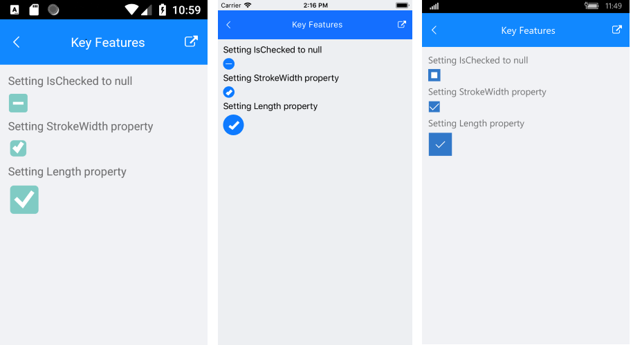
Here is the result at runtime showing the above Indeterminate state as well as StrokeWidth and Length examples:
RadCheckBox follows the guidelines of the operating system, meaning that on iOS it is visualized as circle and on Android and UWP - as square.