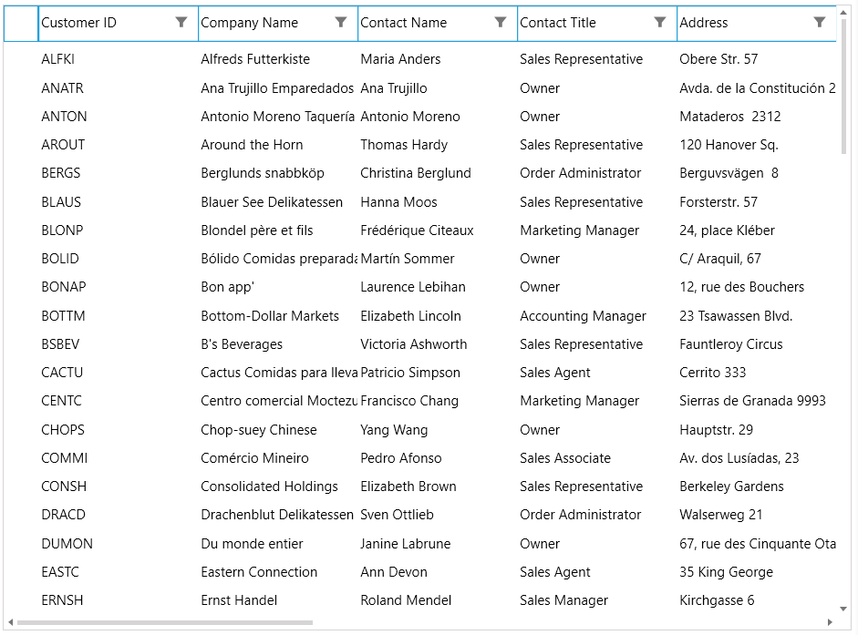
Getting Started with WPF VirtualGrid
This tutorial will walk you through the required steps for using RadVirtualGrid.
- Adding Telerik Assemblies Using NuGet
- Adding Assembly References Manually
- Adding RadVirtualGrid to the Project
- Populating with Data
- Populating with Data through DataProvider
- MeasureTextOnRender
Adding Telerik Assemblies Using NuGet
To use RadVirtualGrid when working with NuGet packages, install the Telerik.Windows.Controls.VirtualGrid.for.Wpf.Xaml package. The package name may vary slightly based on the Telerik dlls set - Xaml or NoXaml
Read more about NuGet installation in the Installing UI for WPF from NuGet Package article.
With the 2025 Q1 release, the Telerik UI for WPF has a new licensing mechanism. You can learn more about it here.
Adding Assembly References Manually
If you are not using NuGet packages, you can add a reference to the following assemblies:
- Telerik.Licensing.Runtime
- Telerik.Windows.Controls
- Telerik.Windows.Controls.VirtualGrid
- Telerik.Windows.Data
Adding RadVirtualGrid to the Project
Defining RadVirtualGrid Declaratively
<telerik:RadVirtualGrid x:Name="VirtualGrid"/>
Populating with Data Manually
In order the control to be populated with data, its InitialRowCount and InitialColumnCount properties need to be set.
RadVirtualGrid needs to be initially defined with a fixed amount of rows and columns. The below listed properties are exposed for achieving this. An important note is that when additional rows or columns are added at runtime, the values of these properties remain unmodified, but the capacity of the control increases. More information on inserting rows and columns can be found in the Insert and Remove Data topic.
-
InitialRowCount—Gets or sets the amount of initially loaded rows -
InitialColumnCount—Gets or sets the amount of initially loaded columns
Setting the InitialRowCount and InitialColumnCount properties
<telerik:RadVirtualGrid x:Name="VirtualGrid"
                            InitialColumnCount="5"
                            InitialRowCount="5"/>
The control populates its data through the CellValueNeeded event. It is raised when the control is initially loaded and when newly data is about to be loaded on demand when the user scrolls horizontally or vertically. The event arguments expose the following properties:
CellValueNeeded
-
CellIndex—Provides information regarding the index of the currently loaded cell. -
RowIndex—Provides information regarding the index of the currently loaded row. -
Value—Through it the needed value for the respective cell can be set.
Populating RadVirtualGrid with data through the CellValueNeeded event
private void virtualGrid_CellValueNeeded(object sender,
        Telerik.Windows.Controls.VirtualGrid.CellValueEventArgs e)
    {
        e.Value = String.Format("{0}.{1}", e.RowIndex, e.ColumnIndex);
    }
RadVirtualGrid populated with data

Populating with Data Through DataProvider
Instead of using the CellValueNeeded event, RadVirtualGrid provides an option to populate its data through the built-in DataProvider mechanism. The DataProvider object accepts an IEnumerable through its constructor and can be applied to RadVirtualGrid through its relevant property.
When populating data with a
DataProvider, it handles most of the operations of RadVirtualGrid out-of-the-box. Thus, the events that are intended to be used for manually populating and manipulating the data of the control will not be raised.
Applying a DataProvider
this.VirtualGrid.DataProvider = new Telerik.Windows.Controls.VirtualGrid.DataProvider(this.myCollection);
The DataProvider mechanism is intended to cover basic scenarios for populating the control with data. For extending the default behavior, RadVirtualGrid provides support for Custom DataProvider
MeasureTextOnRender
The MeasureTextOnRender property indicates whether the text is measured on rendering. Its default value is False. When set to True, the usage of the FitColumnWidthToContent and CellTextAlignment mechanisms is enabled. Note, that this may affect the performance of the control.
If the MeasureTextOnRender property is set to True, the FitColumnWidthToContent method will return the calculated column width. Otherwise, the return value will be 0.0.
Setting a Theme
The controls from our suite support different themes. You can see how to apply a theme different than the default one in the Setting a Theme help article.
Changing the theme using implicit styles will affect all controls that have styles defined in the merged resource dictionaries. This is applicable only for the controls in the scope in which the resources are merged.
To change the theme, you can follow the steps below:
Choose between the themes and add reference to the corresponding theme assembly (ex: Telerik.Windows.Themes.Windows8.dll). You can see the different themes applied in the Theming examples from our WPF Controls Examples application.
-
Merge the ResourceDictionaries with the namespace required for the controls that you are using from the theme assembly. For RadVirtualGrid, you will need to merge the following resources:
- Telerik.Windows.Controls
- Telerik.Windows.Controls.VirtualGrid
The following example demonstrates how to merge the ResourceDictionaries so that they are applied globally for the entire application.
Merge the ResourceDictionaries
    <Application.Resources>
        <ResourceDictionary>
            <ResourceDictionary.MergedDictionaries>
                <ResourceDictionary Source="/Telerik.Windows.Themes.Windows8;component/Themes/System.Windows.xaml"/>
                <ResourceDictionary Source="/Telerik.Windows.Themes.Windows8;component/Themes/Telerik.Windows.Controls.xaml"/>
                <ResourceDictionary Source="/Telerik.Windows.Themes.Windows8;component/Themes/Telerik.Windows.Controls.VirtualGrid.xaml"/>
            </ResourceDictionary.MergedDictionaries>
        </ResourceDictionary>
    </Application.Resources>
RadVirtualGrid with the Windows8 theme

See also
Telerik UI for WPF Learning Resources
- Telerik UI for WPF VirtualGrid Component
- Getting Started with Telerik UI for WPF Components
- Telerik UI for WPF Installation
- Telerik UI for WPF and WinForms Integration
- Telerik UI for WPF Visual Studio Templates
- Setting a Theme with Telerik UI for WPF
- Telerik UI for WPF Virtual Classroom (Training Courses for Registered Users)
- Telerik UI for WPF License Agreement