ItemContainerStyle
The Telerik RadTreeView supports styling its RadTreeViewItem elements.
To style the items you can use the ItemContainerStyle property of RadTreeView. The container created by the RadTreeView for each item in the collection is of type RadTreeViewItem. The style defined for the ItemContainerStyle property should have the RadTreeViewItem class as TargetType.
Example 1: RadTreeView definition
<UserControl.Resources>
    <sampleData:RadTreeViewSampleData x:Key="DataSource"/>
    <DataTemplate x:Key="Team">
        <TextBlock Text="{Binding Name}" />
    </DataTemplate>
    <HierarchicalDataTemplate x:Key="Division" ItemTemplate="{StaticResource Team}"
       ItemsSource="{Binding Teams}">
        <TextBlock Text="{Binding Name}" />
    </HierarchicalDataTemplate>
    <HierarchicalDataTemplate x:Key="League" ItemTemplate="{StaticResource Division}"
       ItemsSource="{Binding Divisions}">
        <TextBlock Text="{Binding Name}" />
    </HierarchicalDataTemplate>
</UserControl.Resources>

<Grid x:Name="LayoutRoot" Background="White">
    <telerik:RadTreeView x:Name="radTreeView"
       ItemsSource="{Binding Source={StaticResource DataSource}, Path=LeaguesDataSource}"
       ItemTemplate="{StaticResource League}"/>
</Grid>
The data source class RadTreeViewSampleData assigned to the RadTreeView is covered in greater details in the chapter Binding to Object.
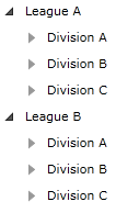
Figure 1: Result from Example 1
Defining the style in the resources of the control or in the resources of the application makes it reusable.
ItemContainerStyle Definition
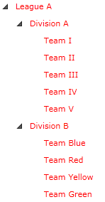
Example 2 demonstrates how to create an ItemContainerStyle, which sets the Foreground and IsExpanded properties of the items.
Example 2: ItemContainerStyle Definition
<!-- If you are using the NoXaml binaries, you will have to base the style on the default one for the theme like so:
<Style x:Key="myItemContainerStyle" TargetType="telerik:RadTreeViewItem" BasedOn="{StaticResource RadTreeViewItemStyle}">-->

<Style x:Key="myItemContainerStyle" TargetType="telerik:RadTreeViewItem">
    <Setter Property="Foreground" Value="Red"/>
    <Setter Property="IsExpanded" Value="True"/>
</Style>
Example 3: Setting the ItemContainerStyle property
<telerik:RadTreeView x:Name="radTreeView"
   ItemsSource="{Binding Source={StaticResource DataSource}, Path=LeaguesDataSource}"
   ItemTemplate="{StaticResource League}"
   ItemContainerStyle="{StaticResource myItemContainerStyle}"/>
Figure 2: Result from Example 3
When using ItemContainerStyle with static items, it will get applied only to the direct children of the RadTreeView - the top-level items. If you want their child items to have the same style, you have to manually set the ItemContainerStyle property of the RadTreeViewItems.
When using the ItemContainerStyle with dynamic items, its value gets inherited through the hierarchy thanks to the HierarchicalDataTemplate. You are free to break the inheritance, when needed, by using multiple nested HierarchicalDataTemplates and by setting the ItemContainerStyle property of each of them.
If you have different items and/or you prefer to display items with different styles, you can use the ItemContainerStyleSelector property of RadTreeView.
The ItemContainerStyle setting is overridden by the StyleManager's applied theme in case the theme is set to the RadTreeView control using the StyleManager.Theme attached property. To use a theme different than the default one and ItemContainerStyle you can use the the Implicit Styles theming mechanism.