Getting Started with WPF TransitionControl
The RadTransitionControl derives from ContentControl and its purpose is to visualize some content (UserControls, UIElements, Data etc). Additionally it can apply transition effects upon changing its content. This tutorial will help you get started with the RadTransitionControl basics.
Adding Telerik Assemblies Using NuGet
To use RadTransitionControl when working with NuGet packages, install the Telerik.Windows.Controls.for.Wpf.Xaml package. The package name may vary slightly based on the Telerik dlls set - Xaml or NoXaml
Read more about NuGet installation in the Installing UI for WPF from NuGet Package article.
With the 2025 Q1 release, the Telerik UI for WPF has a new licensing mechanism. You can learn more about it here.
Adding Assembly References Manually
If you are not using NuGet packages, you can add a reference to the following assemblies:
- Telerik.Licensing.Runtime
- Telerik.Windows.Controls
Add a RadTransitionControl to your application
In order to add a RadTransitionControl to your application, you have to simply create an instance of it in your XAML. As the RadTransitionControl is located in the Telerik.Windows.Controls namespace of the Telerik.Windows.Controls assembly, you have to add the following namespace declaration in your UserControl:
Example 1: Adding telerik namespace
xmlns:telerik="clr-namespace:Telerik.Windows.Controls;assembly=Telerik.Windows.Controls"
Example 2: Creating a RadTransitionControl
<telerik:RadTransitionControl x:Name="radTransitionControl" />
The RadTransitionControl doesn't have any visual elements, so if it has no content, nothing will be visualized.
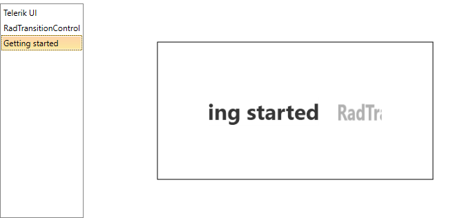
Display strings listed in a RadListBox
The RadTransitionControl is a content control. Besides displaying content it can apply transition effects upon its change. To make you familiar with this, a collection of RadListBoxItems will be used in this tutorial, which will be listed in a RadListBox control. The content of the selected RadListBoxItem should appear as content of the RadTransitionControl. Changing the selected item should change the content of the control, too.
Here is a sample RadListBox definition, which is populated with RadListBoxItems with a string for Content.
Example 3: Sample RadListBox definition
 <telerik:RadListBox x:Name="radListBox">
    <telerik:RadListBox.Items>
        <telerik:RadListBoxItem Content="Telerik UI" />
        <telerik:RadListBoxItem Content="RadTransitionControl" />
        <telerik:RadListBoxItem Content="Getting started" />
    </telerik:RadListBox.Items>
</telerik:RadListBox>
The content of the RadTransitionControl should be represented by the content of the SelectedItem in the RadListBox. This can be done by using element to element binding.
You can learn more about binding the RadTransitionControl in the Data Binding topic.
Example 4: Binding RadTransitionControl Content
<Grid>
    <Grid.ColumnDefinitions>
        <ColumnDefinition Width="Auto" />
        <ColumnDefinition Width="*"/>
    </Grid.ColumnDefinitions>
    <telerik:RadListBox x:Name="radListBox">
        <telerik:RadListBox.Items>
            <telerik:RadListBoxItem Content="Telerik UI" />
            <telerik:RadListBoxItem Content="RadTransitionControl" />
            <telerik:RadListBoxItem Content="Getting started" />
        </telerik:RadListBox.Items>
    </telerik:RadListBox>

    <Border Margin="50 0 0 0" Grid.Column="1" BorderThickness="1" BorderBrush="Black" Width="400" Height="200" >
        <telerik:RadTransitionControl
                        FontSize="35"
                        FontWeight="Bold"
                        HorizontalAlignment="Center"
                        VerticalAlignment="Center"
                        Content="{Binding SelectedItem.Content, ElementName=radListBox}">
        </telerik:RadTransitionControl>
    </Border>
</Grid>
If you run your application at this point, the content of the RadTransitionControl should change when you select an item in the RadListBox.
Change default transition
The RadTransitionControl automatically detects when the content is changed and applies a transition to the content. The default transition is MotionBlurredZoomTransition.
To learn more about the transitions in the RadTransitionControl read the Transitions topic.
As the built-in transition effects are located in the Telerik.Windows.Controls.TransitionEffects namespace of the Telerik.Windows.Controls assembly, you have to add the following namespace declaration in your UserControl:
Example 5: Adding TransitionEffects namespace
xmlns:telerikTransitions="clr-namespace:Telerik.Windows.Controls.TransitionEffects;assembly=Telerik.Windows.Controls"
In order to change the applied transition you can set the Transition property of the RadTransitionControl to one of the available transitions in the TransitionEffects namespace.
Example 6: Applying SlideAndZoomTransition to RadTransitionControl
 <telerik:RadTransitionControl
                        Grid.Column="1"
                        FontSize="35"
                        FontWeight="Bold"
                        HorizontalAlignment="Center"
                        VerticalAlignment="Center"
                        Content="{Binding SelectedItem.Content, ElementName=radListBox}">
    <telerik:RadTransitionControl.Transition>
        <telerikTransitions:SlideAndZoomTransition />
    </telerik:RadTransitionControl.Transition>
</telerik:RadTransitionControl>
Figure 1: Result from Example 6
Telerik UI for WPF Learning Resources
- Telerik UI for WPF TransitionControl Component
- Getting Started with Telerik UI for WPF Components
- Telerik UI for WPF Installation
- Telerik UI for WPF and WinForms Integration
- Telerik UI for WPF Visual Studio Templates
- Setting a Theme with Telerik UI for WPF
- Telerik UI for WPF Virtual Classroom (Training Courses for Registered Users)
- Telerik UI for WPF License Agreement