How to Customize the Look of the Tick Marks Using TickTemplateSelector
The TickTemplateSelector property gives you the ability to display ticks with different templates. This tutorial will walk you through the common task of creating and applying TickTemplateSelector.
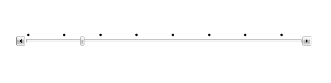
Having the following Slider declaration, every fourth tick will be displayed:
Example 1: Defining the RadSlider
<telerik:RadSlider x:Name="MySlider"
                   HandlesVisibility="Visible"
                   IsSnapToTickEnabled="True"
                   Maximum="30"
                   SmallChange="1"
                   TickFrequency="1"
                   TickPlacement="TopLeft" />
First, you have to create two DataTemplates in the resources of your application. In the first one the tick marks will be displayed as Ellipses and the second one will be empty.
Example 2: Creating a custom template for the ticks
<DataTemplate x:Key="EllipseTemplate">
    <Grid>
        <Ellipse Width="5"
                 Height="5"
                 Fill="Black" />
    </Grid>
</DataTemplate>

<DataTemplate x:Key="EmptyTemplate">
    <Grid />
</DataTemplate>
The next step is to create the TickTemplateSelector and choose the appropriate template depending on the numeric value of the tick:
When you create a TickTemplateSelector, you must derive from the DataTemplateSelector class.
Example 3: Defining the custom template selector
public class TickTemplateSelector : DataTemplateSelector
{
}
Public Class TickTemplateSelector
    Inherits DataTemplateSelector
End Class
Override, the SelectTemplate method and implement your custom logic in it. The method accepts the following arguments:
object: The actual object being bound.
DependencyObject: The container for the object argument.
Example 4: Overriding the SelectTemplate method
public class TickTemplateSelector : DataTemplateSelector
{
    public DataTemplate EllipseTemplate { get; set; }
    public DataTemplate EmptyTemplate { get; set; }
    public override DataTemplate SelectTemplate(object item, DependencyObject container)
    {
        double tick = Convert.ToDouble(item);
        if (tick % 4 == 0.0)
        {
            return EllipseTemplate;
        }
        else
        {
            return EmptyTemplate;
        }
    }
}
Public Class TickTemplateSelector
Inherits DataTemplateSelector

    Public Property EllipseTemplate() As DataTemplate
    Public Property EmptyTemplate() As DataTemplate
    Public Overrides Function SelectTemplate(ByVal item As Object, ByVal container As DependencyObject) As DataTemplate
        Dim tick As Double = Convert.ToDouble(item)
        If tick Mod 4 = 0.0 Then
            Return EllipseTemplate
        Else
            Return EmptyTemplate
        End If
    End Function
End Class
Define the created selector as a resource in the XAML and set it to the TickTemplateSelector property.
Example 5: Defining the template selector in XAML
<local:TickTemplateSelector x:Key="TickTemplateSelector"
                            EllipseTemplate="{StaticResource EllipseTemplate}"
                            EmptyTemplate="{StaticResource EmptyTemplate}" />
Example 6: Setting the TickTemplate and TickTemplateSelector properties
<telerik:RadSlider HandlesVisibility="Visible"
                   IsSnapToTickEnabled="True"
                   Maximum="30"
                   SmallChange="1"
                   TickFrequency="1"
                   TickPlacement="TopLeft"
                   TickTemplate="{x:Null}"
                   TickTemplateSelector="{StaticResource TickTemplateSelector}" />
Please note that the TickTemplate property needs to be set to null for the TickTemplateSelector property to be respected.