Customizing Appearance
RadSlider allows you to easily modify its appearance by providing some useful properties.
ThumbStyle
The ThumbStyle property allows you to control the appearance of the thumb, which is used to control the Value.
If you are using the implicit styles theming approach, base the custom style on the default RadTickBarStyle using the BasedOn property.
Creating a custom style for the ThumbStyle property when using implicit styles theming approach
<Grid>
    <Grid.Resources>
        <Style x:Key="CustomThumbStyle" TargetType="Thumb" BasedOn="{StaticResource ThumbStyle}">
            <Setter Property="Width" Value="25" />
        </Style>
    </Grid.Resources>
    <telerik:RadSlider Minimum="0"
                       Maximum="100"
                       TickFrequency="10"
                       TickPlacement="BottomRight"
                       ThumbStyle="{StaticResource CustomThumbStyle}">
        <telerik:RadSlider.TickTemplate>
            <DataTemplate>
                <TextBlock Text="{Binding}" />
            </DataTemplate>
        </telerik:RadSlider.TickTemplate>
    </telerik:RadSlider>
</Grid>
BasedOn property. In the following example, the GenericFluent.xaml dictionary of the Telerik.Windows.Controls assembly is merged, because the Fluent theme is used.
Creating a custom style for the ThumbStyle property when using StyleManager theming approach
<Grid>
    <Grid.Resources>
        <ResourceDictionary>
            <ResourceDictionary.MergedDictionaries>
                <ResourceDictionary Source="/Telerik.Windows.Controls;component/Themes/GenericFluent.xaml"/>
            </ResourceDictionary.MergedDictionaries>
            <Style x:Key="CustomThumbStyle" TargetType="Thumb" BasedOn="{StaticResource ThumbStyle}">
                <Setter Property="Width" Value="25" />
            </Style>
        </ResourceDictionary>

    </Grid.Resources>
    <telerik:RadSlider Minimum="0"
                       Maximum="100"
                       TickFrequency="10"
                       TickPlacement="BottomRight"
                       ThumbStyle="{StaticResource CustomThumbStyle}">
        <telerik:RadSlider.TickTemplate>
            <DataTemplate>
                <TextBlock Text="{Binding}" />
            </DataTemplate>
        </telerik:RadSlider.TickTemplate>
    </telerik:RadSlider>
</Grid>
If another theme is used, for example, Office_Black, change the GenericFluent.xaml to GenericOfficeBlack.xaml.
RadSlider with custom ThumbStyle

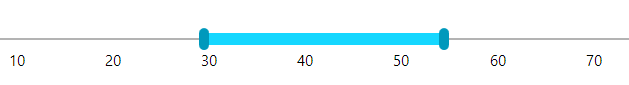
SelectionMiddleThumbStyle
The SelectionMiddleThumbStyle property lets you control the appearance of the middle thumb, which is displayed when the IsSelectionRangeEnabled property is True.
If you are using the implicit styles theming approach, base the custom style on the default SelectionMiddleThumbStyle using the BasedOn property.
Creating a custom style for the SelectionMiddleThumbStyle property using the implicit styles theming approach
<Grid>
    <Grid.Resources>
        <Style x:Key="CustomSelectionMiddleThumbStyle" TargetType="Thumb" BasedOn="{StaticResource SelectionMiddleThumbStyle}">
            <Setter Property="Height" Value="10" />
        </Style>
    </Grid.Resources>
    <telerik:RadSlider Minimum="0"
                       Maximum="100"
                       TickFrequency="10"
                       TickPlacement="BottomRight"
                       IsSelectionRangeEnabled="True"
                       Margin="5"
                       SelectionMiddleThumbStyle="{StaticResource CustomSelectionMiddleThumbStyle}">
        <telerik:RadSlider.TickTemplate>
            <DataTemplate>
                <TextBlock Text="{Binding}" />
            </DataTemplate>
        </telerik:RadSlider.TickTemplate>
    </telerik:RadSlider>
</Grid>
BasedOn property. In the following example, the GenericFluent.xaml dictionary of the Telerik.Windows.Controls assembly is merged, because the Fluent theme is used.
Creating a custom style for the SelectionMiddleThumbStyle property using the StyleManager theming approach
<Grid>
    <Grid.Resources>
        <ResourceDictionary>
            <ResourceDictionary.MergedDictionaries>
                <ResourceDictionary Source="/Telerik.Windows.Controls;component/Themes/GenericFluent.xaml"/>
            </ResourceDictionary.MergedDictionaries>
            <Style x:Key="CustomSelectionMiddleThumbStyle" TargetType="Thumb" BasedOn="{StaticResource SelectionMiddleThumbStyle}">
                <Setter Property="Height" Value="10" />
            </Style>
        </ResourceDictionary>
    </Grid.Resources>
    <telerik:RadSlider Minimum="0"
                       Maximum="100"
                       TickFrequency="10"
                       IsSelectionRangeEnabled="True"
                       VerticalAlignment="Center"
                       TickPlacement="BottomRight"
                       SelectionMiddleThumbStyle="{StaticResource CustomSelectionMiddleThumbStyle}">
        <telerik:RadSlider.TickTemplate>
            <DataTemplate>
                <TextBlock Text="{Binding}" />
            </DataTemplate>
        </telerik:RadSlider.TickTemplate>
    </telerik:RadSlider>
</Grid>
If another theme is used, for example, Office_Black, change the GenericFluent.xaml to GenericOfficeBlack.xaml.
RadSlider with custom SelectionMiddleThumbStyle
DecreaseHandleStyle and IncreaseHandleStyle
The DecreaseHandleStyle and IncreaseHandleStyle properties allow you to modify the appearance of the two repeat buttons, which increase and decrease the Value. They are shown when the HandlesVisibility is True.
If you are using the implicit styles theming approach, base the custom styles on the default DecreaseHandleStyle and IncreaseHandleStyle styles using the BasedOn property.
Creating custom Styles for the DecreaseHandleStyle and IncreaseHandleStyle properties when using the implicit styles theming approach
<Grid>
    <Grid.Resources>
        <Style x:Key="CustomDecreaseHandleStyle" TargetType="RepeatButton" BasedOn="{StaticResource DecreaseHandleStyle}">
            <Setter Property="Foreground" Value="Red" />
        </Style>
        <Style x:Key="CustomIncreaseHandleStyle" TargetType="RepeatButton" BasedOn="{StaticResource IncreaseHandleStyle}">
            <Setter Property="Foreground" Value="Red" />
        </Style>
    </Grid.Resources>
    <telerik:RadSlider Minimum="0"
                       Maximum="100"
                       TickFrequency="10"
                       TickPlacement="BottomRight"
                       Margin="5"
                       HandlesVisibility="Visible"
                       DecreaseHandleStyle="{StaticResource CustomDecreaseHandleStyle}"
                       IncreaseHandleStyle="{StaticResource CustomIncreaseHandleStyle}">
        <telerik:RadSlider.TickTemplate>
            <DataTemplate>
                <TextBlock Text="{Binding}" />
            </DataTemplate>
        </telerik:RadSlider.TickTemplate>
    </telerik:RadSlider>
</Grid>
BasedOn property. In the following example, the GenericFluent.xaml dictionary of the Telerik.Windows.Controls assembly is merged, because the Fluent theme is used.
Creating custom Styles for the DecreaseHandleStyle and IncreaseHandleStyle properties when using the StyleManager theming approach
<Grid>
    <Grid.Resources>
        <ResourceDictionary>
            <ResourceDictionary.MergedDictionaries>
                <ResourceDictionary Source="/Telerik.Windows.Controls;component/Themes/GenericFluent.xaml"/>
            </ResourceDictionary.MergedDictionaries>
            <Style x:Key="CustomDecreaseHandleStyle" TargetType="RepeatButton" BasedOn="{StaticResource DecreaseHandleStyle}">
                <Setter Property="Foreground" Value="Red" />
            </Style>
            <Style x:Key="CustomIncreaseHandleStyle" TargetType="RepeatButton" BasedOn="{StaticResource IncreaseHandleStyle}">
                <Setter Property="Foreground" Value="Red" />
            </Style>
        </ResourceDictionary>
    </Grid.Resources>
    <telerik:RadSlider Minimum="0"
                       Maximum="100"
                       TickFrequency="10"
                       TickPlacement="BottomRight"
                       Margin="5"
                       HandlesVisibility="Visible"
                       DecreaseHandleStyle="{StaticResource CustomDecreaseHandleStyle}"
                       IncreaseHandleStyle="{StaticResource CustomIncreaseHandleStyle}">
        <telerik:RadSlider.TickTemplate>
            <DataTemplate>
                <TextBlock Text="{Binding}" />
            </DataTemplate>
        </telerik:RadSlider.TickTemplate>
    </telerik:RadSlider>
</Grid>
If another theme is used, for example, Office_Black, change the GenericFluent.xaml to GenericOfficeBlack.xaml.
RadSlider with custom DecreaseHandleStyle and IncreaseHandleStyle

TickBarStyle
The TickBarStyle property allows you to modify the appearance of the bottom and top tickbars - the controls which displays the ticks.
If you are using the implicit styles theming approach, base the custom style on the default RadTickBarStyle using the BasedOn property as shown in the following example:
Creating a custom style for the TickBarStyle property when using the implicit styles theming approach
<Grid>
    <Grid.Resources>
        <Style x:Key="TickBarStyle" TargetType="telerik:RadTickBar" BasedOn="{StaticResource RadTickBarStyle}">
            <Setter Property="Foreground" Value="Red" />
        </Style>
    </Grid.Resources>
    <telerik:RadSlider Minimum="0"
                       Maximum="100"
                       TickFrequency="10"
                       TickPlacement="BottomRight"
                       Margin="10"
                       TickBarStyle="{StaticResource TickBarStyle}">
        <telerik:RadSlider.TickTemplate>
            <DataTemplate>
                <TextBlock Text="{Binding}" />
            </DataTemplate>
        </telerik:RadSlider.TickTemplate>
    </telerik:RadSlider>
</Grid>
ItemsPanel property of the RadTickBar element to a new instance of the TickBarPanel object.
Creating a custom style for the TickBarStyle property when using the StyleManager theming approach
<Grid>
    <Grid.Resources>
        <Style x:Key="CustomTickBarStyle" TargetType="telerik:RadTickBar">
            <Setter Property="Foreground" Value="Red" />
            <Setter Property="ItemsPanel">
                <Setter.Value>
                    <ItemsPanelTemplate>
                        <telerik:TickBarPanel Background="Transparent"/>
                    </ItemsPanelTemplate>
                </Setter.Value>
            </Setter>
        </Style>
    </Grid.Resources>
    <telerik:RadSlider Minimum="0"
                       Maximum="100"
                       TickFrequency="10"
                       TickPlacement="BottomRight"
                       Margin="10"
                       TickBarStyle="{StaticResource CustomTickBarStyle}">
        <telerik:RadSlider.TickTemplate>
            <DataTemplate>
                <TextBlock Text="{Binding}" />
            </DataTemplate>
        </telerik:RadSlider.TickTemplate>
    </telerik:RadSlider>
</Grid>

TrackStyle
The TrackStyle property lets you modify the appearance of the RadSlider's track.
When using the implicit styles theming approach and NoXaml binaries, base the custom style on the default TrackStyle. This style comes from the chosen theme using the BasedOn property.
Creating a custom style for the TrackStyle property when using the implicit styles theming approach
<Grid>
    <Grid.Resources>
        <Style x:Key="CustomTrackStyle" TargetType="ContentControl" BasedOn="{StaticResource TrackStyle}">
            <Setter Property="Height" Value="25" />
        </Style>
    </Grid.Resources>
    <telerik:RadSlider Minimum="0"
                       Maximum="100"
                       TickFrequency="10"
                       TickPlacement="BottomRight"
                       Margin="10"
                       TrackStyle="{StaticResource CustomTrackStyle}">
        <telerik:RadSlider.TickTemplate>
            <DataTemplate>
                <TextBlock Text="{Binding}" />
            </DataTemplate>
        </telerik:RadSlider.TickTemplate>
    </telerik:RadSlider>
</Grid>
BasedOn property. In the following example, the GenericFluent.xaml dictionary of the Telerik.Windows.Controls assembly is merged, because the Fluent theme is used.
Creating a custom style for the TrackStyle property when using the StyleManager theming approach
<Grid>
    <Grid.Resources>
        <ResourceDictionary>
            <ResourceDictionary.MergedDictionaries>
                <ResourceDictionary Source="/Telerik.Windows.Controls;component/Themes/GenericFluent.xaml"/>
            </ResourceDictionary.MergedDictionaries>
            <Style x:Key="CustomTrackStyle" TargetType="ContentControl" BasedOn="{StaticResource TrackStyle}">
                <Setter Property="Height" Value="25" />
            </Style>
        </ResourceDictionary>
    </Grid.Resources>
    <telerik:RadSlider Minimum="0"
                   Maximum="100"
                   TickFrequency="10"
                   TickPlacement="BottomRight"
                   Margin="10"
                   TrackStyle="{StaticResource CustomTrackStyle}">
        <telerik:RadSlider.TickTemplate>
            <DataTemplate>
                <TextBlock Text="{Binding}" />
            </DataTemplate>
        </telerik:RadSlider.TickTemplate>
    </telerik:RadSlider>
</Grid>
If another theme is used, for example, Office_Black, change the GenericFluent.xaml to GenericOfficeBlack.xaml.
RadSlider with custom TrackStyle

Using the TickTemplateSelector
The TickTemplateSelector property property of RadSlider allows to customize the appearance of the ticks, based on different conditions. The following example shows how to use the selector.
The
TickTemplateproperty needs to be set tonullfor theTickTemplateSelectorproperty to get applied.
Implementing the selector
public class TickTemplateSelector : DataTemplateSelector
{
    public DataTemplate EllipseTemplate { get; set; }
    public DataTemplate EmptyTemplate { get; set; }
    public override DataTemplate SelectTemplate(object item, DependencyObject container)
    {
        double tick = Convert.ToDouble(item);
        if (tick % 4 == 0.0)
        {
            return EllipseTemplate;
        }
        else
        {
            return EmptyTemplate;
        }
    }
}
Defining the template selector
<local:TickTemplateSelector x:Key="TickTemplateSelector">
    <local:TickTemplateSelector.EllipseTemplate>
        <DataTemplate>
            <Ellipse Width="5" Height="5" Fill="Black" />
        </DataTemplate>
    </local:TickTemplateSelector.EllipseTemplate>
    <local:TickTemplateSelector.EmptyTemplate>
        <DataTemplate/>
    </local:TickTemplateSelector.EllipseTemplate>
</local:TickTemplateSelector>
Defining the slider and setting the template selector
<telerik:RadSlider HandlesVisibility="Visible"
                   IsSnapToTickEnabled="True"
                   Maximum="30"
                   SmallChange="1"
                   TickFrequency="1"
                   TickPlacement="TopLeft"
                   TickTemplate="{x:Null}"
                   TickTemplateSelector="{StaticResource TickTemplateSelector}" />

Customizing the Thumb Shape
By default the thumb of the slider is a rectangle visual. To change this and use custom shape or any other visual, you can re-templated the Thumb element. The custom template can be assigned with the ThumbStyle property of RadSlider. The following example shows how to replace the default rectangle with an ellipse shape.
Custom Thumb ControlTemplate based on the Fluent theme
<Grid>
    <Grid.Resources>
        <ResourceDictionary>
            <ResourceDictionary.MergedDictionaries>
                <ResourceDictionary Source="/Telerik.Windows.Controls;component/Themes/GenericFluent.xaml"/>
            </ResourceDictionary.MergedDictionaries>
        </ResourceDictionary>
    </Grid.Resources>
    <telerik:RadSlider Width="400" VerticalAlignment="Center" telerik:StyleManager.Theme="Fluent">
        <telerik:RadSlider.ThumbStyle>
            <Style TargetType="Thumb" BasedOn="{StaticResource ThumbStyle}">
                <Setter Property="Width" Value="20"/>
                <Setter Property="Height" Value="20"/>
                <Setter Property="Template">
                    <Setter.Value>
                        <ControlTemplate TargetType="Thumb">
                            <Ellipse x:Name="ThumbVisual" Fill="{TemplateBinding Background}"/>
                            <ControlTemplate.Triggers>
                                <Trigger Property="IsFocused" Value="True">
                                    <Setter TargetName="ThumbVisual" Property="Fill" Value="{telerik:FluentResource ResourceKey=AccentFocusedBrush}"/>
                                </Trigger>
                                <Trigger Property="IsMouseOver" Value="True">
                                    <Setter TargetName="ThumbVisual" Property="Fill" Value="{telerik:FluentResource ResourceKey=AccentMouseOverBrush}"/>
                                </Trigger>
                                <Trigger Property="IsDragging" Value="True">
                                    <Setter TargetName="ThumbVisual" Property="Fill" Value="{telerik:FluentResource ResourceKey=AccentPressedBrush}"/>
                                </Trigger>
                                <Trigger Property="IsEnabled" Value="False">
                                    <Setter TargetName="ThumbVisual" Property="Fill" Value="{telerik:FluentResource ResourceKey=ComplementaryBrush}"/>
                                </Trigger>
                            </ControlTemplate.Triggers>
                        </ControlTemplate>
                    </Setter.Value>
                </Setter>
            </Style>
        </telerik:RadSlider.ThumbStyle>
    </telerik:RadSlider>
</Grid>

In order to learn how to further modify any of the elements referenced in the article by extracting their control template, read the Editing Control Templates article.