How to customize the DragVisualProvider
In RadListBox it is possible to enrich the drag-drop functionality of the control by creating a custom DragVisualProvider or using one of the built-in DragVisualProviders. More information about the built-in DragVisualProviders could be found here.
Custom DragVisualProvider
The next example will demonstrate the how to create a custom DragVisualProvider in order to change its Foreground, Background, BorderBrush and Template.
Before proceeding with this example you should get familiar with Drag and Drop: Overview, Implicit Styles and Binding To Object.
-
First you will need to create a Country class with the necessary properties:
Country class creation
public class Country { public string Name { get; set; } public string Capital { get; set; } public int Id { get; set; } } -
Next you should create a Countries collection in your ViewModel and populate it with some sample data:
ViewModel declaration_
public class ViewModel : ViewModelBase { public ViewModel() { this.Countries= new ObservableCollection<Country>() { new Country() { Name = "Australia", Capital = "Canberra", Id = 1 }, new Country() { Name = "Bulgaria", Capital = "Sofia", Id = 2 }, new Country() { Name = "Canada", Capital = "Ottawa", Id = 3 }, new Country() { Name = "Denmark", Capital = "Copenhagen", Id = 4 }, new Country() { Name = "France", Capital = "Paris", Id = 5 }, new Country() { Name = "Germany", Capital = "Berlin", Id = 6 }, new Country() { Name = "India", Capital = "New Delhi", Id = 7 }, new Country() { Name = "Italy", Capital = "Rome", Id = 8 }, new Country() { Name = "Norway", Capital = "Oslo", Id = 9 }, new Country() { Name = "Russia", Capital = "Moscow", Id = 10 }, new Country() { Name = "Spain ", Capital = "Madrid", Id = 11 }, new Country() { Name = "United Kingdom", Capital = "London", Id = 12 }, new Country() { Name = "United States", Capital = "Washington, D.C.", Id = 13 } }; } public ObservableCollection<Country> Countries { get; set; } } -
In the App.xaml file merge the necessary ResourceDictionary for the RadListBox control based on the theme you are using. This example uses the Office_Black theme:
Merging the necessary ResourceDictionary
<Application.Resources> <ResourceDictionary> <ResourceDictionary.MergedDictionaries> <ResourceDictionary Source="/Telerik.Windows.Themes.Office_Black;component/Themes/System.Windows.xaml"/> <ResourceDictionary Source="/Telerik.Windows.Themes.Office_Black;component/Themes/Telerik.Windows.Controls.xaml"/> </ResourceDictionary.MergedDictionaries> </ResourceDictionary> </Application.Resources> -
Next you will need to create a Style in the same file that targets ListBoxDragVisual and set its Foreground, Background, BorderBrush and Template properties:
Style targeting ListBoxDragVisual
You can find the entire ListBoxDragVisual Template code in each specific theme for the RadListBox control.<Style TargetType="telerikDragDrop:ListBoxDragVisual" BasedOn="{StaticResource DragVisualStyle}"> <Setter Property="Foreground" Value="White"/> <Setter Property="BorderBrush" Value="DarkGreen"/> <Setter Property="Background" Value="Green"/> <Setter Property="Template"> <Setter.Value> <ControlTemplate TargetType="telerikDragDrop:DragVisual"> <Grid> <VisualStateManager.VisualStateGroups> <!-- ... --> </VisualStateManager.VisualStateGroups> <!-- ...--> <Border Margin="0 0 4 4" Padding="{TemplateBinding BorderThickness}"> <Grid Margin="2, 0, 2, 0"> <!-- ... --> <Grid.RowDefinitions> <RowDefinition Height="20"/> <RowDefinition Height="Auto"/> <RowDefinition Height="20"/> <RowDefinition Height="Auto"/> <RowDefinition Height="20"/> </Grid.RowDefinitions> <!-- ... --> <StackPanel Orientation="Horizontal" Margin="15, 0, 0, 0" Grid.Row="0" VerticalAlignment="Center"> <TextBlock Text="ID: "/> <TextBlock Text="{Binding Content.Id, RelativeSource={RelativeSource TemplatedParent}}" FontWeight="Bold"/> </StackPanel> <Border Background="White" Height="1" Grid.Row="1"/> <StackPanel Orientation="Horizontal" Margin="15, 0, 0, 0" Grid.Row="2" VerticalAlignment="Center"> <TextBlock Text="Name: "/> <TextBlock Text="{Binding Content.Name, RelativeSource={RelativeSource TemplatedParent}}" FontWeight="Bold"/> </StackPanel> <Border Background="White" Height="1" Grid.Row="3"/> <StackPanel Orientation="Horizontal" Margin="15, 0, 0, 0" Grid.Row="4" VerticalAlignment="Center"> <TextBlock Text="Capital: "/> <TextBlock Text="{Binding Content.Capital, RelativeSource={RelativeSource TemplatedParent}}" FontWeight="Bold"/> </StackPanel> </Grid> </Border> </Grid> </ControlTemplate> </Setter.Value> </Setter> </Style>The custom DragVisualStyle must be created in the App.xaml file as the DragVisualProvider is placed inside of another visual tree and cannot be targeted from the /Window where RadListBox is placed.
-
Finally you will need to declare the RadListBox control. The xaml of the control should look like this:
RadListBox declaration
    <telerik:RadListBox ItemsSource="{Binding Countries}"
    DisplayMemberPath="Name">
        <telerik:RadListBox.DragDropBehavior>
            <telerik:ListBoxDragDropBehavior AllowReorder="True" />
        </telerik:RadListBox.DragDropBehavior>
        <telerik:RadListBox.DragVisualProvider>
            <telerik:ListBoxDragVisualProvider/>
        </telerik:RadListBox.DragVisualProvider>
    </telerik:RadListBox>
Find a runnable project of the previous example in the WPF Samples GitHub repository.
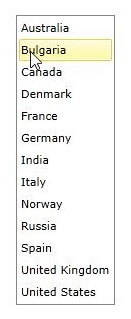
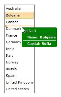
The next screenshots show the final result: