Row Details Overview
Each RadGridView row is capable of presenting additional information by means of a Row Details. The Row Details is a DataTemplate defined on the grid- or row-level and is used for displaying data without affecting the dimensions of the row and the cells within it.
One of the advantages of using a Row Details template is that it can be displayed for the selected row only, thus providing a more compact layout. Another benefit of Row Details is the option of placing the Details Presenter outside the RadGridView, which provides more room for traditional rows without depriving the user of the additional information.
The Row Details is part of Telerik UI for WPF, a
professional grade UI library with 160+ components for building modern and feature-rich applications. To try it out sign up for a free 30-day trial.
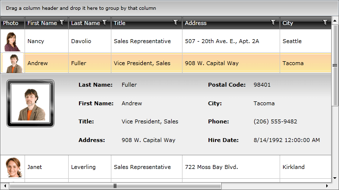
To easily expand / collapse the Row Details you can use the Toggle RowDetails Column.
The row and the row details share the same data context, so you are free to bind the elements in your template to any of the properties of the data item. To learn more about the Row Details template read here.
In order to not scroll the RowDetails when horizontally scrolling the parent RadGridView, you should set AreRowDetailsFrozen="True" for it.
This chapter will make you familiar with the specifics around the Row Details. The following things will get explained:
Related Resources
If you want to learn more about the Row Details and how to implement them in more specific scenarios, please take a look at the list with related resources: