Getting Started with WPF GanttView
This tutorial will walk you through the creation of a sample application that contains a RadGanttView.
Adding Telerik Assemblies Using NuGet
To use RadGanttView when working with NuGet packages, install the Telerik.Windows.Controls.GanttView.for.Wpf.Xaml package. The package name may vary slightly based on the Telerik dlls set - Xaml or NoXaml
Read more about NuGet installation in the Installing UI for WPF from NuGet Package article.
With the 2025 Q1 release, the Telerik UI for WPF has a new licensing mechanism. You can learn more about it here.
Adding Assembly References Manually
If you are not using NuGet packages, you can add a reference to the following assemblies:
- Telerik.Licensing.Runtime
- Telerik.Windows.Controls
- Telerik.Windows.Controls.GanttView
- Telerik.Windows.Scheduling.Core
Adding RadGanttView to your project
You can add RadGanttView by writing the XAML code in Example 1. You can also add the control by dragging it from the Visual Studio Toolbox and dropping it over the XAML view.
Example 1: Defining a RadGanttView
<UserControl xmlns:telerik="http://schemas.telerik.com/2008/xaml/presentation">
    <Grid>
        <telerik:RadGanttView x:Name="ganttView" />
    </Grid>
</UserControl>
If you run the application now, you will see an empty RadGanttView as demonstrated in Figure 1:
Figure 1: Empty RadGanttView
Define columns
You can manually define columns in order to showcase information from the displayed tasks as demonstrated in Example 2.
Example 2: Defining columns
<telerik:RadGanttView x:Name="ganttView2">
    <telerik:RadGanttView.Columns>
        <telerik:TreeColumnDefinition Header="Title" Width="AutoHeaderAndContent"/>
        <telerik:ColumnDefinition MemberBinding="{Binding Start}" Header="Start" Width="AutoHeaderAndContent"/>
        <telerik:ColumnDefinition MemberBinding="{Binding End}" Header="End" Width="AutoHeaderAndContent"/>
    </telerik:RadGanttView.Columns>
</telerik:RadGanttView>
Check the Columns Overview topic for more information about the columns of the data grid.
Bind the RadGanttView
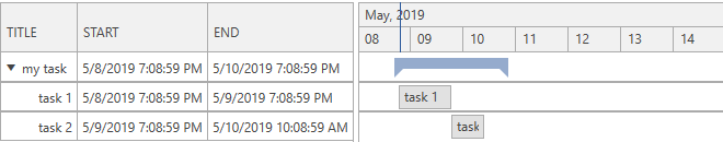
In order to populate a RadGanttView control with sample data, you can create a collection of GanttTask objects as demonstrated in Example 3. The example also shows how you can specify a DateRange object in order to bind it to the VisibleRange property of RadGanttView. It will control the range that is visible in the timeline section of the control.
Example 3: Creating a ViewModel
public class ViewModel : ViewModelBase
{
    private DateRange visibleRange;

    public ViewModel()
    {
        var date = DateTime.Now;

        var task1 = new GanttTask(date, date.AddDays(1), "task 1");
        var task2 = new GanttTask(date.AddDays(1), date.AddDays(1).AddHours(15), "task 2");

        var mainTask = new GanttTask(date, date.AddDays(2), "my task")
        {
            Children = { task1, task2 }
        };

        this.Tasks = new ObservableCollection<GanttTask>() { mainTask };

        this.VisibleRange = new DateRange(date.AddHours(-12), date.AddDays(12));
    }
    public ObservableCollection<GanttTask> Tasks { get; set; }

    public DateRange VisibleRange
    {
        get
        {
            return this.visibleRange;
        }
        set
        {
            this.visibleRange = value;
            this.OnPropertyChanged(() => this.VisibleRange);
        }
    }
}
Public Class ViewModel
    Inherits ViewModelBase
        Private _visibleRange As DateRange

        Public Sub New()
            Dim [date] = Date.Now

            Dim task1 = New GanttTask([date], [date].AddDays(1), "task 1")
            Dim task2 = New GanttTask([date].AddDays(1), [date].AddDays(1).AddHours(15), "task 2")

            Dim mainTask = New GanttTask([date], [date].AddDays(2), "my task") With {
                .Children = { task1, task2 }
            }

            Me.Tasks = New ObservableCollection(Of GanttTask)() From {mainTask}

            Me.VisibleRange = New DateRange([date].AddHours(-12), [date].AddDays(12))
        End Sub
        Public Property Tasks() As ObservableCollection(Of GanttTask)

        Public Property VisibleRange() As DateRange
            Get
                Return Me._visibleRange
            End Get
            Set(ByVal value As DateRange)
                Me._visibleRange = value
                Me.OnPropertyChanged(Function() Me.VisibleRange)
            End Set
        End Property
End Class
Example 4: Binding to a TaskSource
<Grid>
    <Grid.DataContext>
        <local:ViewModel />
    </Grid.DataContext>
    <telerik:RadGanttView x:Name="ganttView2" TasksSource="{Binding Tasks}" VisibleRange="{Binding VisibleRange}">
        <telerik:RadGanttView.Columns>
            <telerik:TreeColumnDefinition Header="Title" Width="AutoHeaderAndContent"/>
            <telerik:ColumnDefinition MemberBinding="{Binding Start}" Header="Start" Width="AutoHeaderAndContent"/>
            <telerik:ColumnDefinition MemberBinding="{Binding End}" Header="End" Width="AutoHeaderAndContent"/>
        </telerik:RadGanttView.Columns>
    </telerik:RadGanttView>
</Grid>
Figure 2: Result from Example 4 in the Office2016 theme
Setting a Theme
The controls from our suite support different themes. You can see how to apply a theme different than the default one in the Setting a Theme help article.
Changing the theme using implicit styles will affect all controls that have styles defined in the merged resource dictionaries. This is applicable only for the controls in the scope in which the resources are merged.
To change the theme, you can follow the steps below:
Choose between the themes and add reference to the corresponding theme assembly (ex: Telerik.Windows.Themes.Windows8.dll). You can see the different themes applied in the Theming examples from our WPF Controls Examples application.
-
Merge the ResourceDictionaries with the namespace required for the controls that you are using from the theme assembly. For RadGanttView, you will need to merge the following resources:
- Telerik.Windows.Controls
- Telerik.Windows.Controls.GanttView
Example 5 demonstrates how to merge the ResourceDictionaries so that they are applied globally for the entire application.
Example 5: Merge the ResourceDictionaries
<Application.Resources>
    <ResourceDictionary>
        <ResourceDictionary.MergedDictionaries>
            <ResourceDictionary Source="/Telerik.Windows.Themes.Windows8;component/Themes/System.Windows.xaml"/>
            <ResourceDictionary Source="/Telerik.Windows.Themes.Windows8;component/Themes/Telerik.Windows.Controls.xaml"/>
            <ResourceDictionary Source="/Telerik.Windows.Themes.Windows8;component/Themes/Telerik.Windows.Controls.GanttView.xaml"/>
        </ResourceDictionary.MergedDictionaries>
    </ResourceDictionary>
</Application.Resources>
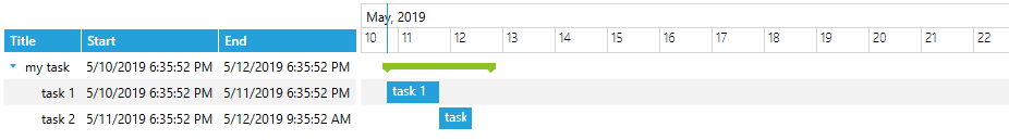
Figure 3: RadGanttView with the Windows8 theme applied
Telerik UI for WPF Learning Resources
- Telerik UI for WPF GanttView Component
- Getting Started with Telerik UI for WPF Components
- Telerik UI for WPF Installation
- Telerik UI for WPF and WinForms Integration
- Telerik UI for WPF Visual Studio Templates
- Setting a Theme with Telerik UI for WPF
- Telerik UI for WPF Virtual Classroom (Training Courses for Registered Users)
- Telerik UI for WPF License Agreement