Getting Started with WPF FilePathPicker
This tutorial will walk you through the creation of a sample application that contains a RadFilePathPicker control.
Adding Telerik Assemblies Using NuGet
To use RadFilePathPicker when working with NuGet packages, install the Telerik.Windows.Controls.FileDialogs.for.Wpf.Xaml package. The package name may vary slightly based on the Telerik dlls set - Xaml or NoXaml
Read more about NuGet installation in the Installing UI for WPF from NuGet Package article.
With the 2025 Q1 release, the Telerik UI for WPF has a new licensing mechanism. You can learn more about it here.
Adding Assembly References Manually
If you are not using NuGet packages, you can add a reference to the following assemblies:
- Telerik.Licensing.Runtime
- Telerik.Windows.Controls
- Telerik.Windows.Controls.Input
- Telerik.Windows.Controls.Navigation
- Telerik.Windows.Controls.GridView
- Telerik.Windows.Controls.FileDialogs
- Telerik.Windows.Data
You can find the required assemblies for each control from the suite in the Controls Dependencies help article.
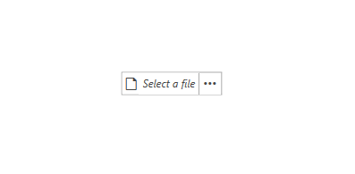
Defining RadFilePathPicker
Example 1 demonstrates how you can define a RadFilePathPicker in xaml.
Example 1: Defining RadFilePathPicker
<telerik:RadFilePathPicker x:Name="filePathPicker" />
Figure 1: RadFilePathPicker in the Office2016 theme
Even at this point, you are ready to start using the control. The following few sections will demonstrate some of the features of the RadFilePathPicker.
IsReadOnly
By default the RadFilePathPicker is read-only, which means that you cannot input text in the RadWatermarkTextBox inside it. In order to change this, you can set the IsReadOnly property to False as demonstrated in Example 2.
Example 2: Setting the IsReadOnly property
<telerik:RadFilePathPicker IsReadOnly="False" />
Text and FilePath
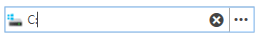
The RadFilePathPicker control exposes two properties that come in handy for working with input: Text and FilePath. The Text property is updated constantly when the user is typing. The FilePath property is only updated when a valid file path is entered or when one is selected through a file dialog.
ShowDialogButtonContent and ShowDialogButtonTemplate
There are two properties that allow for modifying the appearance of the button on the right side of the control, which opens the dialog. The ShowDialogButtonContent expects a glyph as a value, since the default ShowDialogButtonTemplate contains a RadGlyph. Example 3 demonstrates how to change the default glyph shown in the button.
Example 3: Setting the ShowDialogButtonContent
<telerik:RadFilePathPicker ShowDialogButtonContent="" />
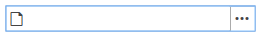
Figure 2: RadFilePathPicker with ShowDialogButtonContent set in the Office2016 theme
If you don't want to show a RadGlyph in the show dialog button, you can set the ShowDialogButtonTemplate property to a custom DataTemplate. Note, that whatever is set to the ShowDialogButtonContent will be the DataContext inside the ShowDialogButtonTemplate.
Example 4: Setting the ShowDialogButtonTemplate
<StackPanel>
    <StackPanel.Resources>
        <DataTemplate x:Key="ShowDialogButtonTemplate">
            <TextBlock Text="{Binding}" />
        </DataTemplate>
    </StackPanel.Resources>

    <telerik:RadFilePathPicker ShowDialogButtonContent="Show" ShowDialogButtonTemplate="{StaticResource ShowDialogButtonTemplate}"  />
</StackPanel>
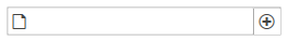
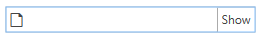
Figure 3: RadFilePathPicker with ShowDialogButtonTemplate set in the Office2016 theme
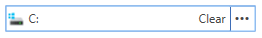
ClearButtonContent and ClearButtonTemplate
There are two properties that allow for modifying the appearance of the clear button, which is shown when some text is entered. The ClearButtonContent expects a glyph as a value, since the default ClearButtonTemplate contains a RadGlyph. Example 5 demonstrates how to change the default glyph shown in the button.
Example 5: Setting the ClearButtonContent
<telerik:RadFilePathPicker IsReadOnly="False" ClearButtonContent="" />
Figure 4: RadFilePathPicker with ClearButtonContent set in the Office2016 theme
To avoid showing a RadGlyph in the clear button, you can set the ClearButtonTemplate property to a custom DataTemplate. Note, that whatever is set to the ClearButtonContent will be the DataContext inside the ClearButtonTemplate.
Example 6: Setting the ClearButtonTemplate
<StackPanel>
    <StackPanel.Resources>
        <DataTemplate x:Key="ClearButtonTemplate">
            <TextBlock Text="{Binding}" />
        </DataTemplate>
    </StackPanel.Resources>

    <telerik:RadFilePathPicker IsReadOnly="False" ClearButtonContent="Clear" ClearButtonTemplate="{StaticResource ClearButtonTemplate}"/>
</StackPanel>
Figure 5: RadFilePathPicker with ClearButtonTemplate set in the Office2016 theme
Setting FilePath on Drop
Since the 2020.1.316 internal build version, the RadFilePathPicker automatically sets its FilePath when a file is dropped over it. If multiple files are dropped, the first one will be used. In order to disable this functionality, you can set the AllowDrop property of the control to False.
Figure 6: Dropping a file over the RadFilePathPicker
Setting a Theme
The controls from our suite support different themes. You can see how to apply a theme different than the default one in the Setting a Theme help article.
Changing the theme using implicit styles will affect all controls that have styles defined in the merged resource dictionaries. This is applicable only for the controls in the scope in which the resources are merged.
To change the theme, you can follow the steps below:
Choose between the themes and add reference to the corresponding theme assembly (ex: Telerik.Windows.Themes.Windows8.dll). You can see the different themes applied in the Theming examples from our WPF Controls Examples application.
-
Merge the ResourceDictionaries with the namespace required for the controls that you are using from the theme assembly. For the RadFilePathPicker, you will need to merge the following resources:
- Telerik.Windows.Controls
- Telerik.Windows.Controls.Input
- Telerik.Windows.Controls.Navigation
- Telerik.Windows.Controls.GridView
- Telerik.Windows.Controls.FileDialogs
Example 7 demonstrates how to merge the ResourceDictionaries so that they are applied globally for the entire application.
Example 7: Merge the ResourceDictionaries
<Application.Resources>
    <ResourceDictionary>
        <ResourceDictionary.MergedDictionaries>
            <ResourceDictionary Source="/Telerik.Windows.Themes.Windows8;component/Themes/System.Windows.xaml"/>
            <ResourceDictionary Source="/Telerik.Windows.Themes.Windows8;component/Themes/Telerik.Windows.Controls.xaml"/>
            <ResourceDictionary Source="/Telerik.Windows.Themes.Windows8;component/Themes/Telerik.Windows.Controls.Input.xaml"/>
            <ResourceDictionary Source="/Telerik.Windows.Themes.Windows8;component/Themes/Telerik.Windows.Controls.Navigation.xaml"/>
            <ResourceDictionary Source="/Telerik.Windows.Themes.Windows8;component/Themes/Telerik.Windows.Controls.GridView.xaml"/>
            <ResourceDictionary Source="/Telerik.Windows.Themes.Windows8;component/Themes/Telerik.Windows.Controls.FileDialogs.xaml"/>
        </ResourceDictionary.MergedDictionaries>
    </ResourceDictionary>
</Application.Resources>
Alternatively, you can use the theme of the control via the StyleManager.
Figure 7 shows a RadFilePathPicker with the Windows8 theme applied.
Figure 7: RadFilePathPicker with the Windows8 theme

Telerik UI for WPF Learning Resources
- Telerik UI for WPF FilePathPicker Component
- Getting Started with Telerik UI for WPF Components
- Telerik UI for WPF Installation
- Telerik UI for WPF and WinForms Integration
- Telerik UI for WPF Visual Studio Templates
- Setting a Theme with Telerik UI for WPF
- Telerik UI for WPF Virtual Classroom (Training Courses for Registered Users)
- Telerik UI for WPF License Agreement