WPF ColorPicker Overview
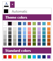
RadColorPicker for WPF is a lightweight UI component that allows users to select colors from predefined Color Presets or from bound lists of custom colors. It can be used to easily format a Control's text or background.
The ColorPicker is part of Telerik UI for WPF, a
professional grade UI library with 160+ components for building modern and feature-rich applications. To try it out sign up for a free 30-day trial.
Key Features
Display multiple color palettes: You can choose how many color palettes to display. Check out the Appearance article for more information.
Populate the control with custom colors: Add your own colors easily in an MVVM scenario. Find out more in the Populate ColorPicker with Business Data article.
Show recent colors: Include a recent colors palette for colors which are not part of the other palettes. Read more about that in the Use IsRecentColorsActive property.
Set custom button content: Change the content of the RadColorPicker button with its ContentTemplate property. Find out more in the Set Custom Content article.
Command property: You can easily react to user interaction with a command from the ViewModel. Check out the Commands article for more information.
Styling and Appearance: RadColorPicker comes with a variety of themes and properties that allows customizing the control's appearance.
UI Automation Support: Check the UI Automation Support common article.
Get started with the control with its Getting Started help article that shows how to use it in a basic scenario.
Check out the examples at demos.telerik.com.
See also
Telerik UI for WPF Support and Learning Resources
- Telerik UI for WPF ColorPicker Homepage
- Get Started with the Telerik UI for WPF ColorPicker
- Telerik UI for WPF API Reference
- Getting Started with Telerik UI for WPF Components
- Telerik UI for WPF Virtual Classroom (Training Courses for Registered Users)
- Telerik UI for WPF ColorPicker Forums
- Telerik UI for WPF Knowledge Base