Getting Started with WPF ColorEditor
This article will help you get started with the Telerik RadColorEditor control
Adding Telerik Assemblies Using NuGet
To use RadColorEditor when working with NuGet packages, install the Telerik.Windows.Controls.Input.for.Wpf.Xaml package. The package name may vary slightly based on the Telerik dlls set - Xaml or NoXaml
Read more about NuGet installation in the Installing UI for WPF from NuGet Package article.
With the 2025 Q1 release, the Telerik UI for WPF has a new licensing mechanism. You can learn more about it here.
Adding Assembly References Manually
If you are not using NuGet packages, you can add a reference to the following assemblies:
- Telerik.Licensing.Runtime
- Telerik.Windows.Controls
- Telerik.Windows.Controls.Input
You can find the required assemblies for each control from the suite in the Controls Dependencies help article.
Adding RadColorEditor to the Project
You can add RadColorEditor manually by writing the XAML code in Example 1. You can also add the control by dragging it from the Visual Studio Toolbox and dropping it over the XAML view.
Example 1: Adding RadColorEditor in XAML
<Grid>
    <telerik:RadColorEditor x:Name="colorEditor" />
</Grid>
Selection
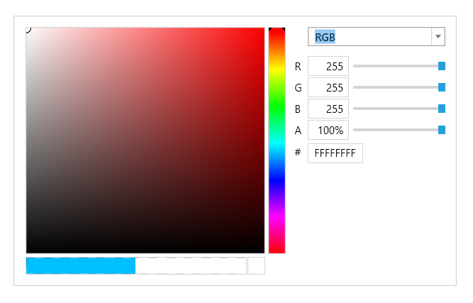
The RadColorEditor is a control that displays a custom palette from which users can select a single color. The control exposes a SelectedColor property, which is of type Color and is used to store the selected color value.
Example 2: Setting the SelectedColor property
<telerik:RadColorEditor SelectedColor="Red" />
Example 2: Setting the SelectedColor property in code behind
RadColorEditor colorEditor = new RadColorEditor();
colorEditor.SelectedColor = Colors.Red;
Dim colorEditor As New RadColorEditor()
colorEditor.SelectedColor = Colors.Red
Whenever a color is selected the SelectedColorChanged event is raised:
Example 3: Subscribing to SelectedColorChanged event
<telerik:RadColorEditor x:Name="colorEditor" SelectedColorChanged="colorEditor_SelectedColorChanged " />
Example 4: Subscribing to SelectedColorChanged event in code behind
colorEditor.SelectedColorChanged += new EventHandler<ColorChangeEventArgs>(colorEditor_SelectedColorChanged);

private void colorEditor1_SelectedColorChanged(object sender, ColorChangeEventArgs e)
{
   Color selectedColor = e.Color;
}
colorEditor.SelectedColorChanged += New EventHandler(Of ColorChangeEventArgs)(colorEditor_SelectedColorChanged)

Private Sub colorEditor1_SelectedColorChanged(ByVal sender As Object, ByVal e As ColorChangeEventArgs)
    Dim selectedColor As Color = e.Color
End Sub
Set Color Settings Panel Width
Since the R3 2021 SP1 release, RadColorEditor exposes the ColorSettingsPanelWidth property for setting the width of the color settings panel area.
Example 5: Setting the ColorSettingsPanelWidth property
<telerik:RadColorEditor x:Name="colorEditor" ColorSettingsPanelWidth="450" />
Setting a Theme
The controls from our suite support different themes. You can see how to apply a theme different than the default one in the Setting a Theme help article.
Changing the theme using implicit styles will affect all controls that have styles defined in the merged resource dictionaries. This is applicable only for the controls in the scope in which the resources are merged.
To change the theme, you can follow the steps below:
Choose between the themes and add reference to the corresponding theme assembly (ex: Telerik.Windows.Themes.Windows8.dll). You can see the different themes applied in the Theming examples from our WPF Controls Examples application.
-
Merge the ResourceDictionaries with the namespace required for the controls that you are using from the theme assembly. For the RadColorEditor, you will need to merge the following resources:
- Telerik.Windows.Controls
- Telerik.Windows.Controls.Input
Example 6 demonstrates how to merge the ResourceDictionaries so that they are applied globally for the entire application.
Example 6: Merge the ResourceDictionaries
<Application.Resources>
    <ResourceDictionary>
        <ResourceDictionary.MergedDictionaries>
            <ResourceDictionary Source="/Telerik.Windows.Themes.Windows8;component/Themes/System.Windows.xaml"/>
            <ResourceDictionary Source="/Telerik.Windows.Themes.Windows8;component/Themes/Telerik.Windows.Controls.xaml"/>
            <ResourceDictionary Source="/Telerik.Windows.Themes.Windows8;component/Themes/Telerik.Windows.Controls.Input.xaml"/>
        </ResourceDictionary.MergedDictionaries>
    </ResourceDictionary>
</Application.Resources>
Alternatively, you can use the theme of the control via the StyleManager.
Figure 4 shows a RadColorEditor with the Windows8 theme applied.
Figure 4: RadCalculator with the Windows8 theme
Telerik UI for WPF Learning Resources
- Telerik UI for WPF ColorEditor Component
- Getting Started with Telerik UI for WPF Components
- Telerik UI for WPF Installation
- Telerik UI for WPF and WinForms Integration
- Telerik UI for WPF Visual Studio Templates
- Setting a Theme with Telerik UI for WPF
- Telerik UI for WPF Virtual Classroom (Training Courses for Registered Users)
- Telerik UI for WPF License Agreement