Getting Started with WPF Callout
This tutorial will walk you through the creation of a sample application that contains a RadCallout control.
Adding Telerik Assemblies Using NuGet
To use RadCallout when working with NuGet packages, install the Telerik.Windows.Controls.for.Wpf.Xaml package. The package name may vary slightly based on the Telerik dlls set - Xaml or NoXaml
Read more about NuGet installation in the Installing UI for WPF from NuGet Package article.
With the 2025 Q1 release, the Telerik UI for WPF has a new licensing mechanism. You can learn more about it here.
Adding Assembly References Manually
If you are not using NuGet packages, you can add a reference to the following assemblies:
- Telerik.Licensing.Runtime
- Telerik.Windows.Controls
You can find the required assemblies for each control from the suite in the Controls Dependencies help article.
Defining RadCallout in XAML
The control can be used as a static element to highlight an element from your application. This gives you the freedom to place the control in any type of parent.
Example 1: Defining in XAML
<Grid>
    <telerik:RadButton Content="My Button" VerticalAlignment="Center" HorizontalAlignment="Center" />
    <telerik:RadCallout Margin="0 0 0 100" Content="Click on the button" />
</Grid>
Defining as a Popup
The control can be placed inside a Popup element. This way, you can dynamically show/hide the control per your needs. For the purpose of this tutorial, we are going to show the RadCallout on a button click. First, we need to define our RadButton control and subscribe to its Click event.
Example 2: Defining RadButton
<Grid>
    <telerik:RadButton Content="My Button" VerticalAlignment="Center" HorizontalAlignment="Center" Click="RadButton_Click" />
</Grid>
Example 3: Setting RadCallout in code behind
private void RadButton_Click(object sender, RoutedEventArgs e)
{
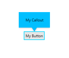
RadCallout callout = new RadCallout() { Background = Brushes.DeepSkyBlue, Content = "My Callout" };
CalloutPopupSettings settings = new CalloutPopupSettings()
{
Placement = System.Windows.Controls.Primitives.PlacementMode.Top,
};
CalloutPopupService.Show(callout, sender as FrameworkElement, settings);
}
Figure 1: RadCallout sample
Setting a Theme
The controls from our suite support different themes. You can see how to apply a theme different than the default one in the Setting a Theme help article.
Changing the theme using implicit styles will affect all controls that have styles defined in the merged resource dictionaries. This is applicable only for the controls in the scope in which the resources are merged.
To change the theme, you can follow the steps below:
Choose between the themes and add reference to the corresponding theme assembly (ex: Telerik.Windows.Themes.Fluent.dll). You can see the different themes applied in the Theming examples from our WPF Controls Examples application.
-
Merge the ResourceDictionaries with the namespace required for the controls that you are using from the theme assembly. For the RadCallout, you will need to merge the following resources:
- Telerik.Windows.Controls
Example 4 demonstrates how to merge the ResourceDictionaries so that they are applied globally for the entire application.
Example 4: Merge the ResourceDictionaries
<Application.Resources>
    <ResourceDictionary>
        <ResourceDictionary.MergedDictionaries>
            <ResourceDictionary Source="/Telerik.Windows.Themes.Fluent;component/Themes/System.Windows.xaml"/>
            <ResourceDictionary Source="/Telerik.Windows.Themes.Fluent;component/Themes/Telerik.Windows.Controls.xaml"/>
        </ResourceDictionary.MergedDictionaries>
    </ResourceDictionary>
</Application.Resources>
Alternatively, you can use the theme of the control via the StyleManager.
Figure 4 shows a RadCallout with the Fluent theme applied.
Figure 4: RadCallout with the Fluent theme
Telerik UI for WPF Learning Resources
- Telerik UI for WPF Callout Component
- Getting Started with Telerik UI for WPF Components
- Telerik UI for WPF Installation
- Telerik UI for WPF and WinForms Integration
- Telerik UI for WPF Visual Studio Templates
- Setting a Theme with Telerik UI for WPF
- Telerik UI for WPF Virtual Classroom (Training Courses for Registered Users)
- Telerik UI for WPF License Agreement