Template Structure
Like most controls, the RadBusyIndicator also allows you to template it in order to change the control from the inside. Except for templating the whole control, you can also template only parts of it. This topic will make you familiar with the template structures of the:
For more information about templating and how to modify the default templates of the controls from the UI for WPF suite read the common topics on this matter.
RadBusyIndicator

-
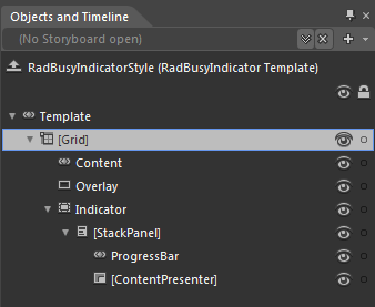
[Grid]
Content - is of type ContentControl and hosts the RadBusyIndicator's content.
Overlay - is of type Rectangle and represents the rectangle overlaying the content while the RadBusyIndicator is active.
-
Indicator - hosts the indicator control and is of type Border.
-
[StackPanel] - represents the StackPanel containing the indicator's elements:
ProgressBar - represents the RadProgressBar visible while the RadBusyIndicator is active.
[ContentPresenter] - represents the content shown underneath the RadProgressBar and is of type ContentPresenter.
-
RadProgressBar

-
[Grid] - represents the host container for the RadProgressBar control.
IndeterminateBackgroundDonut - represents the outer background donut visible while the RadProgressBar is active and is of type Path.
IndeterminateDonut - represents the rolling background Path visible while the RadProgressBar is active.
-
ProgressBarTrack - represents a specific PART element of type Grid hosting the indicator's content.
SkipValueSpacer - is of type Rectangle and is also a PART element.
ProgressBarIndicator- is a PART element of type Rectangle and hosts the innermost circle of the RadProgressBar's indicator.