Key Features
The purpose of this help article is to show you the key features of the RadShadow control.
You can access the RadShadow control through an alias pointing to the Telerik.UI.Xaml.Controls.Primitives namespace:
xmlns:primitives="using:Telerik.UI.Xaml.Controls.Primitives"
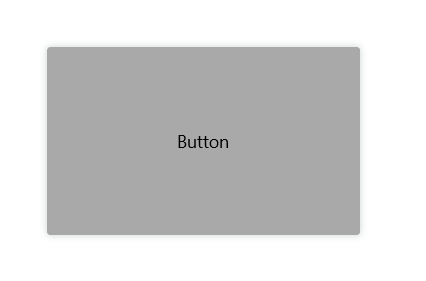
Setting Shadow Color
Through the Color property you can paint the shadow that wraps around your views – you can make it consistent with the colors of the surrounded controls, or you can just use a softer color to make the shadow look more natural.
Here is a quick example of a colored shadow around RadButton:
Example 1: Shadow Colors
<primitives:RadShadow Color="DarkSlateGray">
    <Button Content="Button" Width="250" Height="150" Background="DarkGray" />
</primitives:RadShadow>
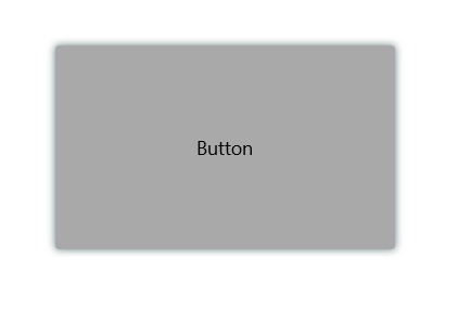
Defining Transparency
Through ShadowOpacity you can control the color transparency level of the RadShadow. The defined value should be between 0 and 1, by default ShadowOpacity is set to 0.26.
Example 2: Shadow Opacity
<primitives:RadShadow Color="DarkSlateGray" ShadowOpacity="0.8">
    <Button Content="Button" Width="250" Height="150" Background="DarkGray" />
</primitives:RadShadow>
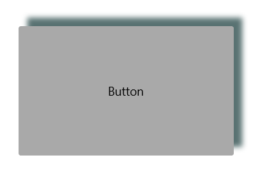
Defining Shadow Position
RadShadow exposes OffsetX and OffsetY properties used to specify the shadow’s position relative to the position of the view that is casting it. Positive x/y offsets will shift the shadow to the right and down, while negative offsets shift the shadow to the left and up.
By default, OffsetX and OffsetY are set to 0.00, so that the shadow appears on all sides of the View it surrounds.
Example 3: Shadow Offset
<primitives:RadShadow Color="DarkSlateGray" ShadowOpacity="0.8" OffsetX="10" OffsetY="-10">
    <Button Content="Button" Width="250" Height="150" Background="DarkGray" />
</primitives:RadShadow>
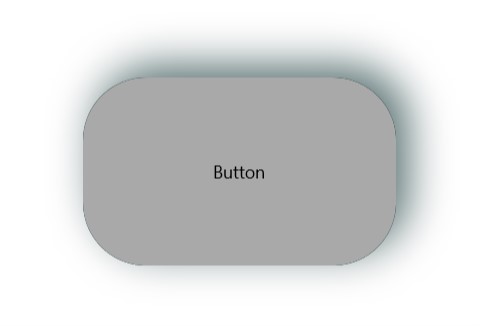
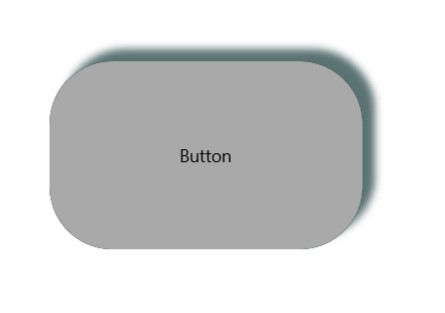
Applying Shadow Corner Radius
The ShadowCornerRadius property represents the degree to which the corners of the Shadow are rounded. This is useful in cases RadShadow wraps around a view with rounded edges. The default value is 0,0.
Elements like Shape, Image, and TextBlock provides a corner radius for their shadows out of the box. That is why ShadowCornerRadius property of the RadShadow control will not apply to these elements. To override this behavior, you can create a custom class that derives from RadShadow and override the GetShadowMask() method.
Check below a quick example with RadButton with ShadowCornerRadius applied:
Example 4: Shadow Corner Radius
<primitives:RadShadow Color="DarkSlateGray" ShadowOpacity="0.8" OffsetX="10" OffsetY="-10" ShadowCornerRadius="50">
    <Button Content="Button" Width="250" Height="150" Background="DarkGray" CornerRadius="50" />
</primitives:RadShadow>
Applying Blur Radius
Through the BlurRadius property you can specify the shadow blur-level. The higher the number, the more blurred it will be, and the further out the shadow will extend. By default, the BlurRadius is 10.
Example 5: Applying Blur Radius
<primitives:RadShadow Color="DarkSlateGray" ShadowOpacity="0.8" OffsetX="10" OffsetY="-10" ShadowCornerRadius="50" BlurRadius="50">
    <Button Content="Button" Width="250" Height="150" Background="DarkGray" CornerRadius="50" />
</primitives:RadShadow>