Key Features
The purpose of this help article is to show you the key features of the RadLoopingList control.
You can access the RadLoopingList control through an alias pointing to the Telerik.UI.Xaml.Controls.Primitives.LoopingList namespace: xmlns:loopingList="using:Telerik.UI.Xaml.Controls.Primitives.LoopingList"
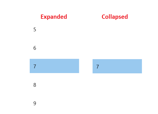
Expand/Collapse State
By default, the RadLoopingList control shows its selected item and other items which fit into its layout slot. In some cases, you might want to display the other items only when the user is interacting with the control but otherwise keep only the selected one visible. This is done by using the IsExpanded property of RadLoopingList. You could collapse the control when it loses focus.
Example 1: Collapse LoopingList
private void loopingList_LostFocus(object sender, Microsoft.UI.Xaml.RoutedEventArgs e)
{
    var loopingList = sender as RadLoopingList;
    loopingList.IsExpanded = false;
}
Figure 1
Item Size
You can control the size of the RadLoopingList control's visual items by using the following properties:
- ItemWidth: Specifies the Width of the item.
- ItemHeight: Specifies the Height of the item.
- ItemSpacing: Specifies the space between the items.
Here is an example of a RadLoopingList control with items having a width of 120, a height of 50, and spacing equal to 10.
Example 2: Different Item Size
<telerikLoopingList:RadLoopingList ItemWidth="120" ItemHeight="50" ItemSpacing="10" />
Snapping
RadLoopingList supports defining different centering positions for the selected item when the IsCentered property is set to true. This is done via the CenteredItemSnapPosition property, which accepts the following values:
- Middle: The default value and implies that the selected item is positioned in the center of the viewport.
- Near: Implies that the selected item is positioned at the near viewport edge of RadLoopingList. In horizontal scrolling mode that means at the left side of the control, whereas in vertical scrolling mode that means at the top edge of the viewport.
- Far: Implies that the selected item is positioned at the far viewport edge of RadLoopingList. In horizontal scrolling mode that means at the right side of the control, whereas in vertical scrolling mode that means at the bottom edge of the viewport.
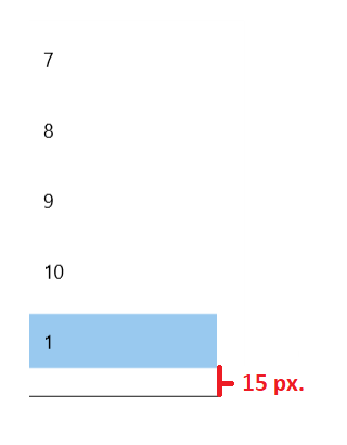
RadLoopingList exposes the SnapOffsetCorrection property which accepts double values and defines the offset correction applied to the selected item when it is snapped. For instance, when the CenteredItemSnapPosition property is set to Far and the SnapOffsetCorrection property is set to -15, the selected item will be snapped to the far edge of the viewport and then a correction of 15 pixels off the new scroll position will be made.
The SnapOffsetCorrection is applicable only when the IsCentered property of RadLoopingList is set to true.
Example 3: Different Item Size
<telerikLoopingList:RadLoopingList CenteredItemSnapPosition="Far" SnapOffsetCorrection="-15"/>
Figure 2
Looping
The looping feature can be turned on an off with the IsLoopingEnabled property.
Example 3: Different Item Size
private void Button_Click(object sender, Microsoft.UI.Xaml.RoutedEventArgs e)
{
    this.loopingList.IsLoopingEnabled = false;
}