Default Theme
Telerik UI for WinForms comes with a set of built-in themes that enhance the visual appearance of the components, helping you achieve an outstanding look of your application. Each theme determines the colors, borders, backgrounds, size, layout, position, font, font size, etc of the components.
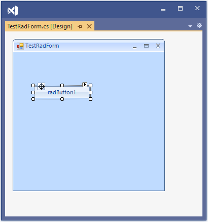
All RadControls from the Telerik UI for WinForms suite get the ControlDefault theme applied to them by default if no other theme is set. If you create a new Windows Forms App, then drag any RadControl from the Toolbox and drop it onto the form, the ControlDefault theme should be automatically applied.
Design time - ControlDefault theme
Fluent theme as Default
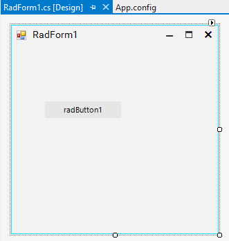
As of R1 2021, Telerik UI for WinForms starts using Fluent theme as default as it provides more modern and fresh look. If you create a new Telerik Windows Forms Application, then drag any RadControl from the Toolbox and drop it onto RadForm, the Fluent theme should be automatically applied .
Fluent theme is defined in the App.config file as follows:
<?xml version="1.0" encoding="utf-8"?>
<configuration>
  <startup>
    <supportedRuntime version="v4.0" sku=".NETFramework,Version=v4.8" />
  </startup>
  <appSettings>
    <add key="TelerikWinFormsThemeName" value="Fluent" />
  </appSettings>
</configuration>
Design time - Fluent theme
Fluent and ControlDefault themes are both included in the Telerik.WinControls assembly. They are available at any time, and it is not necessary to reference them explicitly in the project references.
Other Telerik theme as Default
All Telerik themes that Telerik UI for WinForms offers, can be used as default theme in the application either at design time and run time. You can check other themes styles here.
To use any Telerik theme you should follow these two steps below :
-
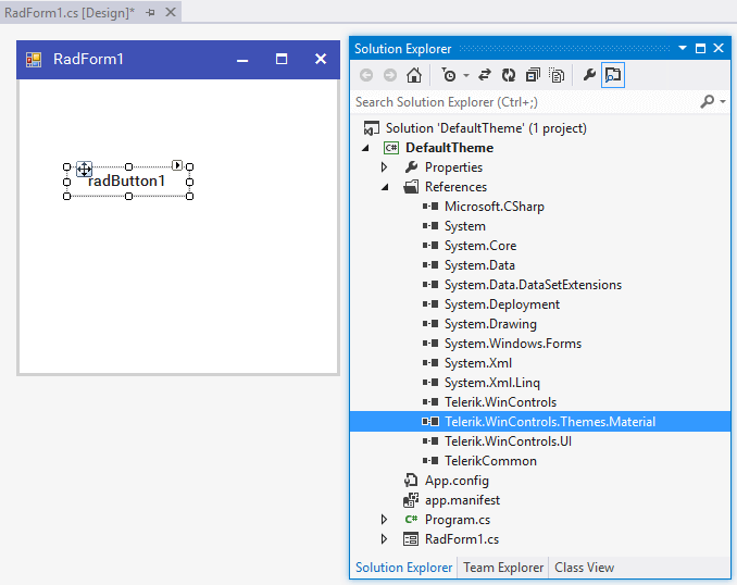
Add the relevant theme assembly to the project references. For example, if you prefer using the Windows11Compact theme in your application, you should add a reference to the Telerik.WinControls.Themes.Windows11 in your project. You can do this by either drag-drop the theme from the Toolbox or reference it from your installation folder.
When you use the UI.for.WinForms.AllControls Telerik NuGet package, all the available themes are included in the package.
-
Specify the TelerikWinFormsThemeName in the App.config file:
Once, the two steps are completed, you can close and reopen the designer file again to ensure the theme is applied:<?xml version="1.0" encoding="utf-8" ?> <configuration> <appSettings> <add key="TelerikWinFormsThemeName" value="Windows11Compact" /> </appSettings> </configuration>Design time - Windows11Compact theme
Missing Assembly Reference Message
If it happens that a valid Telerik theme name is used in the App.config, but the project misses the theme assembly reference, the following message will appear indicating missing assembly reference when you try to load the designer:
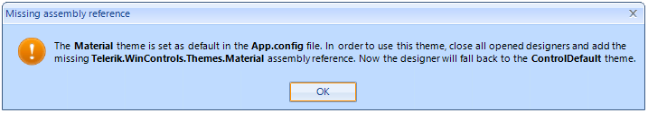
Theme settings are read upon opening the form designer in the project for the first time. If you change the default theme in App.config, it might be necessary to close all opened designers, then open them again to ensure the newest changes are kept in Visual Studio.
Custom theme as Default
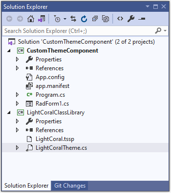
It is also possible to set a client's custom theme as default theme in an application. As we provide an apportunity for our clients to build their own custom style theme, we can use the same API to load client's theme defined in their own assemblies: Creating a theme component
To use a custom theme as default it is necessary to use the assembly fully qualified name inside the App.config. Also, it is important to create an instance of the newly created theme.
Let's say there is a custom Windows11CompactLightBlue theme created, which is a variation of the basic Windows11Compact theme. Besides the theme name, the App.config will also need the theme type and theme assembly name, version, culture, and public key token:
Design time - Custom Windows11CompactLightBlue theme
<?xml version="1.0" encoding="utf-8" ?>
<configuration>
  <appSettings>
    <add key="TelerikWinFormsThemeName" value="Windows11CompactLightBlue" />
    <add key="TelerikWinFormsThemeType" value="Windows11LightBlueClassLibrary.Windows11LightBlue"/>
    <add key="TelerikWinFormsThemeAssemblyName" value="Windows11LightBlueClassLibrary, Version=1.0.0.0, Culture=neutral, PublicKeyToken=null" />
  </appSettings>
</configuration>
Full tutorial demonstrating the exact setup of the above example is available in the following KB article: Custom theme as default. Complete projects in .NET9 and NET Framework 48 are available in our SDK repo here.
See Also