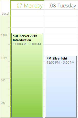
Day View
Overview
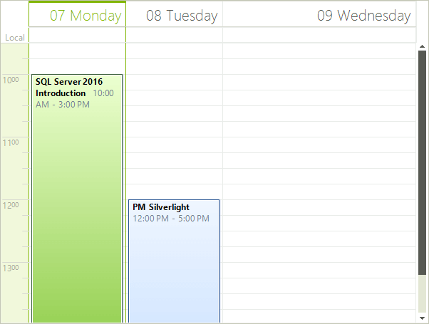
The Day view shows one or more days at a time. To move to the next or previous day, you can use the back and forward keyboard arrows, or the SchedulerNavigator control.
Figure 1: Day View
Setting Day View
The Day View is the default RadScheduler view, but you can explicitly set it to be the view which the user sees:
Set Day View
this.radScheduler1.ActiveViewType = SchedulerViewType.Day;
Me.RadScheduler1.ActiveViewType = SchedulerViewType.Day
Getting Day View
To get the instance to the SchedulerDayView from the RadScheduler object, either:
- use the GetDayView method:
GetDayView Method
SchedulerDayView dayView = this.radScheduler1.GetDayView();
Dim dayView As SchedulerDayView = Me.RadScheduler1.GetDayView()
This method returns null if the active view of the scheduler is not SchedulerDayView.
- use the the RadScheduler ActiveView property:
ActiveView Property
if (this.radScheduler1.ActiveViewType == SchedulerViewType.Day)
{
    SchedulerDayView activeDayView = (SchedulerDayView)this.radScheduler1.ActiveView;
}
If Me.RadScheduler1.ActiveViewType = SchedulerViewType.Day Then
    Dim activeDayView As SchedulerDayView = CType(Me.RadScheduler1.ActiveView, SchedulerDayView)
End If
Changing the number of days visible
The Day View can show a predefined number of days through the DayCount property. The default value is 3 days, whereas the minimum value is 1 day and the maximum is 10 days:
Day Count
dayView.DayCount = 3;
dayView.DayCount = 3
Changing The Work Time
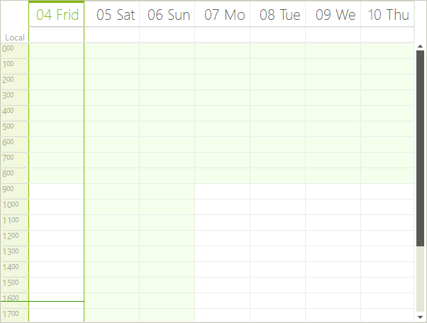
The work time hours is a predefined range of hours, which can be specified within the timeline to make it easier for end-users to carry out scheduling. They are properly indicated by a lighter color, similar to Microsoft Outlook, and are controled from the TimeInterval property.
Work Time
dayView.WorkTime = TimeInterval.DefaultWorkTime;
dayView.WorkTime = TimeInterval.DefaultWorkTime
Example when you set a 4 hour working day:
Figure 2: Four Hour Working Day
Additionally, you can specify which week days are part of the working week. This can be achieved by setting the WorkWeekStart and WorkWeekEnd properties.
Work Week Start and End
dayView.WorkWeekStart = DayOfWeek.Thursday;
dayView.WorkWeekEnd = DayOfWeek.Saturday;
dayView.WorkWeekStart = DayOfWeek.Thursday
dayView.WorkWeekEnd = DayOfWeek.Saturday
Showing and hiding the Day Headers
Showing/hiding the day headers is done through the ShowHeader property (the default setting is True):
Show Day Headers
dayView.ShowHeader = true;
dayView.ShowHeader = True
Customizing the day header format
RadScheduler uses the .NET Standard DateTime Format Strings, which can be set through the HeaderFormat property (either in design time or through code). The default value is "MMMM dd":
Set Header Format
dayView.Scheduler.HeaderFormat = "MMMM dd";
dayView.Scheduler.HeaderFormat = "MMMM dd"
Ruler Scale
The default scale of the ruler can be set with a single property (RangeFactor) to any of the predefined values, or the user can select a new scale by simply right-clicking in the time ruler and selecting the preferable setting. The Range factor modes are (the default is 60 minutes):
5 minutes
6 minutes
10 minutes
15 minutes (quarter hour)
30 minutes (half hour)
60 minutes (one hour) - this is the default value.
Set Ruler Scale
dayView.RangeFactor = ScaleRange.Hour;
dayView.RangeFactor = ScaleRange.Hour
Ruler Height and Row Height
The size of the ruler height (and row height respectively) is controlled by the RulerScaleSize property, for example 50px:
Set Ruler Size
dayView.RulerScaleSize = 50;
dayView.RulerScaleSize = 50
Start and End Times
You can control which hours are visible in the view by using RulerStartScale and RulerEndScale properties, where the start time cannot be bigger than the end time. The minimum and maximum values should are between 0 and 24. Setting the start and end times is needed when you do not want to show all hours in a day. Additionally, you can use the RulerStartScaleMinutes and RulerEndScaleMinutes properties to go into more detail and specify the minutes part of the starting and ending times. Note that the minutes are automatically rounded down to the previous ruler tick. You can use the RulerScale property to set the frequency of the ruler ticks. The following example shows how you can show the time between 9:30 and 14:45:
Ruler Start and End
dayView.RangeFactor = ScaleRange.QuarterHour;
dayView.RulerStartScale = 9;
dayView.RulerStartScaleMinutes = 30;
dayView.RulerEndScale = 14;
dayView.RulerEndScaleMinutes = 45;
dayView.RangeFactor = ScaleRange.QuarterHour
dayView.RulerStartScale = 9
dayView.RulerStartScaleMinutes = 30
dayView.RulerEndScale = 14
dayView.RulerEndScaleMinutes = 45
Figure 3: Ruler Scaling
Ruler Time Format (am/pm)
The RulerFormatStrings property changes the time format in the ruler between am and pm. The properties of the RulerFormatStrings class allow you to specify the hour and minute formats for both types of ticks (whole hour ticks and sub hour ticks). The following example demonstrates the usage of RulerFormatStrings:
Set 12 Hour Time Format
dayView.RulerStartScale = 9;
dayView.RulerEndScale = 14;
dayView.RulerFormatStrings = new RulerFormatStrings("%h", "mm", "", "");
dayView.RulerStartScale = 9
dayView.RulerEndScale = 14
dayView.RulerFormatStrings = New RulerFormatStrings("%h", "mm", "", "")
Figure 4: 12 Hour Time Format
Set 24 Hour Time Format
dayView.RulerStartScale = 9;
dayView.RulerEndScale = 14;
dayView.RulerFormatStrings = new RulerFormatStrings("%H", "mm", "", "");
dayView.RulerStartScale = 9
dayView.RulerEndScale = 14
dayView.RulerFormatStrings = New RulerFormatStrings("%H", "mm", "", "")
Figure 5: 24 Hour Time Format
Showing and Hiding the Ruler
To show and hide the ruler, use the ShowRuler property:
Show Ruler
dayView.ShowRuler = true;
dayView.ShowRuler = True
Ruler Width
The width of the ruler is controlled from the RulerWidth property, whereas the minimum value is 0, and the default value is 40px:
Set Ruler Width
dayView.RulerWidth = 40;
dayView.RulerWidth = 40
Current Time Pointer
The current time pointer is a thin line on the ruler and on the today’s column in the appointments area and it visually represents the current time. The current time pointer belongs to the RulerPrimitive which is a visual element, part of the element tree of SchedulerDayViewElement. You can manipulate this line in two ways – by setting its style or by setting its width. The following code snippet demonstrates this:
Time Pointer
SchedulerDayViewElement dayViewElement = (SchedulerDayViewElement)this.radScheduler1.ViewElement;
dayViewElement.DataAreaElement.Ruler.TimePointerStyle = RulerCurrentTimePointer.Arrow;
dayViewElement.DataAreaElement.Ruler.CurrentTimePointerWidth = 3;
dayViewElement.DataAreaElement.Ruler.CurrentTimePointerColor = Color.Red;
Dim dayViewElement As SchedulerDayViewElement = DirectCast(Me.RadScheduler1.ViewElement, SchedulerDayViewElement)
dayViewElement.DataAreaElement.Ruler.TimePointerStyle = RulerCurrentTimePointer.Arrow
dayViewElement.DataAreaElement.Ruler.CurrentTimePointerWidth = 3
dayViewElement.DataAreaElement.Ruler.CurrentTimePointerColor = Color.Red
The All Day Area
The AllDay area contains appointments that are either defined as AllDay appointments or their duration is greater than 24 hours. The appointments in this area are displayed with a fixed height (unless AutoSizeAppointments is enabled). When the total height of the appointments reaches a certain value, a vertical scrollbar is displayed. Using the properties of the AllDayHeaderElement you can manipulate the height of the appointments and the maximum height before the scrollbar appears:
Modify All Day Area
dayViewElement.AllDayHeaderElement.HeaderHeight = 50;
dayViewElement.AllDayHeaderElement.MaxHeaderHeight = 200;
dayViewElement.AllDayHeaderElement.HeaderHeight = 50
dayViewElement.AllDayHeaderElement.MaxHeaderHeight = 200
Modifying The Size Of Day View Columns
The SchedulerDayViewElement allows you to specify different size for the different columns. To manipulate the size of the columns, you can use the SetColumnWidth and GetColumnWidth methods. The values passed to the SetColumnWidth method are proportional and the actual width of the columns is calculated based on them. By default all columns have a value of 1 and therefore if you set a value of 2 to any column, it will stay twice as bigger compared to the others.
Set Column Size
dayViewElement.SetColumnWidth(2, 2);
dayViewElement.SetColumnWidth(2, 2)
Figure 6: Column Size