Custom data cell
RadVirtualGrid provides a convenient way to create custom cells. RadVirtualGrid supports a powerful and flexible mechanism for creating cell types with custom content elements, functionality and properties.
| Default VirtualGridCellElement for the Discontinued column | Custom VirtualGridCheckBoxCellElement for the Discontinued column |
|---|---|
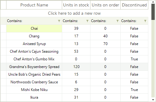 |
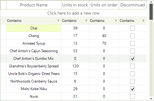 |
You can use the following approach to create a custom data cell with a check box in it:
1. Create a class for the cell which derives from VirtualGridCellElement.
2. Create the RadCheckBoxElement and add it as a child of the custom cell. You can achieve this by overriding the CreateChildElements method.
3. Override the UpdateInfo method to update the check box according to the cell value.
4. The custom cell will have no styles, because there are no defined styles for its type in the themes. You can apply the VirtualGridCellElement’s styles to it by defining its ThemeEffectiveType.
5. Override the IsCompatible method and return true only for the compatible column and rows. This will prevent the cell from being unintentionally reused by other columns.
Thanks to the UI virtualization mechanism of RadVirtualGrid, only the currently visible cells are created and they are further reused when needed during operations like scrolling, filtering, etc. It is necessary to specify that our custom cell is applicable only to the desired column, e.g. ColumnIndex = 3. For this purpose, it is necessary to override the IsCompatible method and return true only if the cell is relevant for this column and row. This will ensure that the custom cell will be used only in this particular column and it won't be reused in other columns. However, the cell elements belonging to the rest of the columns, by default, are applicable to the custom column as well. This requires creating a default VirtualGridCellElement which IsCompatible with all the columns but our custom column with ColumnIndex = 3.
A cell element is reused in other rows or columns if it is compatible for them.
6. In order to center the check box within the cell element, you should override the ArrangeOverride method and arrange the RadCheckBoxElement in the middle.
7. Subscribe to the RadCheckBoxElement.ToggleStateChanged event in order to synchronize the cell's value with the check box.
Custom VirtualGridCellElement
public class MyVirtualGridCheckBoxCellElement : VirtualGridCellElement
{
    private RadCheckBoxElement checkBox;

    protected override void CreateChildElements()
    {
        base.CreateChildElements();

        this.checkBox = new RadCheckBoxElement();
        this.Children.Add(this.checkBox);
    }

    protected override void UpdateInfo(VirtualGridCellValueNeededEventArgs args)
    {
        base.UpdateInfo(args);

        if (args.Value is bool)
        {
            this.checkBox.Checked = (bool)args.Value;
        }

        this.Text = String.Empty;
    }

    public override bool IsCompatible(int data, object context)
    {
        VirtualGridRowElement rowElement = context as VirtualGridRowElement;

        return data == 3 && rowElement.RowIndex >= 0;
    }

    public override void Attach(int data, object context)
    {
        base.Attach(data, context);

        this.checkBox.ToggleStateChanged += checkBox_ToggleStateChanged;
    }

    public override void Detach()
    {
        this.checkBox.ToggleStateChanged -= checkBox_ToggleStateChanged;

        base.Detach();
    }

    protected override SizeF ArrangeOverride(SizeF finalSize)
    {
        SizeF size = base.ArrangeOverride(finalSize);

        this.checkBox.Arrange(new RectangleF((finalSize.Width - this.checkBox.DesiredSize.Width) / 2f,
            (finalSize.Height - this.checkBox.DesiredSize.Height) / 2f, this.checkBox.DesiredSize.Width, this.checkBox.DesiredSize.Height));

        return size;
    }

    protected override Type ThemeEffectiveType
    {
        get
        {
            return typeof(VirtualGridCellElement);
        }
    }

    private void checkBox_ToggleStateChanged(object sender, StateChangedEventArgs args)
    {
        this.TableElement.GridElement.SetCellValue(this.checkBox.Checked, this.RowIndex, this.ColumnIndex, this.ViewInfo);
    }
}
Public Class MyVirtualGridCheckBoxCellElement
    Inherits VirtualGridCellElement
    Private checkBox As RadCheckBoxElement
    Protected Overrides Sub CreateChildElements()
        MyBase.CreateChildElements()
        Me.checkBox = New RadCheckBoxElement()
        Me.Children.Add(Me.checkBox)
    End Sub
    Protected Overrides Sub UpdateInfo(args As VirtualGridCellValueNeededEventArgs)
        MyBase.UpdateInfo(args)
        If TypeOf args.Value Is Boolean Then
            Me.checkBox.Checked = CBool(args.Value)
        End If
        Me.Text = [String].Empty
    End Sub
    Public Overrides Function IsCompatible(data As Integer, context As Object) As Boolean
        Dim rowElement As VirtualGridRowElement = TryCast(context, VirtualGridRowElement)
        Return data = 3 AndAlso rowElement.RowIndex = 0
    End Function
    Public Overrides Sub Attach(data As Integer, context As Object)
        MyBase.Attach(data, context)
        AddHandler Me.checkBox.ToggleStateChanged, AddressOf checkBox_ToggleStateChanged
    End Sub
    Public Overrides Sub Detach()
        RemoveHandler Me.checkBox.ToggleStateChanged, AddressOf checkBox_ToggleStateChanged
        MyBase.Detach()
    End Sub
    Protected Overrides Function ArrangeOverride(finalSize As SizeF) As SizeF
        Dim size As SizeF = MyBase.ArrangeOverride(finalSize)
        Me.checkBox.Arrange(New RectangleF((finalSize.Width - Me.checkBox.DesiredSize.Width) / 2.0F, _
                                           (finalSize.Height - Me.checkBox.DesiredSize.Height) / 2.0F, Me.checkBox.DesiredSize.Width, Me.checkBox.DesiredSize.Height))
        Return size
    End Function
    Protected Overrides ReadOnly Property ThemeEffectiveType() As Type
        Get
            Return GetType(VirtualGridCellElement)
        End Get
    End Property
    Private Sub checkBox_ToggleStateChanged(sender As Object, args As StateChangedEventArgs)
        Me.TableElement.GridElement.SetCellValue(Me.checkBox.Checked, Me.RowIndex, Me.ColumnIndex, Me.ViewInfo)
    End Sub
End Class
8. Once, you are ready with the implementation for the custom data cell, you should create the default cell:
public class DefaultVirtualGridCellElement : VirtualGridCellElement
{
    public override bool IsCompatible(int data, object context)
    {
        VirtualGridRowElement rowElement = context as VirtualGridRowElement;

        return data != 3 && rowElement.RowIndex >= 0;
    }
    protected override Type ThemeEffectiveType
    {
        get
        {
            return typeof(VirtualGridCellElement);
        }
    }
}
Public Class DefaultVirtualGridCellElement
    Inherits VirtualGridCellElement

    Public Overrides Function IsCompatible(ByVal data As Integer, ByVal context As Object) As Boolean
        Dim rowElement As VirtualGridRowElement = TryCast(context, VirtualGridRowElement)
        Return data <> 3 AndAlso rowElement.RowIndex >= 0
    End Function

    Protected Overrides ReadOnly Property ThemeEffectiveType As Type
        Get
            Return GetType(VirtualGridCellElement)
        End Get
    End Property
End Class
9. Subscribe to the CreateCellElement event where we should replace the default VirtualGridCellElement with the custom one:
Apply the custom cell
private void radVirtualGrid1_CreateCellElement(object sender, VirtualGridCreateCellEventArgs e)
{
    if (e.CellType == typeof(VirtualGridCellElement))
    {
        if (e.ColumnIndex == 3 && e.RowIndex >= 0)
        {
            e.CellElement = new MyVirtualGridCheckBoxCellElement();
        }
        else
        {
            e.CellElement = new DefaultVirtualGridCellElement();
        }
    }
}
Private Sub radVirtualGrid1_CreateCellElement(ByVal sender As Object, ByVal e As VirtualGridCreateCellEventArgs)
    If e.CellType = GetType(VirtualGridCellElement) Then
        If e.ColumnIndex = 3 AndAlso e.RowIndex >= 0 Then
            e.CellElement = New MyVirtualGridCheckBoxCellElement()
        Else
            e.CellElement = New DefaultVirtualGridCellElement()
        End If
    End If
End Sub
9. Register the custom cell for the specified column index:
this.radVirtualGrid1.MasterViewInfo.RegisterCustomColumn(3);
Me.RadVirtualGrid1.MasterViewInfo.RegisterCustomColumn(3)
Use the UnregisterCustomColumn method if you need to unregister the custom cell for the specified column index. You can detect whether a custom cell is used for a certain column index by using the RadVirtualGrid.MasterViewInfo.IsCustomColumn method.
10. The last thing we need to do, is to prevent entering edit mode for the custom cell. For this purpose, cancel the EditorRequired event:
Prevent entering edit mode
private void radVirtualGrid1_EditorRequired(object sender, VirtualGridEditorRequiredEventArgs e)
{
    if (e.ColumnIndex == 3)
    {
        e.Cancel = true;
    }
}
Private Sub radVirtualGrid1_EditorRequired(sender As Object, e As VirtualGridEditorRequiredEventArgs)
    If e.ColumnIndex = 3 Then
        e.Cancel = True
    End If
End Sub
The RadCheckBoxElement can be replaced with any other RadElement according to the user's requirement.