Design Time
Common properties
The Smart Tag for RadPageView lets you quickly access common tasks involved with building RadPageView elements and customizing its elements. There is a set of properties valid for each of the available view modes:
New Theme Manager: Adds a new RadThemeManager.
Edit UI Elements: Opens a dialog that displays the Element Hierarchy Editor. This editor lets you browse all the elements in the control.
Theme Name: Select a theme name from the drop down list of themes available for that control. Selecting a theme allows you to change all aspects of the controls visual style at one time.
View Mode: Sets the view mode of RadPageView. The supported modes are Strip, Stack, Outlook, ExplorerBar and Backstage.
Item Size Mode: Determines whether the items should have equal size. The supported modes are EqualHeight, EqualWidth, EqualSize and Individual.
Item Drag Mode: Determines the drag mode of the items. The supported modes are Preview and Immediate.
Item Content Orientation: Determines the orientation of the item content (image, text, and buttons' panel). The supported orientations are Auto, Horizontal, Horizontal180, Vertical90 and Vertical270.
Item Spacing: Determines the spacing between the items in pixels.
Default Page: Specifies the default page in RadPageView.
Add Page: Clicking on this link will add a new page to RadPageView.Pages collection.
Remove Page: Clicking on this will remove the currently selected page in RadPageView.
Learning Center: Navigate to the Telerik help, code library projects or support forum.
Search: Search the Telerik site for a given string.
There are also view-specific properties as shown below:
Strip View Mode
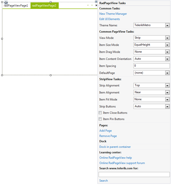
Strip Alignment: Determines the position of the tab items in RadPageView in relation to the content area. It can be Top, Left, Bottom or Right.
Item Alignment: Determines the alignment of items within the strip layout.
Item Fit Mode: Determines the fit mode of the items. The available modes are None, Fill, Shrink and ShrinkAndFill.
Strip Buttons: Determines the style of the navigation buttons. The available styles are None, Auto, LeftScroll, RightScroll, Scroll, VS2005Style, Close, ItemList, VS2008Style, All.
Stack View Mode
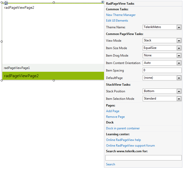
Stack Position: Determines the location of the items in relation to the content area.
Item Selection Mode: Determines how the items in Stack view are selected and positioned.
Outlook View Mode
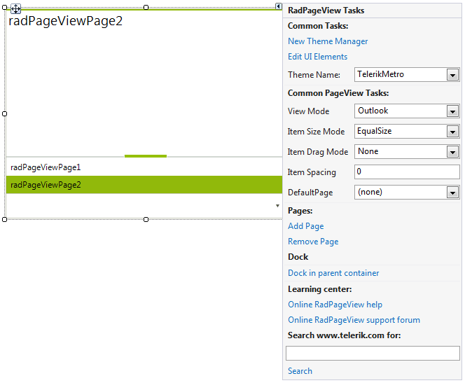
There are no Outlook view related properties in the Action Menu of RadPageView.
ExplorerBar
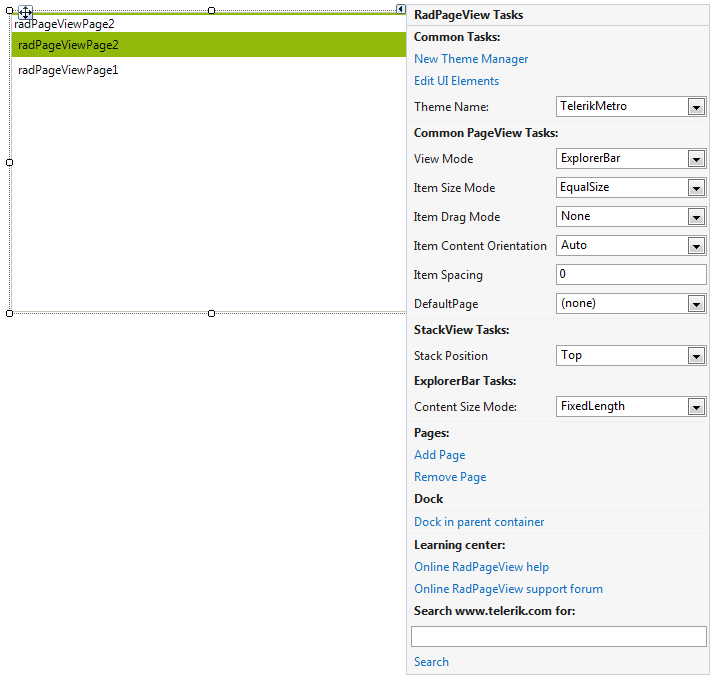
- Content Size Mode: Gets or sets a value that defines how the content areas for each item are sized. The available options are: FixedLength, AutoSizeToBestFit, EqualLength.
Backstage
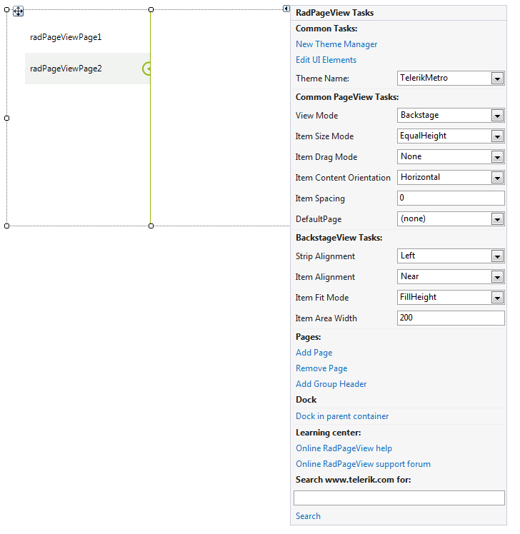
- Strip Alignment: Determines the position of the tab items in RadPageView in relation to the content area. It can be Top, Left, Bottom or Right.
- Item Alignment: Determines the alignment of items within the strip layout.
- Item Fit Mode: Determines the fit mode of the items. The available modes are None, Fill, Shrink and ShrinkAndFill.
- Item Area Width: Gets or sets the width of the items area.
In order to switch from one Action Menu to another, you should first close the menu by clicking on the Smart Tag and then reopen it again.
NavigationView
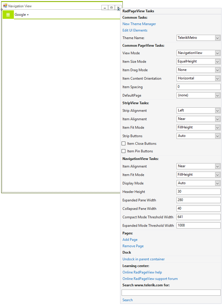
- Item Alignment: Determines the alignment of items within the items container.
- Item Fit Mode:Determines the fit mode of the items. The available modes are None, Fill, Shrink, ShrinkAndFill, FullHeight and MultiLine.
- DisplayMode: Sets the display mode. The possible values are - Auto, Compact, Expanded, Minimal.
- Header Height: Sets the header height.
- Expanded Pane Width: Sets the pages panel width when the mode is set to Expanded.
- Collapsed Pane Width: Sets the pages panel width when the mode is set to Compact.
- Compact Mode Threshold Width: This property determines when the DisplayMode will be switched from Compact to Minimal. The DisplayMode should be set to Auto in order this to work.
- Expanded Mode Threshold Width:This property determines when the DisplayMode will be switched from Expanded to Compact. The DisplayMode should be set to Auto in order this to work.
OfficeNavigationBar
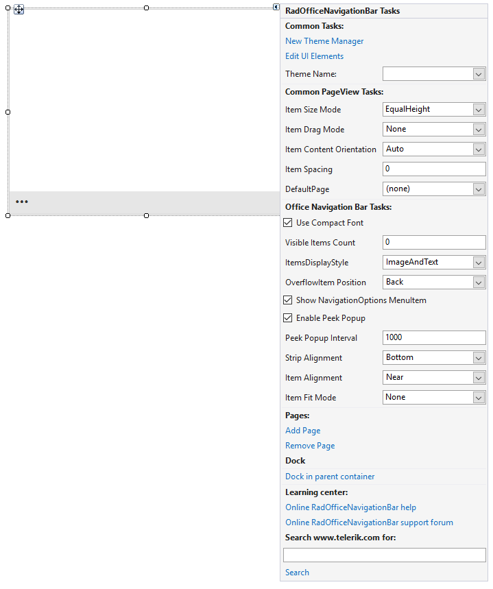
- New Theme Manager: Adds a new RadThemeManager component to the form.
- Edit UI elements: Opens a dialog that displays the Element Hierarchy Editor. This editor lets you browse all the elements in the control.
- Theme Name: Select a theme name from the drop-down list of themes available for that control. Selecting a theme allows you to change all aspects of the control visual style at one time.
- Item Size Mode: Determines whether the items should have equal size. The supported modes are EqualHeight, EqualWidth, EqualSize and Individual.
- Item Drag Mode: Determines the drag mode of the items. The supported modes are Preview and Immediate.
- Item Content Orientation: Determines the orientation of the item content (image, text, and buttons' panel). The supported orientations are Auto, Horizontal, Horizontal180, Vertical90 and Vertical270.
- Item Spacing: Determines the spacing between the items in pixels.
- Default Page: Specifies the default page in RadOfficeNavigationBar.
- Add Page: Clicking on this link will add a new page to RadOfficeNavigationBar.Pages collection.
- Remove Page: Clicking on this will remove the currently selected page in RadOfficeNavigationBar.