Element Hierarchy
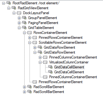
RadGridView uses the Telerik Presentation Framework which enables rich experiences like advanced styling and animations. Just like WPF it uses elements ordered in a visual tree called element hierarchy. This article describes the element hierarchy used in RadGridView:
Figure 1: The RadGridView element hierarchy.

GridVisualElement is the base element which is inherited by all visual elements in RadGridView. It derives from the LightVisualElement and provides functionality to display fill, border, text and image.
RadGridViewElement is the root element in grid hierarchy. Its dock layout allows for presenting different views of the same data simultaneously. All views in this panel should implement the IGridView interface. This enables presenting detail views and split view. This element is accessible using the GridViewElement property.
GridTableElement is an implementation of the IGridView interface. It relates with a single GridViewInfo and represents a child view when used in hierarchy. In a flat grid there is only one table element that contains all rows and cells that are currently visible. The table element which presents data for the first level in hierarchy or a flat grid is accessible through the TableElement property. The GetRowView method returns the table element related with the specified GridViewInfo.
GridRowElement is the base visual element for presenting rows. It contains three different layouts enabling presenting frozen columns. It references a GridViewRowInfo object in its RowInfo property.
Please note that all cell and row elements are virtualized. Visual elements are created only for rows and cells that are currently visible. Read More
GridCellElement: The base visual element for presenting cells. It references GridViewColumn and GridRowElement objects to represent cell text using its Value property.
Scrollbar elements: Instead of using the build-in WinForms mechanism for scrolling, RadGridView uses elements and implements custom logic. Scrollbar elements are accessible using the HScrollBar and RadGridView supports two different scrolling modes – normal and deferred, which is controlled using the EnableFastScrolling property. When using hierarchy, you can choose between a single scrollbar and dedicated scrollbar elements in every child view. To do this, set the UseScrollingInHierarchy property to true.
GroupPanelElement: This panel is placed by default on top of RadGridView and uses to indicate whether grouping applies. Its visibility is controlled by using the ShowGroupPanel and EnableGrouping properties.
GroupFieldElement: Represents a single group descriptor in GroupPanelElement.