Styling in Visual Style Builder
The following article shows how you can change the calendar cells styles in VisualStyleBuilder. The CalendarTableElement corresponds to a single month view in RadCalendar. The CalendarTableElement is the container of RadCalendar cells that represent the days of the month.
Changing the Today cell styles in Visual Style Builder
- Open VisualStyleBuilder.
- Export the built-in themes in a specific folder by selecting
File >> Export Built-in Themes. - Load a desired theme from the just exported files by selecting
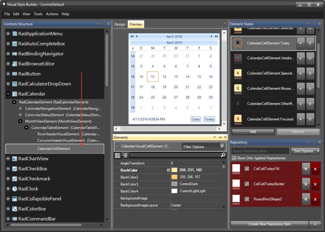
File >> Open Package. - Select RadCalendar and expand the elements up to
CalendarCellElement.
- Select the
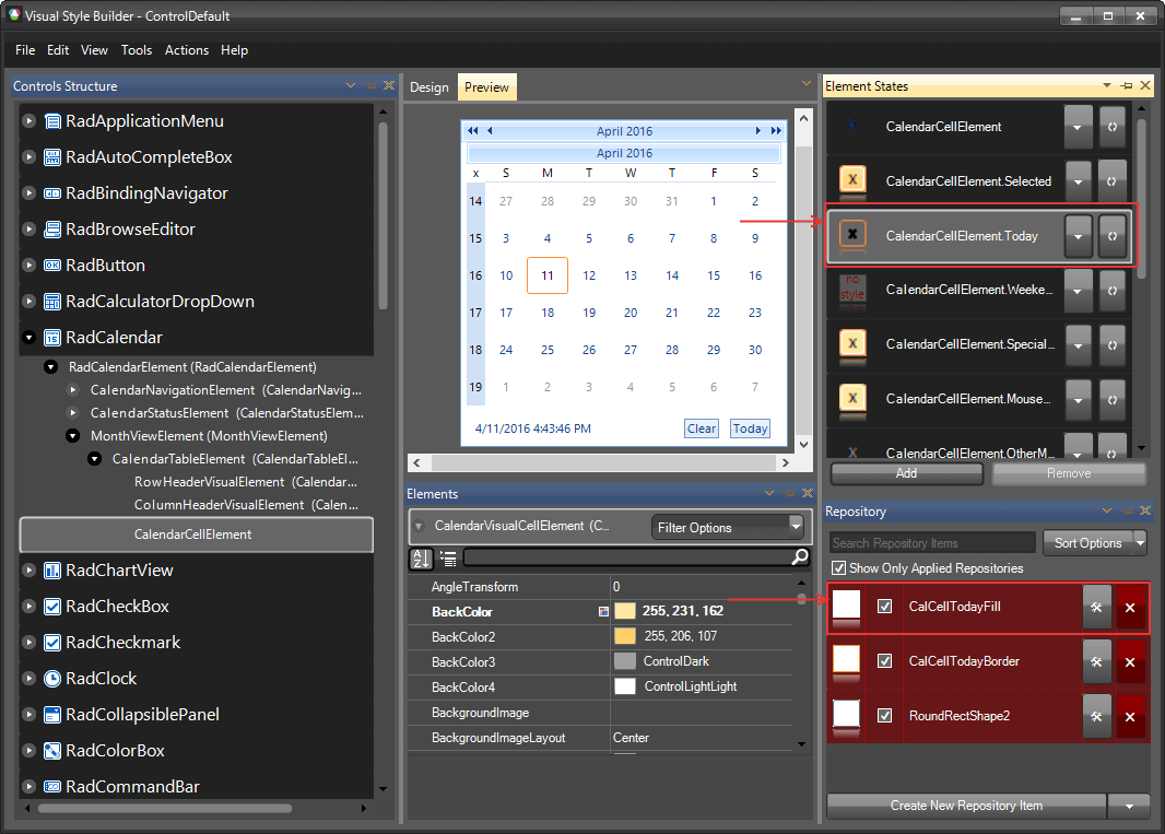
Todaystate in theElement Stateswindow.Then openCalCellTodayFillrepository item.
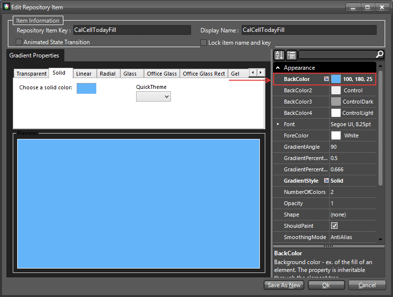
- Once the item is opened change the BackColor and close the item.

- In the
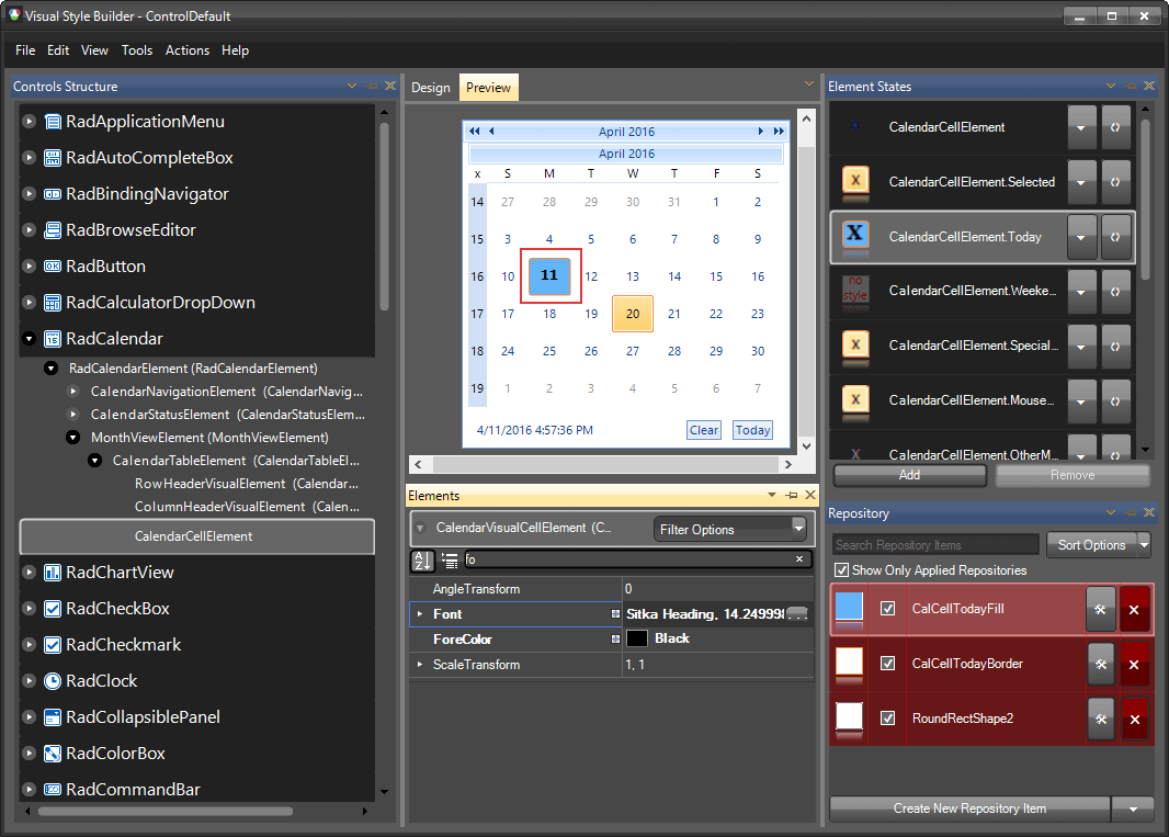
Elementswindow select the Font and change its style and sizе. The result can be seen in the bellow image.
Common Styling Properties
You can use this approach to customize all other states styles. The following list shows some of the most important properties that can be changed:
BackColor: Gets or sets the back color which will be used in the gradient fill.
BackColor2: Gets or sets the second back color which will be used in the gradient fill.
BackColor3: Gets or sets the third back color which will be used in the gradient fill.
BackColor4: Gets or sets the fourth back color which will be used in the gradient fill.
NumberOfColors: Gets or sets the number of back colors which will take effect in the gradient fill.
GradientStyles: Gets or sets the gradient style which will be used in the gradient fill.
BorderBoxStyle: Gets or sets the type of border for the visual element.
BorderColor: Gets or sets the border color.
BorderColor2: Gets or sets the second border color.
BorderColor3: Gets or sets the third border color.
BorderColor4: Gets or sets the fourth border color.
BorderWidth: Gets or sets the width of the visual element's border
DrawFill: Gets or sets whether the gradient fill of the visual element should be drawn.
DrawBorder: Gets or sets whether the border of the visual element should be drawn.
BorderGradientStyle - Gets or sets the border gradient style.
Supported States
Each day is represented by an instance of CalendarCellElement. The logical states of the day are embodied in the CalendarCellElement properties shown below.
WeekEnd: Indicates that the visual element is representing a week end day.
OtherMonth: Indicates that the visual element is representing a day from another month.
Selected: Indicates whether the current visual element is selected
Today: Indicates whether the visual element is representing the current day.
Focused: Indicates whether the visual element is focused.
IsZooming: Indicates whether the visual element is in zoom-mode.
IsHeader: Indicates whether the visual element is representing a header cell.
SpecialDay: Indicates whether the visual element is representing a special day.
OutOfRange: Indicates whether the visual element is representing a day which is out of the specified range.