Design Time
To start using RadDropDownButton just drag it from the toolbox and drop it at the form.
Smart Tag
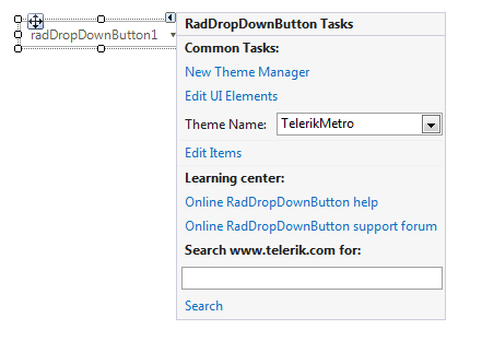
Select RadDropDownButton and click the small arrow on the top right position in order to open the Smart Tag.
Figure 1: Smart Tag
-
Common Tasks
New Theme Manager: Adds a new RadThemeManager component to the form.
Edit UI elements: Opens a dialog that displays the Element Hierarchy Editor. This editor lets you browse all the elements in the control.
Theme Name: Select a theme name from the drop down list of themes available for that control. Selecting a theme allows you to change all aspects of the controls visual style at one time.
Edit Items: Opens the RadItem Collection Editor.
Learning Center: Navigate to the Telerik help, code library projects or support forum.
Search: Search the Telerik site for a given string.
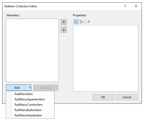
Adding Items at Design Time
To add menu items at Design Time, click on the Edit Items property to launch the RadElement Collection Editor. Click the arrow next to the Add button to add items to the menu. You can add a variety of items to the collection.
Once you have added a RadMenuItem to the collection, it will appear in the list on the left side of the dialog. Click the RadMenuItem to edit its properties in the corresponding property grid on the right of the dialog.
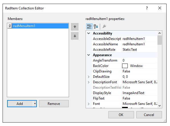
In the property grid you will find many of the standard control properties, including Text, to control the display text of the item and ToolTipText that displays when the mouse hovers over an item. Each RadMenuItem you add also contains an Items collection of its own, allowing you to create menu hierarchies in the RadDropDownButton. You can also do the following with each item:
Associate an image to an item using the Image property or associate a standard ImageList component to the RadDropDownButton and use the ImageIndex or ImageKey properties for the item.
PopupDirection determines the direction in which the sub items of a RadMenuItem will be displayed and can be Left, Right, Up or Down.
Use CheckOnClick to toggle a check mark next to a RadMenuItem. This property is appropriate to use when the item doesn't contain sub items.