Screen Tips
Telerik RibbonView provides a simple and consistent way for building interfaces similar to the ribbon control used in Microsoft Office. The RibbonView consists of various elements, one of which are the ScreenTip. This topic discusses concepts fundamental to the screen tips at first and then goes into the usage of the ScreenTip class and its features.
Before proceeding with this tutorial, it is recommended to get familiar with the Visual Structure of the
RadRibbonViewcontrol.
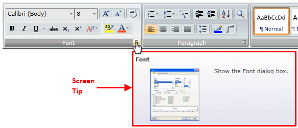
The screen tip is a type of tooltip. UI feature in which a small window appears when the mouse cursor hovers a ribbon element (tab, group, button, etc.). The popup that is displayed on hover provides details that explain the associated ribbon element. When the mouse is moved away from the ribbon element, the Screen Tip will disappear from view.
The class that represents the screen tip is Telerik.Windows.Controls.ScreenTip which derives from the native ToolTip. The class allows you to set the following attached properties on any RibbonView control:
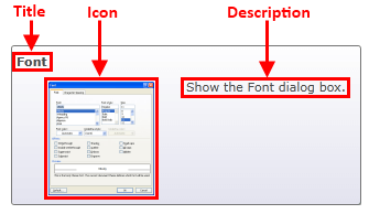
Title—Specifies the title of the screen tip.Description—Specifies the description of the screen tip.Icon—Specifies the image of the screen tip.
Setting Title
To enable the screen tip, set the ScreenTip.Title attached property on the associated ribbon control.
Setting the screen tip title on a RadRibbonGroup element
<telerik:RadRibbonView x:Name="radRibbonView">
    <telerik:RadRibbonTab Header="Home">
        <telerik:RadRibbonGroup x:Name="radRibbonGroupClipboard"
                                DialogLauncherVisibility="Visible"
                                Header="Clipboard"
                                telerik:ScreenTip.Title="Clipboard" />
    </telerik:RadRibbonTab>
</telerik:RadRibbonView>
Setting screen tip title in code-behind
ScreenTip.SetTitle(this.radRibbonGroupClipboard, "Clipboard");
ScreenTip.SetTitle(Me.radRibbonGroupClipboard, "Clipboard")
ScreenTip's Title example

Setting Description
The description is displayed in the content area under the Title. To set the description, use ScreenTip.Description attached property.
Setting the screen tip description on a RadRibbonGroup element
<telerik:RadRibbonView x:Name="radRibbonView">
    <telerik:RadRibbonTab Header="Home">
        <telerik:RadRibbonGroup x:Name="radRibbonGroupClipboard"
                                DialogLauncherVisibility="Visible"
                                Header="Clipboard"
                                telerik:ScreenTip.Description="Show the Clipboard Task options."
                                telerik:ScreenTip.Title="Clipboard" />
    </telerik:RadRibbonTab>
</telerik:RadRibbonView>
Setting screen tip description in code-behind
ScreenTip.SetTitle(this.radRibbonGroupClipboard, "Clipboard");
ScreenTip.SetDescription(this.radRibbonGroupClipboard, "Show the Clipboard Task options.");
ScreenTip.SetTitle(Me.radRibbonGroupClipboard, "Clipboard")
ScreenTip.SetDescription(Me.radRibbonGroupClipboard, "Show the Clipboard Task options.")
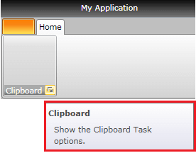
ScreenTip's Description example
Setting Icon
The screen tip allows you to display an image next to the Description content. To set the icon, use the ScreenTip.Icon attached property.
Setting screen tip icon
<telerik:RadRibbonView x:Name="radRibbonView">
    <telerik:RadRibbonTab Header="Home">
        <telerik:RadRibbonGroup x:Name="radRibbonGroupClipboard"
                                DialogLauncherVisibility="Visible"
                                Header="Clipboard"
                                telerik:ScreenTip.Description="Show the Clipboard Task options."
                                telerik:ScreenTip.Icon="Images/IconMSOffice/ClipboardScreenTipIcon.png"
                                telerik:ScreenTip.Title="Clipboard" />
    </telerik:RadRibbonTab>
</telerik:RadRibbonView>
Setting screen tip icon in code-behind
ScreenTip.SetTitle(this.radRibbonGroupClipboard, "Clipboard");
ScreenTip.SetDescription(this.radRibbonGroupClipboard, "Show the Clipboard Task options.");
ScreenTip.SetIcon(this.radRibbonGroupClipboard, new BitmapImage(new Uri("Images/IconMSOffice/ClipboardScreenTipIcon.png",UriKind.Relative)));
ScreenTip.SetTitle(Me.radRibbonGroupClipboard, "Clipboard")
ScreenTip.SetDescription(Me.radRibbonGroupClipboard, "Show the Clipboard Task options.")
ScreenTip.SetIcon(Me.radRibbonGroupClipboard, New BitmapImage(New Uri("Images/IconMSOffice/ClipboardScreenTipIcon.png", UriKind.Relative)))
ScreenTip's Icon example
Setting Initial and Between Show Delay
The screen tip allows you to define a custom initial and between show delays.
The initial show delay is the time that should pass from the moment the mouse enters the associated element to the moment when the screen tip popup is opened. After the first opening of the tooltip there is a period during which another screen tip can be shown without waiting for the initial show delay time to pass. This period is defined with the between show delay. When the user moves the mouse within this period from one element with visible screen tip to another, the screen tip of the second element shows immediately.
The delays are controlled with the ScreenTip.InitialShowDelay and ScreenTip.BetweenShowDelay attached properties.
Setting screen tip show delay properties
<telerik:RadRibbonView>
    <telerik:RadRibbonTab Header="Home">
        <telerik:RadRibbonGroup x:Name="radRibbonGroupClipboard"
                                DialogLauncherVisibility="Visible"
                                Header="Clipboard"
                                telerik:ScreenTip.Title="Clipboard"
                                telerik:ScreenTip.InitialShowDelay="3000"
                                telerik:ScreenTip.BetweenShowDelay="1000"/>
    </telerik:RadRibbonTab>
</telerik:RadRibbonView>
Setting screen tip show delay properties in code-behind
ScreenTip.SetTitle(this.radRibbonGroupClipboard, "Clipboard");
ScreenTip.SetInitialShowDelay(this.radRibbonGroupClipboard, 3000);
ScreenTip.SetBetweenShowDelay(this.radRibbonGroupClipboard, 1000);
ScreenTip.SetTitle(Me.radRibbonGroupClipboard, "Clipboard");
ScreenTip.SetInitialShowDelay(Me.radRibbonGroupClipboard, 3000);
ScreenTip.SetBetweenShowDelay(Me.radRibbonGroupClipboard, 1000);