Ribbon Backstage
Telerik RadRibbonView provides a simple and consistent way for building interfaces similar to the ribbon control used in Microsoft Office. The Ribbon Backstage control allows you to achieve a more native MS Office look and feel of your application.
RibbonBackstage Fundamentals
The RibbonBackstage appears when a user clicks the Application Button. It can be used to display controls, used to perform actions on the entire document, like Save, Print and Send. The RibbonBackstage can also provide a list of recent documents, access to application options for changing user settings and preferences, and application exit.
By default the Backstage isn't opened. In order to control its state you can set the RadRibbonView's IsBackstageOpen property.
Example 1: Set the IsBackstageOpen property
<telerik:RadRibbonView x:Name="radRibbonView" Title="My Title" ApplicationName="My Application" IsBackstageOpen="True">
 ...
</telerik:RadRibbonView>
Adding Backstage to the RadRibbonView
In order to add a backstage to your RadRibbonView control you need to set the RadRibbonView's Backstage property. The next several code-snippets show you how to do that in XAML, as well as in the code-behind.
Example 2: Declaring RadRibbonBackstage in XAML
<telerik:RadRibbonView x:Name="radRibbonView" Title="My Title" ApplicationName="My Application">
    <telerik:RadRibbonView.Backstage>
        <telerik:RadRibbonBackstage />
    </telerik:RadRibbonView.Backstage>
</telerik:RadRibbonView>
Example 3: Declaring RadRibbonBackstage in code-behind
this.radRibbonView.Backstage = new RadRibbonBackstage();
Me.radRibbonView.Backstage = New RadRibbonBackstage()
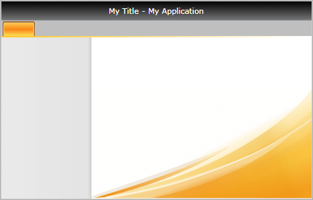
Figure 1: RadRibbonBackstage default appearance
Adding Backstage Items
The Backstage control derives from the RadTabControl. That fact allows you to easily customize it by adding/removing BackstageItems (the BackstageItem derives from a RadTabItem).
Example 4: Adding RadRibbonBackstageItem in XAML
<telerik:RadRibbonView x:Name="radRibbonView"
                        Title="My Title"
                        ApplicationButtonContent="File"
                        ApplicationName="My Application">
    <telerik:RadRibbonView.Backstage>
        <telerik:RadRibbonBackstage>
            <telerik:RadRibbonBackstageItem Header="Save" />
            <telerik:RadRibbonBackstageItem Header="Save As" />
            <telerik:RadRibbonBackstageItem Header="Open" />
            <telerik:RadRibbonBackstageItem Header="Recent" />
            <telerik:RadRibbonBackstageItem Header="New" />
            <telerik:RadRibbonBackstageItem Header="Options" />
            <telerik:RadRibbonBackstageItem Header="Exit" />
        </telerik:RadRibbonBackstage>
    </telerik:RadRibbonView.Backstage>
</telerik:RadRibbonView>
Backstage Properties
WindowMinHeight: Specifies the minimum Height of the window when the backstage is open.
WindowMinWidth: Specifies the minimum Width of the window when the backstage is open.
CloseButtonVisibility: Specifies the visibility of the backstage's close button. The default value is
Visible.-
BackstagePosition: Specifies where the backstage will be positioned when opened. The backstage position is an enumeration of type Telerik.Windows.Controls.RibbonView.BackstagePosition and it accepts the following values:
-
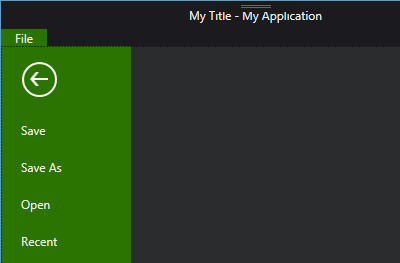
Office2010: The backstage will be positioned under the tab strip area
Figure 2: BackstagePosition property set to Office2010
-
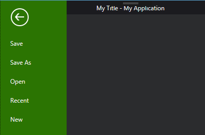
Office2013: The backstage will be positioned on top of the tab strip area
Figure 3: BackstagePosition property set to Office2013
The recommended BackstagePosition for the themes from OfficeBlack to Windows8Touch including from the Available Themes list is the Office2010. If the property is set to Office2013 for any of the themes before Office2013, the close button of the backstage will not be displayed.
-
BackstageItem Properties
The BackstageItem exposes the following properties that allow you to further customize it:
-
IsSelectable: Specifies whether an item can be selected. If you set this property to False, the item will behave like a Button.
If the BackstageItem IsSelectable property is set to False, you will be able to take advantage of the Click() event of the item, as well as its Command property.
-
IsDefault: Specifies whether the item should be selected when the Backstage is opened.
Please note that if you set the IsDefault property of multiple BackstageItems to True, the last one marked as default will be selected.
IsGroupSeparator: Specifies whether an item is a group separator. Such items are used as a heading in order to differentiate a logical group of BackstageItems.
Icon gets or sets BackstageItem icon
-
CloseOnClick: Specifies whether the Backstage will be closed when the item is clicked.
If the BackstageItem is not selectable the CloseOnClick property is set to True by default. However, if the item is selectable, then the CloseOnClick property won't affect its behavior.
Example 5: RadRibbonView with RadRibbonBackstage code example
<telerik:RadRibbonView x:Name="radRibbonView"
Title="My Title"
ApplicationName="My Application">
<telerik:RadRibbonView.Backstage>
<telerik:RadRibbonBackstage>
<telerik:RadRibbonBackstageItem CloseOnClick="False"
Header="Save"
Icon="Images/Save.png"
IsSelectable="False" />
<telerik:RadRibbonBackstageItem Header="Save As"
Icon="Images/SaveAs.png"
IsSelectable="False" />
<telerik:RadRibbonBackstageItem Header="Open"
Icon="Images/Open.png"
IsSelectable="False" />
<telerik:RadRibbonBackstageItem Header="Separator" IsGroupSeparator="True" />
<telerik:RadRibbonBackstageItem Header="Recent" IsDefault="True">
<Grid>
<Grid.ColumnDefinitions>
<ColumnDefinition Width="" />
<ColumnDefinition Width="Auto" />
<ColumnDefinition Width="" />
</Grid.ColumnDefinitions>
<StackPanel Margin="15 15 0 0">
<TextBlock Margin="0 0 0 2"
FontSize="14"
FontWeight="Bold"
Text="Recent Documents" />
<Rectangle Height="1">
<Rectangle.Fill>
<LinearGradientBrush MappingMode="Absolute" SpreadMethod="Repeat" StartPoint="0,0.5" EndPoint="4,0.5">
<GradientStop Offset="0" Color="#40000000" />
<GradientStop Offset="0.5" Color="#40000000" />
<GradientStop Offset="0.501" Color="Transparent" />
</LinearGradientBrush>
</Rectangle.Fill>
</Rectangle>
<ItemsControl Margin="0 4 0 0">
<telerik:RadRibbonButton Width="285" HorizontalContentAlignment="Left">
<StackPanel Orientation="Horizontal">
<Image Source="Images/Document.png" />
<StackPanel Margin="3 0 0 0" HorizontalAlignment="Left">
<TextBlock Margin="0 0 0 2" Text="RadRibbonViewSpecifications" />
<TextBlock Foreground="DimGray" Text="c:\Users\afuller\Documents" />
</StackPanel>
</StackPanel>
</telerik:RadRibbonButton>
<telerik:RadRibbonButton Width="285" HorizontalContentAlignment="Left">
<StackPanel Orientation="Horizontal">
<Image Source="Images/Document.png" />
<StackPanel Margin="3 0 0 0" HorizontalAlignment="Left">
<TextBlock Margin="0 0 0 2" Text="RadRibbonBackstageSpecifications" />
<TextBlock Foreground="DimGray" Text="c:\Users\afuller\Documents" />
</StackPanel>
</StackPanel>
</telerik:RadRibbonButton>
<telerik:RadRibbonButton Width="285" HorizontalContentAlignment="Left">
<StackPanel Orientation="Horizontal">
<Image Source="Images/Document.png" />
<StackPanel Margin="3 0 0 0" HorizontalAlignment="Left">
<TextBlock Margin="0 0 0 2" Text="RadRibbonBackstageItemSpecifications" />
<TextBlock Foreground="DimGray" Text="c:\Users\afuller\Documents" />
</StackPanel>
</StackPanel>
</telerik:RadRibbonButton>
<telerik:RadRibbonButton Width="285" HorizontalContentAlignment="Left">
<StackPanel Orientation="Horizontal">
<Image Source="Images/Document.png" />
<StackPanel Margin="3 0 0 0" HorizontalAlignment="Left">
<TextBlock Margin="0 0 0 2" Text="DevReach 2010" />
<TextBlock Foreground="DimGray" Text="c:\My Documents" />
</StackPanel>
</StackPanel>
</telerik:RadRibbonButton>
</ItemsControl>
</StackPanel>
<Rectangle Grid.Column="1"
Width="1"
Margin="10, 5">
<Rectangle.Fill>
<LinearGradientBrush StartPoint="0.5,0" EndPoint="0.5,1">
<GradientStop Offset="0" Color="#10000000" />
<GradientStop Offset="0.15" Color="#40000000" />
<GradientStop Offset="0.95" Color="#40000000" />
<GradientStop Offset="1" Color="#10000000" />
</LinearGradientBrush>
</Rectangle.Fill>
</Rectangle>
<StackPanel Grid.Column="2" Margin="5 15 7 0">
<TextBlock Margin="0 0 0 2"
FontSize="14"
FontWeight="Bold"
Text="Recent Places" />
<Rectangle Height="1">
<Rectangle.Fill>
<LinearGradientBrush MappingMode="Absolute" SpreadMethod="Repeat" StartPoint="0,0.5" EndPoint="4,0.5">
<GradientStop Offset="0" Color="#40000000" />
<GradientStop Offset="0.5" Color="#40000000" />
<GradientStop Offset="0.501" Color="Transparent" />
</LinearGradientBrush>
</Rectangle.Fill>
</Rectangle>
<ItemsControl Margin="0 4 0 0">
<telerik:RadRibbonButton Width="285" HorizontalContentAlignment="Left">
<StackPanel Orientation="Horizontal">
<Image Source="Images/Document.png" />
<StackPanel Margin="3 0 0 0" HorizontalAlignment="Left">
<TextBlock Margin="0 0 0 2" Text="My Documents" />
<TextBlock Foreground="DimGray" Text="c:\Users\afuller\Documents" />
</StackPanel>
</StackPanel>
</telerik:RadRibbonButton>
<telerik:RadRibbonButton Width="285" HorizontalContentAlignment="Left">
<StackPanel Orientation="Horizontal">
<Image Source="Images/Document.png" />
<StackPanel Margin="3 0 0 0" HorizontalAlignment="Left">
<TextBlock Margin="0 0 0 2" Text="Downloads" />
<TextBlock Foreground="DimGray" Text="c:\Users\afuller\Downloads" />
</StackPanel>
</StackPanel>
</telerik:RadRibbonButton>
</ItemsControl>
</StackPanel>
</Grid>
</telerik:RadRibbonBackstageItem>
<telerik:RadRibbonBackstageItem Header="New" IsSelected="True">
<StackPanel Margin="15 15 0 0">
<TextBlock Margin="0 0 0 2"
FontSize="14"
FontWeight="Bold"
Text="Available Templates" />
<Rectangle Height="1">
<Rectangle.Fill>
<LinearGradientBrush MappingMode="Absolute" SpreadMethod="Repeat" StartPoint="0,0.5" EndPoint="4,0.5">
<GradientStop Offset="0" Color="#40000000" />
<GradientStop Offset="0.5" Color="#40000000" />
<GradientStop Offset="0.501" Color="Transparent" />
</LinearGradientBrush>
</Rectangle.Fill>
</Rectangle>
<ItemsControl>
<ItemsControl.ItemsPanel>
<ItemsPanelTemplate>
<telerik:RadWrapPanel />
</ItemsPanelTemplate>
</ItemsControl.ItemsPanel>
<telerik:RadRibbonButton>
<Grid Width="80">
<Grid.RowDefinitions>
<RowDefinition Height="Auto" />
<RowDefinition />
</Grid.RowDefinitions>
<Image Source="Images/DocTemplateNew.png" Stretch="None" />
<TextBlock Grid.Row="1"
Margin="2"
HorizontalAlignment="Center"
Text="Blank Document"
TextWrapping="Wrap" />
</Grid>
</telerik:RadRibbonButton>
<telerik:RadRibbonButton>
<Grid Width="80">
<Grid.RowDefinitions>
<RowDefinition Height="Auto" />
<RowDefinition />
</Grid.RowDefinitions>
<Image Source="Images/DocTemplateBlogPost.png" Stretch="None" />
<TextBlock Grid.Row="1"
Margin="2"
HorizontalAlignment="Center"
Text="Blog Post"
TextWrapping="Wrap" />
</Grid>
</telerik:RadRibbonButton>
<telerik:RadRibbonButton>
<Grid Width="80">
<Grid.RowDefinitions>
<RowDefinition Height="Auto" />
<RowDefinition />
</Grid.RowDefinitions>
<Image Source="Images/DocTemplateRecent.png" Stretch="None" />
<TextBlock Grid.Row="1"
Margin="2"
HorizontalAlignment="Center"
Text="Recent Templates"
TextWrapping="Wrap" />
</Grid>
</telerik:RadRibbonButton>
<telerik:RadRibbonButton>
<Grid Width="80">
<Grid.RowDefinitions>
<RowDefinition Height="Auto" />
<RowDefinition />
</Grid.RowDefinitions>
<Image Source="Images/DocTemplateSamples.png" Stretch="None" />
<TextBlock Grid.Row="1"
Margin="2"
HorizontalAlignment="Center"
Text="Sample Templates"
TextWrapping="Wrap" />
</Grid>
</telerik:RadRibbonButton>
<telerik:RadRibbonButton>
<Grid Width="80">
<Grid.RowDefinitions>
<RowDefinition Height="Auto" />
<RowDefinition />
</Grid.RowDefinitions>
<Image Source="Images/DocTemplateMy.png" Stretch="None" />
<TextBlock Grid.Row="1"
Margin="2"
HorizontalAlignment="Center"
Text="My Templates"
TextWrapping="Wrap" />
</Grid>
</telerik:RadRibbonButton>
<telerik:RadRibbonButton>
<Grid Width="80">
<Grid.RowDefinitions>
<RowDefinition Height="Auto" />
<RowDefinition />
</Grid.RowDefinitions>
<Image Source="Images/DocTemplateNewBasedOn.png" Stretch="None" />
<TextBlock Grid.Row="1"
Margin="2"
HorizontalAlignment="Center"
Text="New from Existing"
TextWrapping="Wrap" />
</Grid>
</telerik:RadRibbonButton>
</ItemsControl>
</StackPanel>
</telerik:RadRibbonBackstageItem>
<telerik:RadRibbonBackstageItem Header="Exit"
Icon="Images/Exit.png"
IsSelectable="False" />
</telerik:RadRibbonBackstage>
</telerik:RadRibbonView.Backstage>
<telerik:RadRibbonTab Header="Home" />
<telerik:RadRibbonTab Header="View" />
<telerik:RadRibbonTab Header="Text" />
</telerik:RadRibbonView>
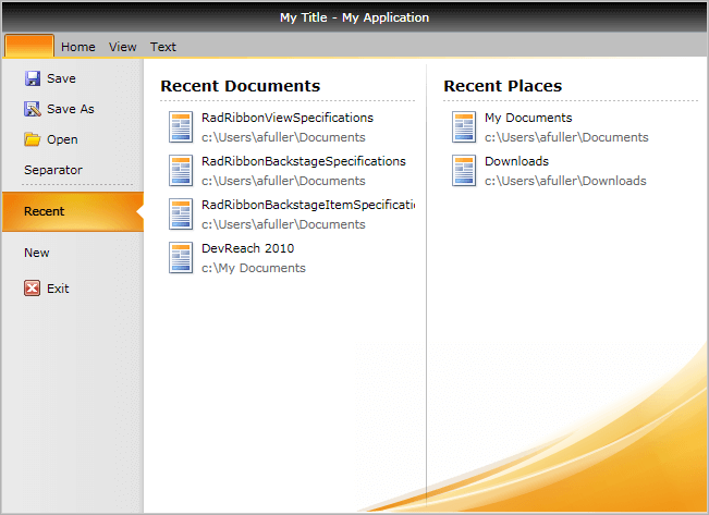
Figure 4: Customized RadRibbonBackstage
The RadRibbonView exposes the BackstageClippingElement property, that allows you to define the area over which the Backstage will be displayed:
Example 6: Specify BackstageClippingElement property
 <Grid x:Name="LayoutRoot" Background="White" ShowGridLines="True">
    <Grid.RowDefinitions>
        <RowDefinition Height="" />
        <RowDefinition Height="" />
    </Grid.RowDefinitions>
    <Grid.ColumnDefinitions>
        <ColumnDefinition Width="" />
        <ColumnDefinition Width="" />
    </Grid.ColumnDefinitions>
    <Grid x:Name="ribbonContainer">
        <Grid.RowDefinitions>
            <RowDefinition Height="" />
            <RowDefinition Height="" />
        </Grid.RowDefinitions>
        <telerik:RadRibbonView x:Name="radRibbonView"
                               Title="My Title"
                               ApplicationName="My Application"
                               BackstageClippingElement="{Binding ElementName=ribbonContainer}">

            <telerik:RadRibbonView.Backstage>
                <telerik:RadRibbonBackstage>...</telerik:RadRibbonBackstage>
            </telerik:RadRibbonView.Backstage>
            ...
        </telerik:RadRibbonView>
    </Grid>
</Grid>
Figure 5: RadRibbonView with BackstageClippingElement property set

Hide Backstage Close Button
The close button of the ribbon backstage control is displayed in the themes after Windows8Touch. See the Available Themes article.
To hide the close button, set the CloseButtonVisibility property of RadRibbonBackstage to Collapsed or Hidden.
Example 7: Setting CloseButtonVisibility
<telerik:RadRibbonView>
    <telerik:RadRibbonView.Backstage>
        <telerik:RadRibbonBackstage BackstagePosition="Office2013" CloseButtonVisibility="Visible" />
    </telerik:RadRibbonView.Backstage>
</telerik:RadRibbonView>
Figure 5: Hidden backstage close button in Fluent theme
The RadRibbonView is a complex control and the backstage menu is only a small part of it. The RadRibbonView consists of various elements such as:
- Application Menu
- Quick Access ToolBar
- Ribbon Tab
- Ribbon Group
- Ribbon Gallery
- RibbonButtons Overview
- Ribbon ComboBox
- Screen Tips