Visual Structure
This section defines the terms and the concepts used in the scope of RadRibbonView which you have to get familiar with before you continue reading this help.
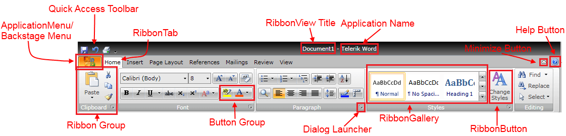
Below you can see a snapshot and explanation of the main visual elements of the RadRibbonView control.
The structure of a RadRibbonView consists of the following main elements:
Application/Backstage Menu- the Application/Backstage menu is accessible through the Application Menu Button on the left. Read more about the ApplicationMenu or the Backstage.
Quick Access Toolbar - the RibbonView's quick access toolbar is usually displayed either in the window's title bar or below the RibbonView. It provides quick access to the most commonly used commands in your application. You can fully customize the Quick Access Toolbar to make it most convenient for your application. Read more
Application Name and Title - the ribbon title and the application name are located in the middle of the top area of the RadRibbonView. You can use it to display the currently opened document along with the name of your application.
Ribbon Tab - this is the highest level container control in the ribbon bar structure. You can use the RadRibbonTab control to organize the controls in a more logical and convenient way for the user. Read more
Ribbon Group - this is one of the most frequently used container controls in the RibbonView structure. You can use the RadRibbonGroup control to organize the controls in a more logical and convenient way for the user. Moreover, the ribbon group adjusts its dimensions and internal layout dynamically to best accommodate the available space. Read more
Dialog Launcher - the dialog launcher button is located in the lower right corner of the ribbon group and it is hidden by default. You can use it to associate configuration dialogs with each ribbon group container. Read more
Button Group - use the RadButtonGroup to organize your buttons with common functionality i.e. Increase, Decrease Font.
Ribbon Gallery - the RadRibbonGallery control provides a list of options to choose from and also a preview functionality. It can be hosted directly in the ribbon group or in a RadRibbonDropDownButton. Read more
Ribbon Button - this is the main action control used in the ribbon, it is responsible for providing interface for the actions exposed by your application. The following types of buttons are available: RadRibbonButton, RadRibbonSplitButton, RadRibbonDropDownButton, RadRibbonRadioButton and RadToggleButton. Read more
Help Button - the help button is located always on the right side of the RadRibbonView. It is hidden by default but if you want to make it visible just set the property RadRibbonView.HelpButtonVisibility to Visible.
Minimize Button - the minimize button is located always on the right side of the RadRibbonView, before the HelpButton. It is hidden by default but if you want to make it visible just set the property RadRibbonView.MinimizeButtonVisibility to Visible.