Collapsible Panel
RadRibbonView's dynamic layout resizing allows you to optimize the layout depending on the available space.
This feature is enabled with the RadCollapsiblePanel (described in this article) and the RadOrderedWrapPanel.
Read the Resizing topic, which is tightly connected with the RadCollapsiblePanel behavior.
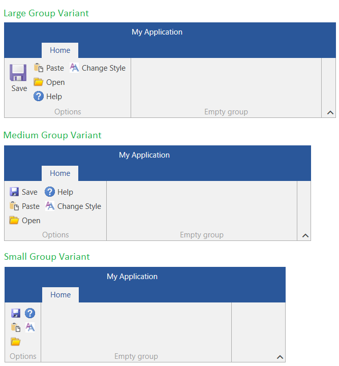
RadCollapsiblePanel behaves similarly to the UniformGrid panel. You can define the number of buttons per column (3 by default) and also the vertical spacing between them. The child buttons are ordered in columns when in Small and Medium size. Each button with Large size will be positioned alone in a separate column.
If there is not enough height to draw the buttons in the corresponding number of rows (buttons per column), the panel will try to order to buttons in less rows. For example, if you define the rows to be 3, but there is only space for 2 rows, then 2 rows will be used. The minimum number of rows that can be reached is 1, after this the buttons will start clipping.
The height of the panel can be changed by changing the height of the RadRibbonView's content. To do this, set the ContentHeight property of RadRibbonView.
Example 1: Setting up RadRibbonView with RadCollapsiblePanel
<telerik:RadRibbonView>
    <telerik:RadRibbonTab Header="Home">
        <telerik:RadRibbonGroup Header="Options">
            <telerik:RadCollapsiblePanel>
                <telerik:RadRibbonButton Text="Save"
                                         Size="Large"
                                         SmallImage="Images/save16.png"
                                         LargeImage="Images/save32.png"
                                         CollapseToSmall="WhenGroupIsSmall"
                                         CollapseToMedium="WhenGroupIsMedium" />
                <telerik:RadRibbonButton Text="Paste"
                                         SmallImage="Images/paste16.png"
                                         LargeImage="Images/paste16.png"
                                         CollapseToSmall="WhenGroupIsSmall"
                                         CollapseToMedium="WhenGroupIsMedium"/>
                <telerik:RadRibbonButton Text="Open"
                                         SmallImage="Images/open16.png"
                                         LargeImage="Images/open16.png"
                                         CollapseToSmall="WhenGroupIsSmall"
                                         CollapseToMedium="WhenGroupIsMedium"/>
                <telerik:RadRibbonButton Text="Help"
                                         SmallImage="Images/help16.png"
                                         LargeImage="Images/help16.png"
                                         CollapseToSmall="WhenGroupIsSmall"
                                         CollapseToMedium="WhenGroupIsMedium"/>
                <telerik:RadRibbonButton Text="Change Style"
                                         SmallImage="Images/change-style16.png"
                                         LargeImage="Images/change-style16.png"
                                         CollapseToSmall="WhenGroupIsSmall"
                                         CollapseToMedium="WhenGroupIsMedium"/>
            </telerik:RadCollapsiblePanel>
        </telerik:RadRibbonGroup>
        <!-- add other groups here -->
    </telerik:RadRibbonTab>
</telerik:RadRibbonView>
Figure 1: Comparison between the different group sizes (variants)

Defining Number of Rows
By default the RadCollapsiblePanel is using 3 rows. To change this behavior, set the RadCollapsiblePanel.SmallButtonsPerColumn attached property on the RadRibbonView element.
Example 2: Setting the number of rows
<telerik:RadRibbonView telerik:RadCollapsiblePanel.SmallButtonsPerColumn="2"/>
Figure 2: Collapsible panel with 2 rows

This setting affects all RadCollapsiblePanel instances within the RadRibbonView instance.
Defining Items Vertical Spacing
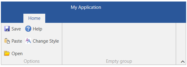
By default the RadCollapsiblePanel does not apply additional vertical spacing between the buttons. To change this and increase the distance between the rows, set the RadCollapsiblePanel.ItemSpacing attached property on the RadRibbonView element.
Example 3: Setting the vertical spacing
<telerik:RadRibbonView ContentHeight="110" Margin="10" telerik:RadCollapsiblePanel.ItemSpacing="10" />
Figure 3: Collapsible panel with a vertical spacing of 10 between the buttons

This setting affects all RadCollapsiblePanel instances within the RadRibbonView instance.